Get Certified for
Capital Markets (CMSA®)
From equities and fixed income to derivatives, the CMSA certification bridges the gap from where you are now to where you want to be — a world-class capital markets analyst.
A chart that summarizes the FOMC’s outlook for the federal funds rate
The FOMC (Federal Open Market Committee) dot plot, alternatively called the Fed’s dot plot, is a chart that summarizes the FOMC’s outlook for the federal funds rate. It is published quarterly and watched closely by investors and economists for indications on the future trajectory of the federal funds rate.
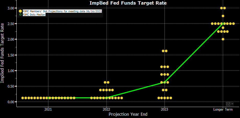
The image below shows the June 2021 FOMC dot plot. (We will revisit the image later for a discussion on its interpretation).
In 2012, the US economy was recovering from the 2008 Global Financial Crisis, and interest rates were near zero. At the time, the Federal Reserve wanted to provide the public with an advance look at what policies the Fed officials were considering over the short and longer-term time horizon.
As a result, the FOMC dot plot was introduced by the Federal Reserve to be more transparent regarding its policies.
Up to 19 Fed officials can contribute a dot anonymously (meaning no dots are “identified”) to each varying calendar year of the FOMC dot plot to indicate where they believe the federal funds rate should be.
The 19 Fed officials who can contribute a dot to the FOMC dot plot include seven members of the Board of Governors of the Federal Reserve System and presidents of the 12 regional banks.
The actual number of dots per year can be lower than 19 if there are vacancies on the Board of Governors of the Federal Reserve System. For example, in the March 2019 FOMC dot plot, there were only 17 dots for each calendar year due to two vacancies on the Board of Governors of the Federal Reserve System.
Although the FOMC dot plot is commonly viewed by investors and economics for gauging potential changes in monetary policy, Fed officials have indicated to not place great emphasis on the FOMC dot plot. This is because the Federal Reserve is data-dependent, meaning their monetary policy depends heavily on economic trends, inflation, and global events.
For example, the December 2019 FOMC dot plot indicated no action on the federal funds rate in 2020. However, due to the coronavirus pandemic, the Federal Reserve altered the federal funds rate by setting it near zero. As stated by Fed Chair Jerome Powell in his June 2021 FOMC meeting: “the dots are not a greater forecaster of future rate moves … it’s because it’s so highly uncertain”.
The June 2021 FOMC dot plot is reproduced below:
Before interpreting the FOMC dot plot, there are some key things to note:
By year-end 2021, all 18 Fed officials believe that the fed funds target rate should be in the range of 0.00% to 0.25%.
The median FOMC dot indicates a fed funds target rate of 0.00% to 0.25% in 2021.
By year-end 2022:
The median FOMC dot indicates a fed funds target rate of 0.00% to 0.25% in 2022.
By year-end 2023:
The median FOMC dot indicates a fed funds target rate of 0.50% to 0.75% in 2023.
Over the longer term:
The median FOMC dot indicates a fed funds target rate of 2.38% to 2.63% over the longer term.
Investors and economists commonly compare the most recent FOMC dot plot to previous FOMC dot plots to obtain an indication of the direction (hawkish or dovish) of monetary policy. Below is a comparison of the June 2021 FOMC dot plot to the March 2021 FOMC dot plot (denoted as grey dots).
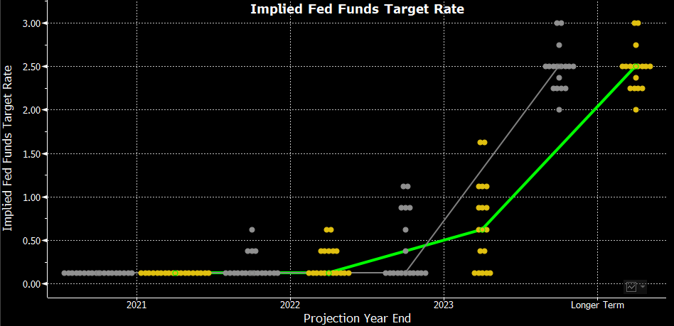
By comparing the June 2021 FOMC dot plot to the March 2021 FOMC dot plot, one can notice that in 2023, a number of Fed officials shifted their dot plots upwards. It caused the median FOMC dot in 2023 to shift from 0.00%-0.25% to 0.50%-0.75%, indicating a potential rate hike in 2023 and a hawkish shift in monetary policy.
CFI is the official provider of the Capital Markets & Securities Analyst (CMSA)® certification program, designed to transform anyone into a world-class financial analyst.
In order to help you become a world-class financial analyst and advance your career to your fullest potential, these additional resources will be very helpful: