Error Bars in Excel
Graphical representations of data variability in Excel
What are Error Bars in Excel?
Error bars in Excel[1] are graphical representations of data variability. They show the precision of a measurement. The bars usually represent standard deviation and standard error. They indicate how far from the determined value the true value is.
Error bars on charts provide a more comprehensive view of the data set and allow users to see the margins or errors in the data.
How to Add Error Bars in Excel?
Microsoft Excel allows you to add error bars to certain types of charts, including line charts, bar charts, and scatter charts.
The following steps will help you to add errors bars to your Excel charts:
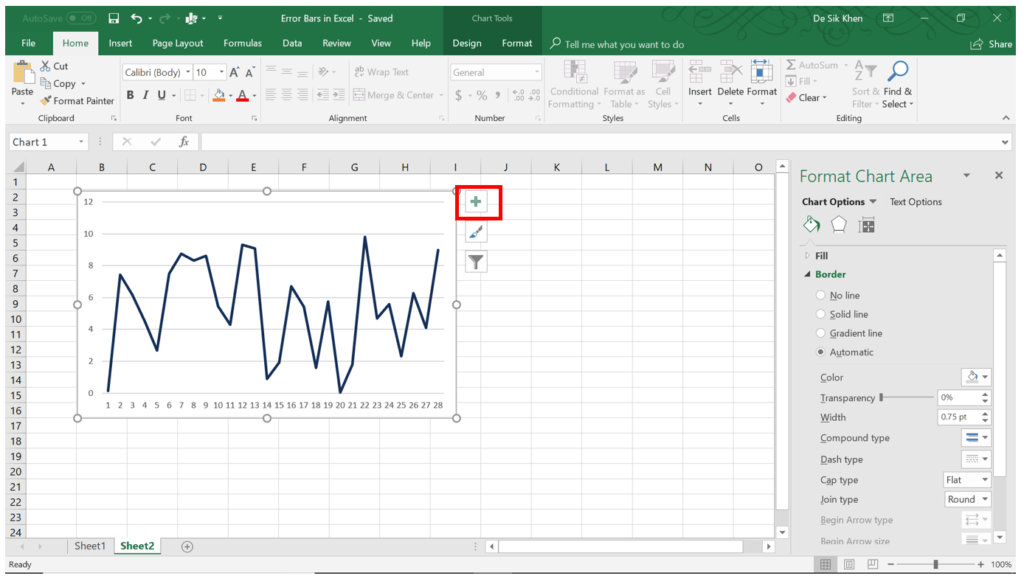
1. Click on your chart.
2. Click the Chart Elements (plus sign).
3. Check the box Error Bars and click the arrow next to it. You will see a list of items that you can add to your chart.
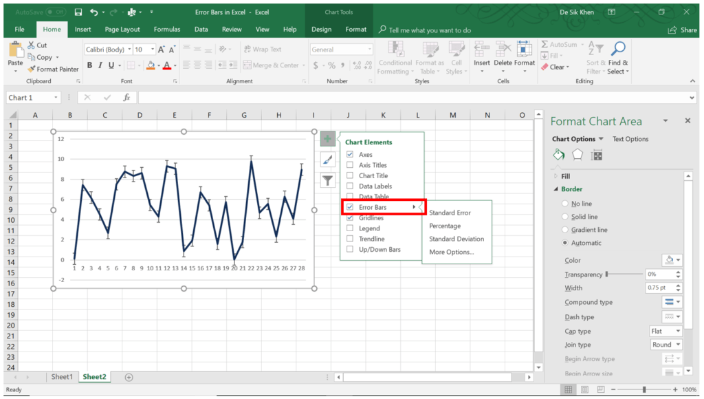
You can add the following errors bars to your chart:
- Standard Error: Indicates the standard error for all values in the dataset.
- Percentage: Determines a percentage error range and error amount for each value.
- Standard Deviation: Displays a standard deviation for all values.
You can also modify the default error bars to suit your needs:
- Click More Options in the Error Bars.
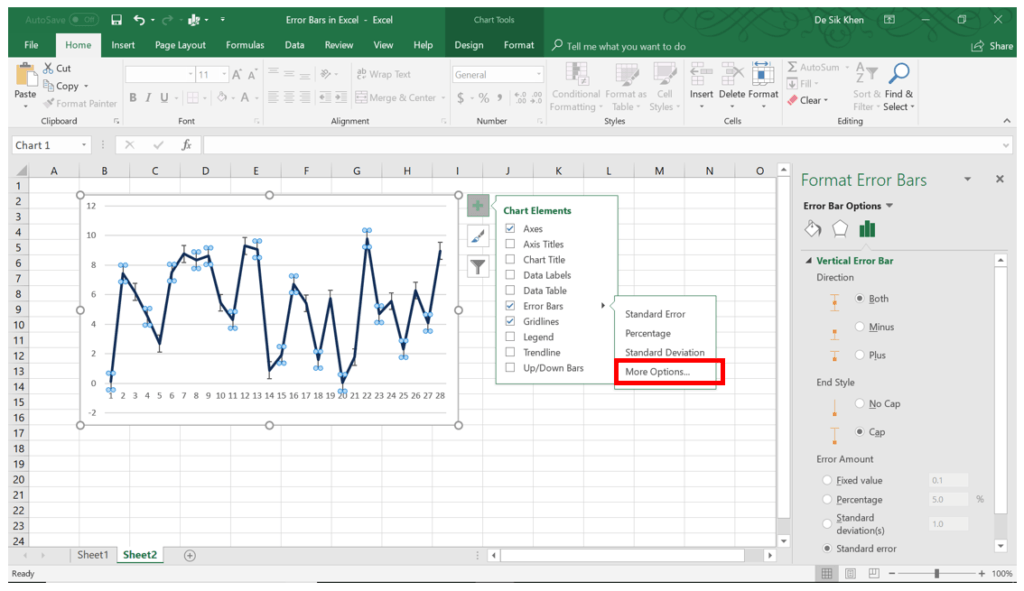
- The Format Error Bars menu will pop-up on the right side of your screen. Here, you can modify the style of the error bars, as well as the error amounts for the bars.
More Resources
Thank you for reading CFI’s guide to adding error bars in Excel. CFI offers a library of resources and training materials designed to help you learn Excel in the most efficient way possible. To learn more, check out these additional resources:
- Advanced Excel Formulas
- Excel for Finance
- Excel Current Date and Time
- List of Excel Shortcuts for PC/Mac
- Free Excel Crash Course
- See all Excel resources
Article Sources
Excel Tutorial
To master the art of Excel, check out CFI’s Excel Crash Course, which teaches you how to become an Excel power user. Learn the most important formulas, functions, and shortcuts to become confident in your financial analysis.

Launch CFI’s Excel Crash Course now to take your career to the next level and move up the ladder!