Get Certified for Financial Modeling (FMVA)®
Gain in-demand industry knowledge and hands-on practice that will help you stand out from the competition and become a world-class financial analyst.
Download our free Excel waterfall template
In Excel 2016, Microsoft finally added a Waterfall chart[1] option. It’s a great way to visually show the effect of positive and negative cash flows on a cumulative basis. If you’re working in Excel 2013 or earlier version, please follow the instructions below as a workaround to build your own waterfall chart using the Up/Down Bars and Error Bars features. Finally, at the bottom of the article, you can download our Excel Waterfall Chart Template.
To learn more, launch our Excel training courses online.
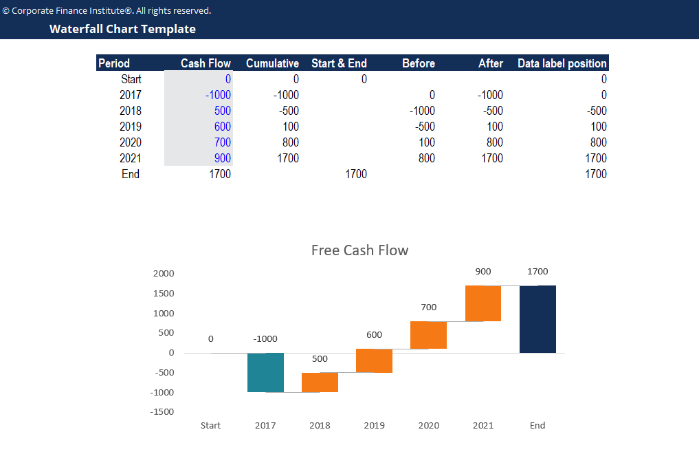
In order to build your own waterfall chart, you first have to organize your data as follows:
Recall that we created a column called Data label position; this column will be used to define the position of the labels.
Below is a preview of the waterfall chart template. Feel free to use this template to present the results of your financial analyses!
Click the button below to download our free Excel Waterfall Chart template!
This is a free Excel Waterfall Chart Template guide. Check out more of our resources to take your Excel skills to the next level: