Get Certified for Financial Modeling (FMVA)®
Gain in-demand industry knowledge and hands-on practice that will help you stand out from the competition and become a world-class financial analyst.
Create compelling Excel graphs and charts!
In addition to working with large volumes of data, finance and accounting professionals need to learn how to make a graph in Excel. Data visualization (visual representation of data in charts or graphs) is critical to many jobs. The graphical visualization of data is an effective method to communicate information to readers quickly. Charts and graphs identify trends and patterns in the data, as well as to detect anomalies and outliers.
Among finance and accounting professionals, Microsoft Excel remains the top choice for many tasks, and data visualization is no exception. MS Excel allows for creating various types of charts and graphs. In addition, the templates can be easily modified to improve the financial models. Finally, graphs and charts created in Excel can be exported to other applications to include them in your report or presentation.
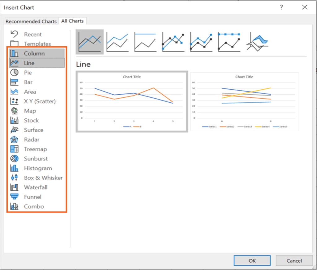
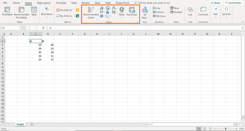
The guide discusses the steps to create any type of chart in Excel:
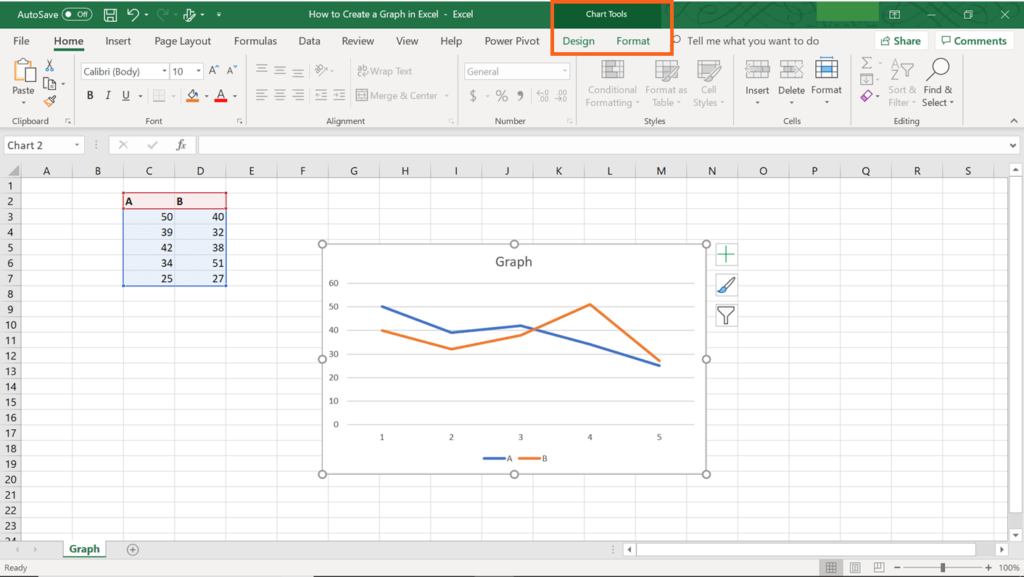
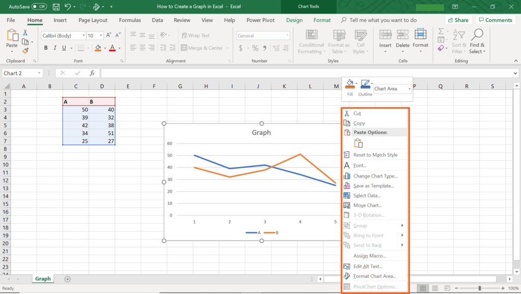
Follow the four simple steps above and you can create a graph in Excel. However, if you want your data visualization to be compelling to the readers, you must also know how to edit your graph. It can be done in several ways:
Now you know how to create graphs and charts in Excel. However, it is not the end of the story. Data visualization is not simply stacking several graphs together, but is concerned with the ability to convey the correct message from the data to the reader in a compelling way. Here are some tips that will allow you taking your data visualization skills to a new level:
“Keep it simple” remains the golden rule in data visualization. Always try to make your graphs or charts as simple as possible. Remember that a reader should be able to understand the message that your chart intends to convey quickly.
Know the key differences between various types of charts such as bar, line, pie charts, etc. Learn about the advantages and disadvantages of each type of chart. This fundamental knowledge will ensure that you choose the most appropriate type of graph in your situation.
Color is a powerful tool in data visualization. Selecting the appropriate colors for a chart or graph may help your readers to grasp the key pieces of information quickly. When you use the right colors for a chart, remember that too similar colors cannot convey the differences between data points while extremely contrasting colors, as well as too many colors, can be distracting for a reader.
Data labeling is crucial to powerful data visualization. For example, it always a good idea to label axes of your chart and main data categories. Nevertheless, be aware that excessive labeling on your chart can be distracting to your readers.
Don’t use special effects (e.g., 3D) unless necessary. For example, a 3D feature on a bar chart is not necessary since a bar chart considers only two dimensions. Special effects may only distort dimensions on a chart, and a reader can be easily confused.
CFI is the official provider of the Financial Modeling and Valuation Analyst (FMVA)™ certification program, designed to transform anyone into a world-class financial analyst.
To keep learning and developing your knowledge of financial analysis, we highly recommend the additional CFI resources below: