Overview
Recommended Prep Course
These preparatory courses are optional, but we recommend you to complete the stated prep course or possess the equivalent knowledge prior to enrolling in this course:
Excel dashboards course overview
This in-depth dashboards course will teach you how to build a custom Excel dashboard using professional data visualization techniques. By the end of the course, you will have a solid understanding of how to tell a story by combining data, charts, graphs, and other visuals.

Who should take this Excel dashboards course?
This Excel dashboards course should be taken by any type of financial analyst working in corporate finance. This includes financial planning & analysis (FP&A), corporate development, equity research, and investment banking.
This data visualization course is designed for professionals who are responsible for presenting financial information to management and executives at their businesses. Anyone who wants to learn how to present clean, focused and impactful information will benefit from this course.
This course will cover the basics of data visualization basics, then go over the theory and specific concepts that drive data visualization. You will learn how to develop effective storytelling techniques by utilizing the best selection, design, and presentation of charts and graphs. Finally, you’ll learn how to build the perfect chart and graphs to effectively communicate the story behind your data.

What will you learn in this dashboard & data visualization course?
This course will teach you all about the most important data visualization techniques, including:
- How to focus attention
- How to use white space effectively
- Storytelling with data
- Narrative techniques
- A variety of visuals
- How to use affordances
- Storyboarding
Additionally, this online course will teach you how to create a dashboard in Excel from scratch. The main dashboard topics covered in this class include:
- Page layout and design
- Line charts
- Area charts
- Column and bar charts
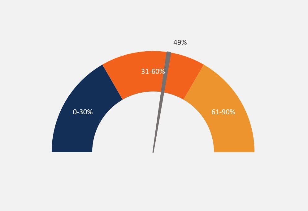
- Gauge charts
- Formatting and design
What’s included in this dashboard & data visualization course?
Purchasing the full dashboards and data visualization course includes:
- Step by step instruction
- Excel dashboard techniques
- Design and formatting tips
- Excel dashboard templates (downloadable)

Prerequisite Courses
Recommended courses to complete before taking this course.
Prerequisite Skills
Recommended skills to have before taking this course.
- Excel
- Basic computer skills
Dashboards & Data Visualization
Level 2
2h 24min
100% online and self-paced
Field of Study: Finance
Start LearningWhat you'll learn
Design Principles
Dashboard #1
Dashboard #2
Conclusion
Qualified Assessment
This Course is Part of the Following Programs
Why stop here? Expand your skills and show your expertise with the professional certifications, specializations, and CPE credits you’re already on your way to earning.
Financial Modeling & Valuation Analyst (FMVA®) Certification
- Skills Learned Financial modeling and valuation, sensitivity analysis, strategy
- Career Prep Investment banking and equity research, FP&A, corporate development


