Get Certified for
Business Intelligence (BIDA®)
Develop analytical superpowers by learning how to use programming and data analytics tools such as VBA, Python, Tableau, Power BI, Power Query, and more.
Tools for effective data presentation
Financial analysts are required to present their findings in a neat, clear, and straightforward manner. They spend most of their time working with spreadsheets in MS Excel, building financial models, and crunching numbers. These models and calculations can be pretty extensive and complex and may only be understood by the analyst who created them. Effective data presentation skills are critical for being a world-class financial analyst.

It is the analyst’s job to effectively communicate the output to the target audience, such as the management team or a company’s external investors. This requires focusing on the main points, facts, insights, and recommendations that will prompt the necessary action from the audience.
One challenge is making intricate and elaborate work easy to comprehend through great visuals and dashboards. For example, tables, graphs, and charts are tools that an analyst can use to their advantage to give deeper meaning to a company’s financial information. These tools organize relevant numbers that are rather dull and give life and story to them.
Here are some key objectives to think about when presenting financial analysis:
For a breakdown of these objectives, check out Excel Dashboards & Data Visualization course to help you become a world-class financial analyst.
Charts and graphs make any financial analysis readable, easy to follow, and provide great data presentation. They are often included in the financial model’s output, which is essential for the key decision-makers in a company.
The decision-makers comprise executives and managers who usually won’t have enough time to synthesize and interpret data on their own to make sound business decisions. Therefore, it is the job of the analyst to enhance the decision-making process and help guide the executives and managers to create value for the company.
When an analyst uses charts, it is necessary to be aware of what good charts and bad charts look like and how to avoid the latter when telling a story with data.
As for great visuals, you can quickly see what’s going on with the data presentation, saving you time for deciphering their actual meaning. More importantly, great visuals facilitate business decision-making because their goal is to provide persuasive, clear, and unambiguous numeric communication.
For reference, take a look at the example below that shows a dashboard, which includes a gauge chart for growth rates, a bar chart for the number of orders, an area chart for company revenues, and a line chart for EBITDA margins.
To learn the step-by-step process of creating these essential tools in MS Excel, watch our video course titled “Excel Dashboard & Data Visualization.” Aside from what is given in the example below, our course will also teach how you can use other tables and charts to make your financial analysis stand out professionally.
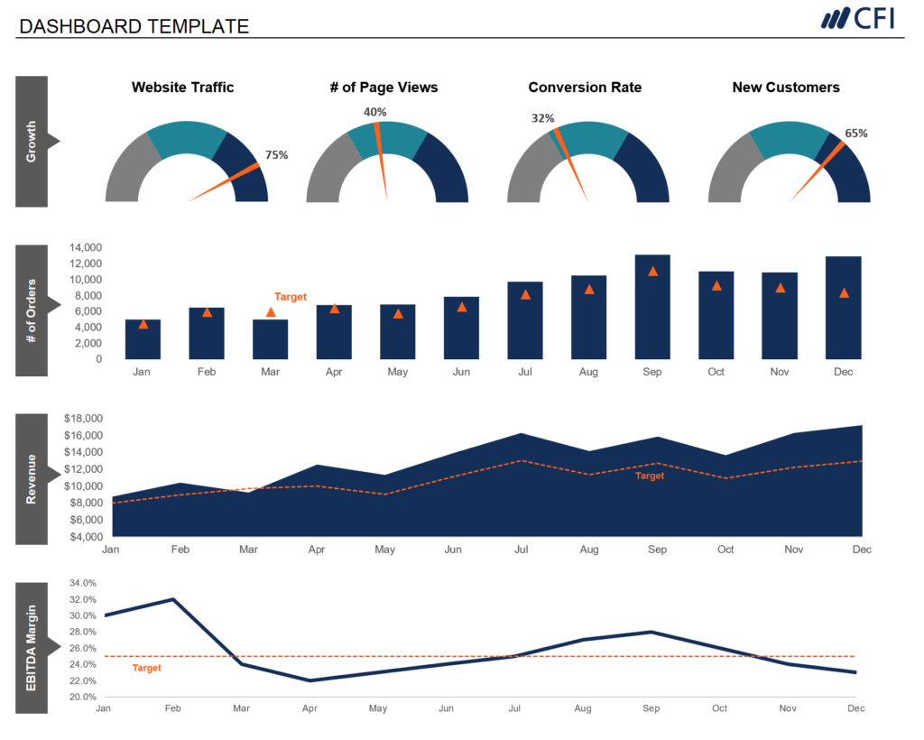
Learn how to build the graph above in our Dashboards Course!
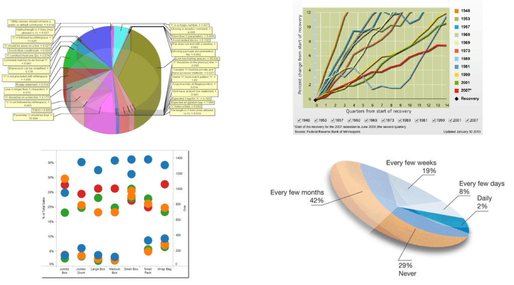
A bad chart, as seen below, will give the reader a difficult time to find the main takeaway of a report or presentation, because it contains too many colors, labels, and legends, and thus, will often look too busy. It also doesn’t help much if a chart, such as a pie chart, is displayed in 3D, as it skews the size and perceived value of the underlying data. A bad chart will be hard to follow and understand.
Aside from understanding the meaning of the numbers, a financial analyst must learn to combine numbers and language to craft an effective story. Relying only on data for a presentation may leave your audience finding it difficult to read, interpret, and analyze your data. You must do the work for them, and a good story will be easier to follow. It will help you arrive at the main points faster, rather than just solely presenting your report or live presentation with numbers.
The data can be in the form of revenues, expenses, profits, and cash flow. Simply adding notes, comments, and opinions to each line item will add an extra layer of insight, angle, and a new perspective to the report.
Furthermore, by combining data, visuals, and text, your audience will get a clear understanding of the current situation, past events, and possible conclusions and recommendations that can be made for the future.
The simple diagram below shows the different categories of your audience.
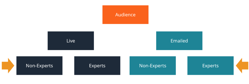
This chart is taken from our course on how to present data.
An internal audience can either be the executives of the company or any employee who works in that company. For executives, the purpose of communicating a data-filled presentation is to give an update about a certain business activity such as a project or an initiative.
Another important purpose is to facilitate decision-making on managing the company’s operations, growing its core business, acquiring new markets and customers, investing in R&D, and other considerations. Knowing the relevant data and information beforehand will guide the decision-makers in making the right choices that will best position the company toward more success.
An external audience can either be the company’s existing clients, where there are projects in progress, or new clients that the company wants to build a relationship with and win new business from. The other external audience is the general public, such as the company’s external shareholders and prospective investors of the company.
When it comes to winning new business, the analyst’s presentation will be more promotional and sales-oriented, whereas a project update will contain more specific information for the client, usually with lots of industry jargon.
A live presentation contains more visuals and storytelling to connect more with the audience. It must be more precise and should get to the point faster and avoid long-winded speech or text because of limited time.
In contrast, an emailed presentation is expected to be read, so it will include more text. Just like a document or a book, it will include more detailed information, because its context will not be explained with a voice-over as in a live presentation.
When it comes to details, acronyms, and jargon in the presentation, these things depend on whether your audience are experts or not.
Every great presentation requires a clear “main idea”. It is the core purpose of the presentation and should be addressed clearly. Its significance should be highlighted and should cause the targeted audience to take some action on the matter.
An example of a serious and profound idea is given below.
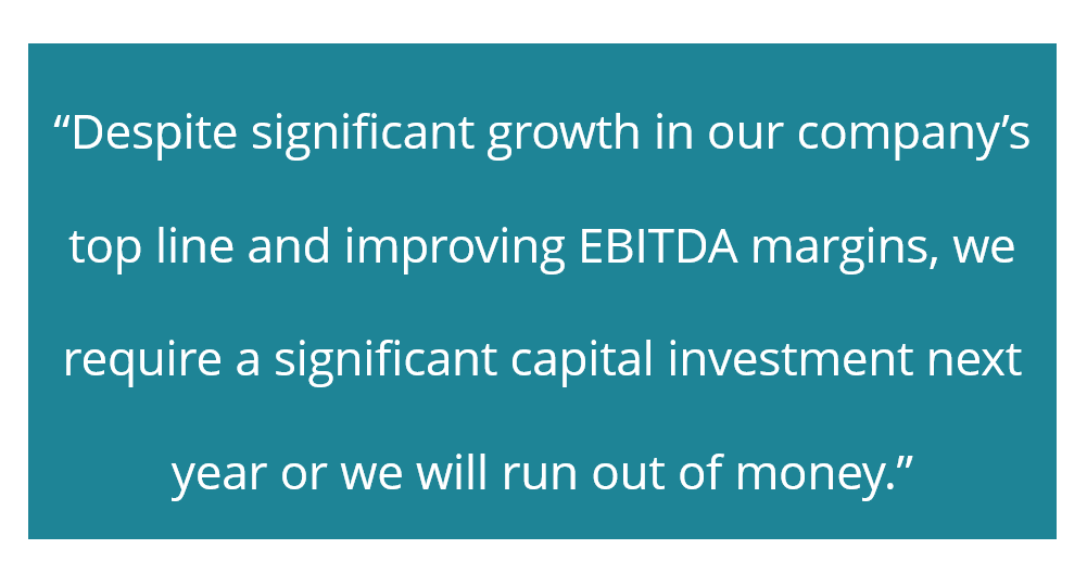
To communicate this big idea, we have to come up with appropriate and effective visual displays to show both the good and bad things surrounding the idea. It should put emphasis and attention on the most important part, which is the critical cash balance and capital investment situation for next year. This is an important component of data presentation.
The storyboarding below is how an analyst would build the presentation based on the big idea. Once the issue or the main idea has been introduced, it will be followed by a demonstration of the positive aspects of the company’s performance, as well as the negative aspects, which are more important and will likely require more attention.
Various ideas will then be suggested to solve the negative issues. However, before choosing the best option, a comparison of the different outcomes of the suggested ideas will be performed. Finally, a recommendation will be made that centers around the optimal choice to address the imminent problem highlighted in the big idea.
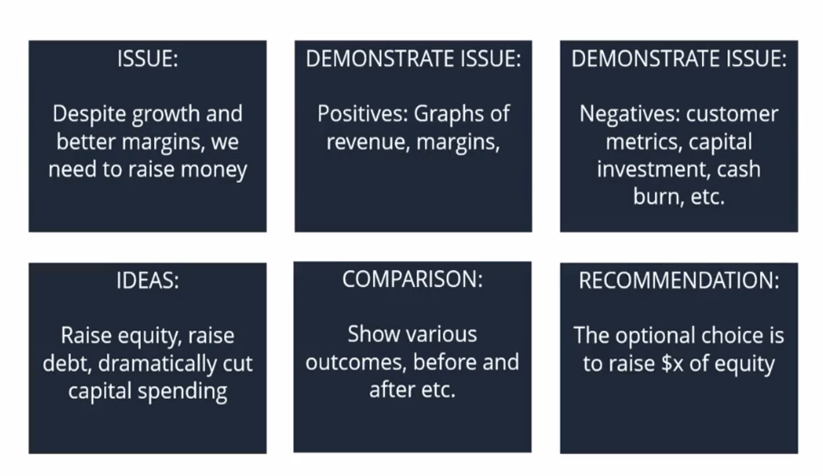
This storyboard is taken from our course on how to present data.
To get to the final point (recommendation), a great deal of analysis has been performed, which includes the charts and graphs discussed earlier, to make the whole presentation easy to follow, convincing, and compelling for your audience.
CFI offers the Business Intelligence & Data Analyst (BIDA)® certification program for those looking to take their careers to the next level. To keep learning and developing your knowledge base, please explore the additional relevant resources below:
To master the art of Excel, check out CFI’s Excel Crash Course, which teaches you how to become an Excel power user. Learn the most important formulas, functions, and shortcuts to become confident in your financial analysis.

Launch CFI’s Excel Crash Course now to take your career to the next level and move up the ladder!


