Get Certified for Financial Modeling (FMVA)®
Gain in-demand industry knowledge and hands-on practice that will help you stand out from the competition and become a world-class financial analyst.
List of the top 10 types of graphs for data
Any good financial analyst knows the importance of effectively communicating results, which largely comes down to knowing the different types of charts and graphs and when and how to use them.
In this guide, we outline the top 10 types of graphs[1] in Excel and what situation each kind is best for. Learn how to deliver powerful presentations and clear takeaways with these effective chart types. Learn more in CFI’s Excel Dashboards Course!
Click the button below to download our free Charts and Graphs template!
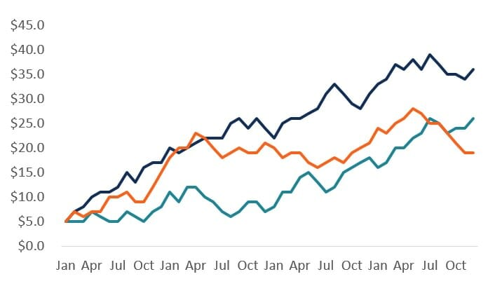
The most common, simplest, and classic type of chart graph is the line graph. This is the perfect solution for showing multiple series of closely related series of data. Since line graphs are very lightweight (they only consist of lines, as opposed to more complex chart types, as shown below), they are great for a minimalistic look.
Tips:
Bars (or columns) are the best types of graphs for presenting a single data series. Bar charts have a much heavier weight than line graphs do, so they really emphasize a point and stand out on the page.
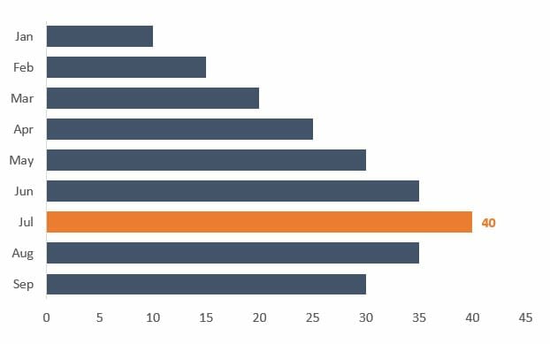
Source: Dashboards and Data Presentation course
Tips
The above two types of graphs can be combined to create a combo chart with bars and lines. This is very useful when presenting two data series with a very different scale and might be expressed in different units. The most common example is dollars on one axis and percentage on the other axis.
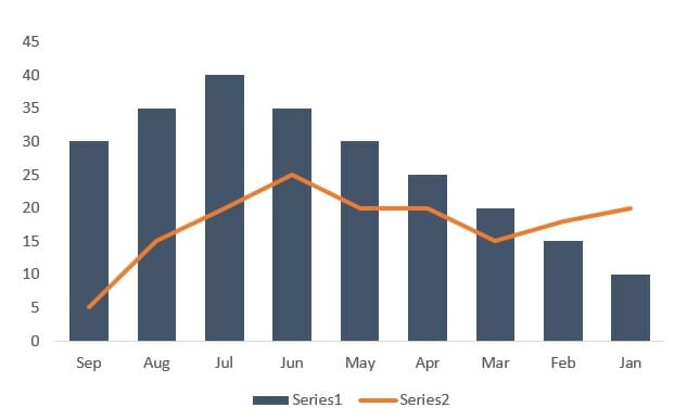
Source: Dashboard Course
Tips
The scatterplot is excellent for showing the relationship between two data series and determining their correlation. The scatterplot is great for showing what a distribution of data points looks like and drawing a line of best fit for regression analysis.
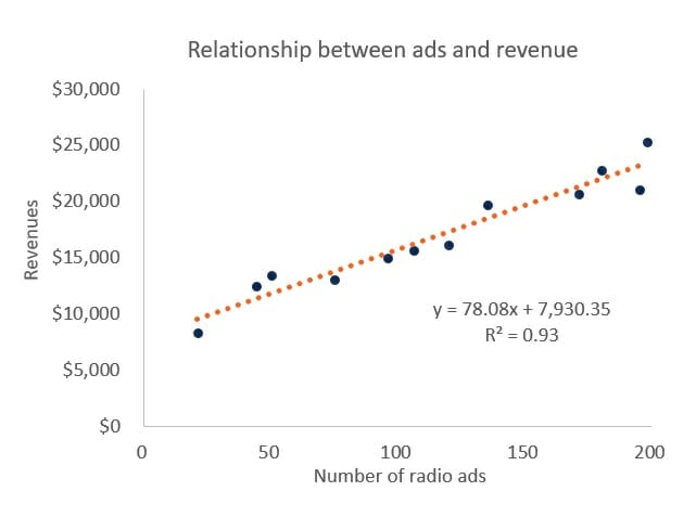
Source: Budgeting & Forecasting Course.
Tips
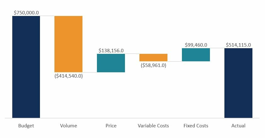
In Excel 2016, Microsoft finally introduced a waterfall chart feature. In all older versions of Excel, analysts had to create a custom workaround using stacked column charts. If you are in a version of Excel before 2016, then please see our free guide and waterfall chart template. The waterfall chart is excellent for variance analysis and explaining how an “actual” result was different than a “budget” or how something has changed relative to an original data point.
Tips
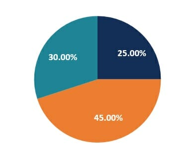
Pie charts have a bad reputation and are known for being messy and hard to read. However, if you’re trying to illustrate the percentage breakdown of a small number of data points, they can be very effective. For example, the percentage of people who prefer bananas, pineapples, and grapes.
Tips
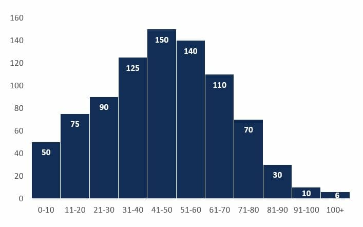
Histograms are a type of graph that shows the distribution of a dataset. They graph the percentage or the number of instances of different categories. For example, to show the distribution of age categories (0-10, 11-20, 21-30, etc.), we can clearly see which categories are the biggest and how many people fall into each.
Tips
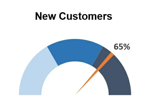
The gauge chart is perfect for graphing a single data point and showing where that result fits on a scale from “bad” to “good.” Gauges are an advanced type of graph, as Excel doesn’t have a standard template for making them. To build one you have to combine a pie and a doughnut. Learn how in our data visualization course.
Source: Advanced Excel Course
Tips
An area chart is a solid area and can be effective when showing stacked, cumulative data series – for example, showing the cumulative sales revenue from different products. This allows the reader to easily visualize the “area” (or weight) of each series relative to each other.
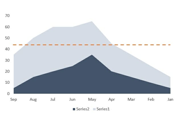
Tips
A spider or radar graph is a very useful type of graph for showing qualitative data or the overall “score” or comparison of multiple series. For example, a spider/radar can be easily used to compare three different types of phones based on five criteria (speed, screen size, camera quality, memory, apps).
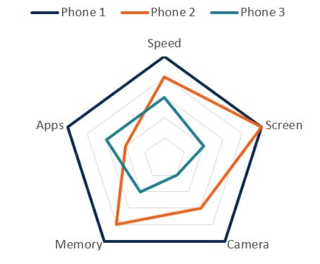
Tips
Watch this short video to learn about different types of graphs commonly seen on financial models and dashboards!
Thank you for reading CFI’s guide on the Types of Graphs. To keep learning and advancing your career, the following CFI resources will be helpful: