Get Certified for
Capital Markets (CMSA®)
From equities and fixed income to derivatives, the CMSA certification bridges the gap from where you are now to where you want to be — a world-class capital markets analyst.
A technical chart pattern that indicates the transition from a bull market to a bear market
The death cross is a chart pattern that indicates the transition from a bull market to a bear market. This technical indicator occurs when a security’s short-term moving average (e.g., 50-day) crosses from above to below a long-term moving average (e.g., 200-day).
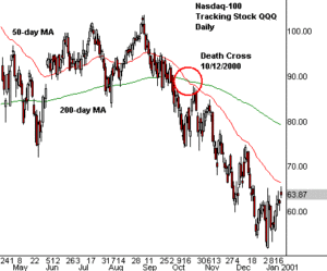
The chart below shows a death cross occurring in the NASDAQ 100 Index during the Dotcom crash of 2000.
The indicator gets its name from the alleged strength of the pattern as a bearish indication. In short, traders who believe in the pattern’s reliability say that a security is “dead” once this bearish moving average crossover occurs.
The death cross is the exact opposite of another chart pattern known as the golden cross.
The golden cross occurs when the 50-day moving average of a stock crosses above its 200-day moving average. The golden cross, in direct contrast to the cross of death, is a strong bullish market signal, indicating the start of a long-term uptrend.
There are three primary phases in the formation of the cross of death pattern.
The first phase involves the existing uptrend of a security, when it begins to reach its peak as buying momentum tapers off. Then the price begins to fall as sellers gain the upper hand in the market.
The second phase is the decline in the security’s price to a point where the actual death cross occurs, with the 50-day moving average falling below the 200-day moving average. This downside shift of the 50-day average signals a new, bearish long-term trend in the market.
The final phase occurs with the continuation of the downward movement in the market. The new downtrend needs to be sustained in order for a genuine death cross to be deemed to have occurred. If the period of downward momentum is merely short-lived, and the stock turns back to the upside, then the cross of death is considered a false signal.
The death cross pattern is more useful to market analysts and traders when its signal is confirmed by other technical indicators. One of the most popular technical indicators to confirm a long-term trend change is trading volume. The bearish cross pattern is considered a more reliable signal if it occurs along with high trading volumes. Higher trading volume indicates more investors buying into (or rather, selling into) the idea of a major trend change.
Momentum indicators such as the MACD can also be used for confirmation. They work well because the momentum of a long-term trend often dies just a bit before the market makes its turn.
Some market analysts and traders put a limited amount of reliance on the death cross pattern because it is often a very lagging indicator. The downside moving average crossover may not occur until significantly after the point at which the trend has shifted from bullish to bearish. A security’s price may have already fallen a substantial amount before the crossing death signal.
To overcome this potential weakness from lagging behind price action, some analysts use a slight variation of the pattern. In this variation, a death cross is deemed to have occurred when the security’s price – rather than a short-term moving average – falls below the 200-day moving average. This event often occurs well in advance of the 50-day moving average crossover.
The 50-day and 200-day moving averages are those most commonly used to identify a death cross. However, some market analysts favor using other moving averages. One common variation of the death signal is a 20-day moving average downside cross of the 50-day moving average. Another variation substitutes the 100-day moving average in place of the 200-day moving average as the long-term average.
The above variations may work more effectively when there is a particularly wide separation between the 50- and 200-day moving averages. (because the further away the two averages are from each other, the more the crossover may lag behind price action.) Traders also look for the pattern in shorter time frames, using the four-hour or hourly charts rather than daily charts.
While there are naysayers to every technical indicator, the death cross is considered a significant chart pattern by many investors. Analysis shows the death cross pattern occurred in primary market indexes, accurately forecasting many major bear market downturns. A death cross pattern in the Dow Jones Industrial Average preceded the crash of 1929. A death cross occurred in the S&P 500 Index in May of 2008 – four months before the 2008 crash.
Thank you for reading CFI’s guide on Death Cross. To keep advancing your career, the additional resources below will be useful:


