
Overview
Visuals and Design in Power BI Course Overview
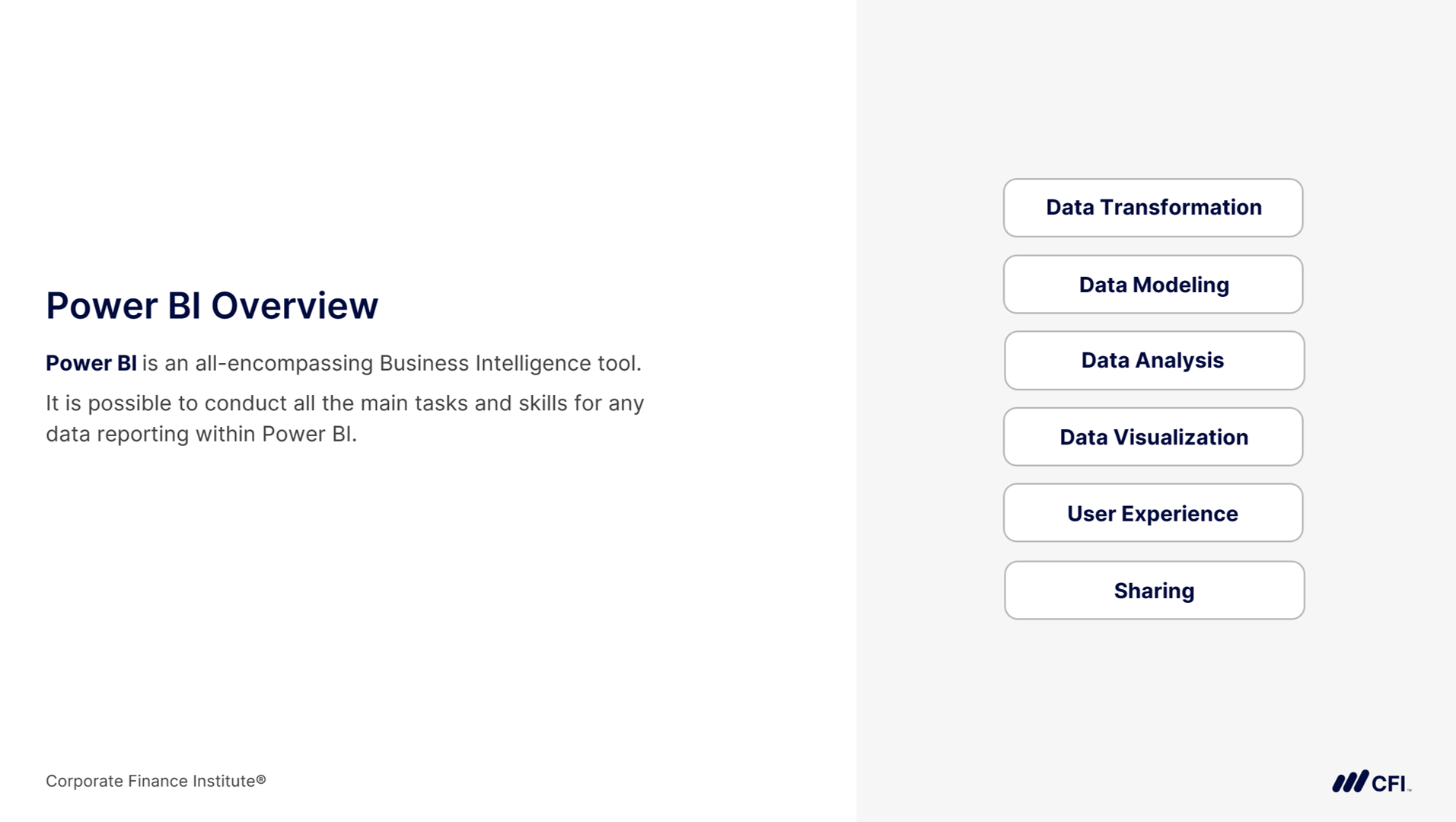
How your report looks is just as important as the data behind it. In Visuals & Design in Power BI, you’ll learn how to transform standard reports into polished, professional tools that capture attention and communicate insights clearly. We’ll cover the principles of effective data visualization, from choosing the right chart type to applying conditional formatting that guides the user’s eye. You’ll also explore layout, interactivity, and user experience design so your reports feel intuitive and engaging. Finally, we’ll go beyond the desktop, looking at how to publish and share content in the Power BI Service through semantic models, dashboards, and apps. By the end of this course, you’ll have the skills to design reports that don’t just inform, but inspire action.
Who Should Take This Course?
This course is ideal for analysts, BI developers, and finance professionals who want to move beyond the basics of reporting and build compelling, user-focused Power BI content. Whether your goal is to support executives, empower teams, or grow your career in data visualization and business intelligence, this course will help you stand out.
Visuals and Design in Power BI Learning Objectives
- Create high-quality visuals that are aesthetically polished to elevate your reports
- Apply conditional formatting strategically to highlight key insights and improve readability
- Incorporate navigation, interactivity, and dynamic elements to make reports intuitive and engaging
- Publish and share content through the Power BI Service, using semantic models, dashboards, and apps to reach your audience effectively
Prerequisite Courses
Recommended courses to complete before taking this course.

Level 3
2h 28min
100% online and self-paced
Field of Study: Information Technology
Start LearningWhat You'll Learn
Visuals
User Experience
This Course is Part of the Following Programs
Why stop here? Expand your skills and show your expertise with the professional certifications, specializations, and CPE credits you’re already on your way to earning.
Business Essentials Certificate
- Skills Learned Microsoft Excel, Word, PowerPoint, Business Communication, Data Visualization, Ethics
- Career Prep Sales Skills, People Management Skills, Relationship Management Skills, Business Analysis Skills
Financial Planning & Analysis Professional
- Skills You’ll Gain Accounting, Finance, Excel, Data Analysis, Financial Statement Analysis, Financial Modeling, Budgeting, Forecasting, Power Query, Power BI, Data Visualization, Economics, and more
- Great For The FPAP certification focuses on practical, desk-ready skills that are immediately applicable to current FP&A professionals or anyone seeking to land a role in FP&A