Get Certified for Financial Modeling (FMVA)®
Gain in-demand industry knowledge and hands-on practice that will help you stand out from the competition and become a world-class financial analyst.
A waterfall chart is a dynamic, intuitive visualization that shows how a series of positive or negative changes impact an initial value, ultimately resulting in a final total. Commonly used in financial analysis, business reporting, and performance tracking, this chart breaks down how specific data points, such as revenue shifts, cost fluctuations, or budget adjustments, contribute to the outcome.
Key features of a waterfall chart include:
Whether you’re analyzing net income, dissecting a project budget, or exploring operational trends, an Excel waterfall chart helps transform complex datasets into clear, actionable insights.
This waterfall chart template guides you step-by-step to construct a waterfall chart using raw data.
Here is a screenshot of the waterfall chart template:
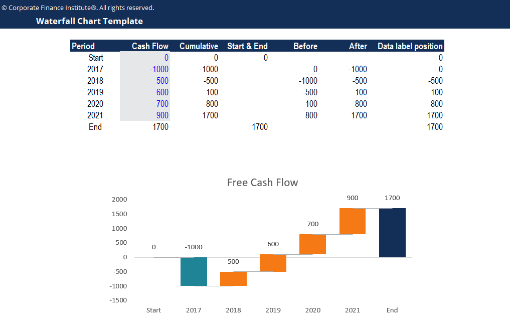
Download the free waterfall template in Excel now to advance your finance knowledge.
Waterfall charts are ideal for breaking down financial statements, tracking project budgets, or highlighting performance variances over time. Here’s a step-by-step guide to creating the chart without a waterfall template in Excel (2016 or later).
To build a waterfall chart, you first have to organize your data into a table.
Use the Up/Down Bars feature in charts to create the foundation of the waterfall chart.
Use the Column Data Label Position to define the position of the data labels.
Use the Error Bars feature in charts to show changes between each Up/Down bar.
Refining your waterfall chart in Excel doesn’t require advanced tools, just a few intentional edits that improve readability and focus. These adjustments help your audience stay oriented and make faster decisions based on your insights.
Right-click a column and choose Add Data Labels to display the value directly on the chart. You can then select Format Data Labels to reposition them, adjust size, or change the font for clarity.
Click anywhere on the chart to bring up the design tools. Use the Chart Design tab to insert a chart title that explains the visualization’s purpose. A precise label reduces guesswork and supports interpretation.
Open the Change Colors panel in the Chart Design tab. Select a palette that suits your brand or reporting style. To emphasize trends or categories, click Customize Colors and assign specific shades to each series.
Excel doesn’t always label starting and ending columns as totals by default. To fix this, right-click a column that represents a total, go to Format Data Series, and select Set as Total from the side panel.
Clean visuals improve comprehension. Delete elements that don’t contribute to the message, such as the legend, axis lines, or gridlines. Use the Chart Options menu to control visibility.
Activate connector lines to show how one value leads to the next. Right-click the chart bars, open Format Data Series, and check the Show Connector Lines Box. This adds a subtle but helpful visual thread.
Reducing the gap width tightens the appearance of your chart and improves the sense of flow. Right-click any bar, choose Format Data Series, and slide the gap width to the left for closer spacing.
Color contrast matters more than visual complexity. Highlight changes that reflect real movement in the data. Avoid overly detailed formatting in your chart design that could distract from the meaning.
Charts placed side-by-side in a report should use the same vertical scale. Otherwise, comparisons will be distorted. To do this, manually set the vertical and horizontal axis bounds under Format Axis for each chart before finalizing your report.
Misaligned columns or inconsistent widths can distract from your message. In Excel, use the gap width slider in the Format Data Series panel to ensure even spacing. This keeps the chart tidy and professional.
Avoid overloading your chart with data labels. Instead, focus on labeling totals or high-impact values. For example, highlight the final result, net income, or key turning points while letting smaller changes remain visual. This keeps attention on what drives the outcome.
Ensure your horizontal axis categories are short, relevant, and evenly spaced. Avoid long text or repetitive labels. If needed, rotate the text slightly under Format Axis to prevent crowding.
If your waterfall template in Excel has multiple small values contributing to one outcome, consider grouping them in your data table before building the chart. This helps emphasize the story rather than overwhelming the viewer with minor fluctuations.
A few careful edits can make a visually appealing chart that supports interpretation without requiring explanation.
A waterfall chart makes sense when explaining how a starting value moves step by step to a final outcome. It also works exceptionally well when presenting a high-level summary of financial performance, showing how each factor, whether gain or loss, contributes to the overall change.
Use a waterfall chart when you need to:
This chart type is ideal for presentations, reports, and dashboards where clarity matters more than granular interactivity. It simplifies complex relationships and gives decision-makers a clean path from question to insight.
If your goal is to break down values across multiple steps and tell a clear story of change, a waterfall chart is often the right fit. Consider alternatives like a cascade chart or standard bar chart when more detail is needed, or if visual comparability is the priority.
For more resources, check out our business templates library to download numerous free Excel modeling, PowerPoint presentations, and Word document templates.
To master the art of Excel, check out CFI’s Excel Crash Course, which teaches you how to become an Excel power user. Learn the most important formulas, functions, and shortcuts to become confident in your financial analysis.

Launch CFI’s Excel Crash Course now to take your career to the next level and move up the ladder!


