Get Specialized with our Financial Planning & Analysis (FP&A) Program
Support business leaders in their decision-making with best-in-class financial models to evaluate and forecast the financial performance of a company.
Even the strongest financial analysis can be overlooked if your visuals don’t make sense. For finance professionals, strong data visualization is a core communication tool. The way you build your visuals directly affects how well your message lands.
The good news? You don’t need fancy tools or advanced design training. The 5 C’s of data visualization offers a structured framework that can help you sharpen your charts, clarify your message, and present analytical insights with confidence.
In this practical breakdown, you’ll learn how to apply these simple principles to your next presentation.
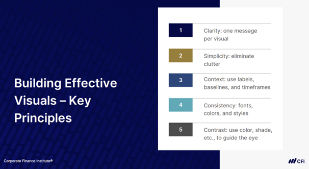
Data visualization is the process of representing data in visual form, which could include charts, maps, and graphs. The 5 C’s of data visualization represent five core principles that make financial charts clearer, cleaner, and more actionable:
Each concept builds on the next, helping you focus your message, remove distractions, and guide your audience to the right takeaway.
Clarity in your visuals helps your audience focus on the point you’re making.
Every chart should answer one specific question or highlight a single takeaway. Yet one of the most common mistakes in financial presentations is including too much data into one chart or graph.
In the example below, revenue, EBITDA, net income, and employee headcount all appear in the same visual. At a glance, it’s hard to tell what the viewer is supposed to focus on.
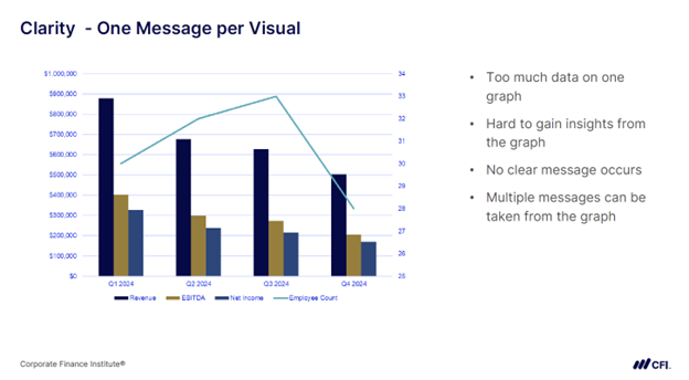
With this much information packed into one graph, multiple storylines compete for attention. The viewer has to work harder to figure out what the takeaway is.
Visual clarity gives them a clean path to the takeaway without distractions or extra interpretation.
Now take a look at the revised version below. This chart narrows the focus to revenue and EBITDA, highlights the average quarterly decline, and adds a simple headline.
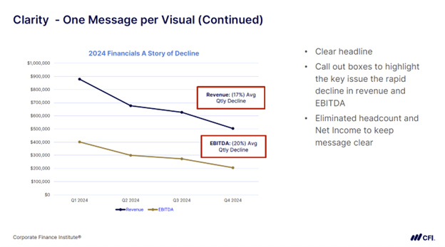
By removing extra data and adding clear annotations, this version makes the message clear: revenue and EBITDA are both declining sharply.
The audience can focus on what’s happening instead of figuring out what the chart is trying to say.
Tip: Ask yourself, what’s the one insight I want my audience to walk away with?
Clutter refers to the extra visual elements that distract more than they inform. Unnecessary visuals bury the message, making it difficult for your audience to process the information.
Take a look at the chart below:
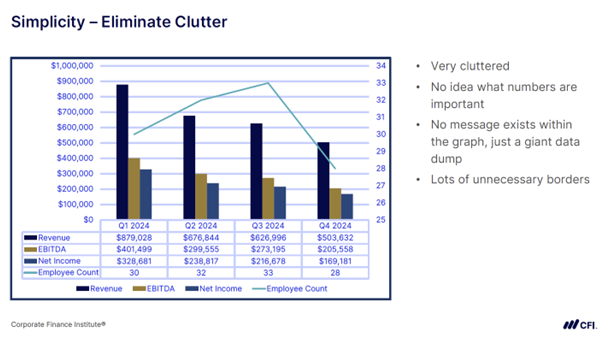
In this example, it’s hard to know where to look. Gridlines, borders, redundant legends, and a data-dense table overwhelm the message and distract from the actual trends. There’s no visual hierarchy or obvious takeaway.
Charts like this tend to look dense without feeling informative. That’s a sign of clutter.
Now look at the cleaned-up version below.
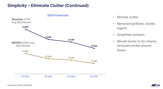
Gridlines, borders, and legends were removed. Labels were placed directly on the data points. And the average decline was called out simply and clearly. This version draws attention to what matters — steady declines in revenue and EBITDA.
Tip: If a design element doesn’t reinforce your message, remove it.
Even a clean, focused chart can fall flat if it doesn’t explain why something happened.
Context transforms a chart from a snapshot into a story. It gives your audience a frame of reference, especially when something changes unexpectedly.
Let’s say revenue is down in Q1. On its own, that drop looks concerning, but is it part of a longer trend? Or is it new?
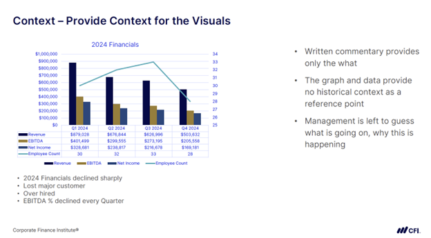
Without historical context, the 2024 revenue decline appears sudden and unexplained. The chart lacks visual cues to help the audience understand what caused the drop. Leaders are left to guess what’s really happening. That weakens your message and delays action.
Here’s how the same chart looks once context is added to a chart with clean, uncluttered visuals.
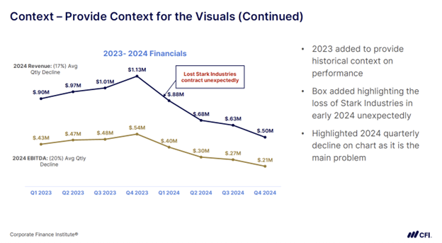
Adding 2023 data and a key annotation provides context for the 2024 decline. The chart now explains what happened and why. Revenue and EBITDA grew steadily in 2023. The annotation in Q1 — “Lost Stark Industries contract unexpectedly” — pinpoints the event that changed the trend.
With this added context, it’s immediately clear that the company lost a major client at the start of the year, triggering a steady decline in revenue and EBITDA across each quarter of 2024.
Now this chart tells a more complete story: a period of growth followed by a sharp disruption. It answers both what happened and why it happened which your audience could easily miss without context.
Tip: Add timelines, annotations, or comparative baselines so your audience sees the full picture.
Consistency means using visuals in a uniform way across your presentation or report. When fonts, labels, and colors vary from one chart to the next, it slows your audience down. Instead of focusing on your message, they’re left trying to decode your formatting.
Visual inconsistency slows your audience down as they try to understand the layout, formatting distracting from the data itself. Consider the chart below:
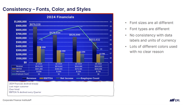
Inconsistent fonts, mixed number formats, random color choices, and unstructured label placement make this chart harder to read and trust.
Now look at what happens when formatting is cleaned up and made consistent across the chart.
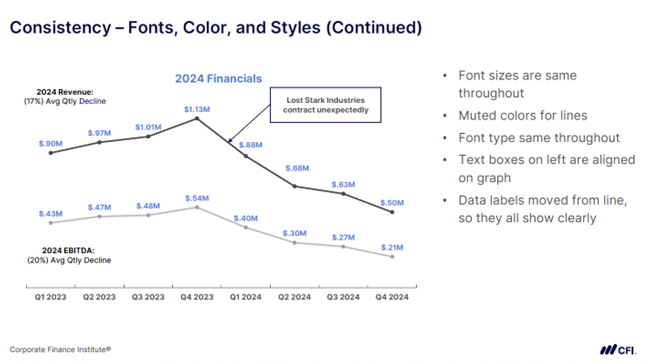
Consistent font style and size, aligned text boxes, and muted color choices improve readability and make the chart easier to interpret.
In this version:
These subtle shifts help the visual feel more structured and easier to understand at a glance. The content hasn’t changed, only the design has. But that change is what makes the message land.
Tip: Visual consistency reduces confusion, builds trust, and makes your insights easier to absorb.
Contrast helps guide your audience’s attention, but only when used with purpose.
Too much bold text, color, or variation in size can overwhelm the viewer. Poor contrast design can leave charts feeling chaotic, or worse, hard on the eyes.
With clashing colors, multiple bold elements, and no visual hierarchy, the chart below overwhelms the viewer instead of guiding them to a clear takeaway.
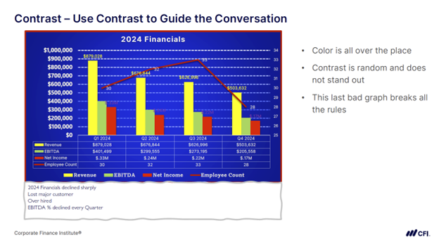
This version breaks nearly every rule of visual contrast. Colors compete instead of support. Bold formatting is used everywhere, making nothing stand out. The chart feels busy and chaotic, which hides the message instead of clarifying it.
Now compare that with a version that uses contrast intentionally.
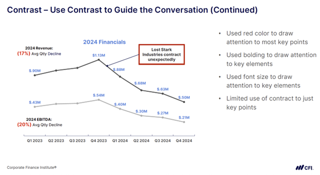
By limiting contrast to a few key elements, this chart draws the eye exactly where it’s needed.
In this revised version:
It’s common for finance professionals to start out overusing color, thinking it adds clarity. The secret to contrast isn’t in how much you use. It’s in how intentionally you apply it.
Tip: Use bold text, color, or size changes to focus your audience on the key insights.
The 5 C’s of data visualization provide a practical checklist you can apply right away. These principles help you communicate more effectively with your stakeholders, especially when decisions depend on what they see and understand. Try using them when you build your next dashboard, report, or presentation.
The table below summarizes each principle and how to apply it to your own charts:
| Clarity | Focus on one main message per chart. | Ask yourself, “What’s the one insight I want my audience to walk away with?” |
| Clutter | Remove any visual elements that don’t support the message. | If a design element doesn’t reinforce your message, remove it. |
| Context | Add background or explanation to help the audience understand why something changed. | Use annotations to explain changes, not just trends. |
| Consistency | Use fonts, labels, and formatting in a uniform way across visuals. | Choose your fonts, colors, and labels once and stick to them. |
| Contrast | Highlight the most important information with intentional use of formatting. | Use formatting to focus the viewer on the key insights. |
The 5 C’s of data visualization is just one component of effective financial data storytelling. Explore CFI’s Crafting the Narrative: Storytelling With Data course to develop the skills to communicate data and insights with clarity and impact.
BUILD Framework: A 5-Step Method to Transform Data into Stories
The Art of Communication in FP&A: Presenting Data with Impact
Beyond Pretty Charts: Creating Dashboards That Drive Decisions
CFI’s Financial Planning & Analysis Professional (FPAP™) Certification