Get Certified for
Business Intelligence (BIDA®)
Develop analytical superpowers by learning how to use programming and data analytics tools such as VBA, Python, Tableau, Power BI, Power Query, and more.
The process of turning data into easily digestible and visible insights
Data visualization is the process of representing data in visual form, which could include charts, maps, and graphs. Data visualization is a great way to extract insights from your data, as it is easier to identify outliers, patterns, and trends compared to other analysis methods — such as observing the raw data in a table.
Visualization also allows us to further enhance our storytelling when working with data. Combining insights from data with visualization can help us build a narrative, bring data to life, and communicate a story to make complex, technical topics more accessible to a broader audience.
Three benefits of using data visualization are the ease of identifying insights, the ability to summarize large quantities of data, and the ability to communicate a clear message.
The human eye is naturally drawn to patterns and colors. We can quickly identify and distinguish colors from each other, as well as see what is trending up or down. We can use data visualization to leverage this strength. Insights and messages that are hard to grasp from raw numbers can become easier to understand and interpret through data visualization.
Outliers are more easily detected in data visualizations compared to rows and rows of raw numbers in a spreadsheet. A common strategy for identifying outliers or patterns is to use summary statistics, such as the mean and standard deviation. However, using these aggregations can hide patterns, and we may miss important insights. Data visualization, using images and color, makes it much easier to detect this information. 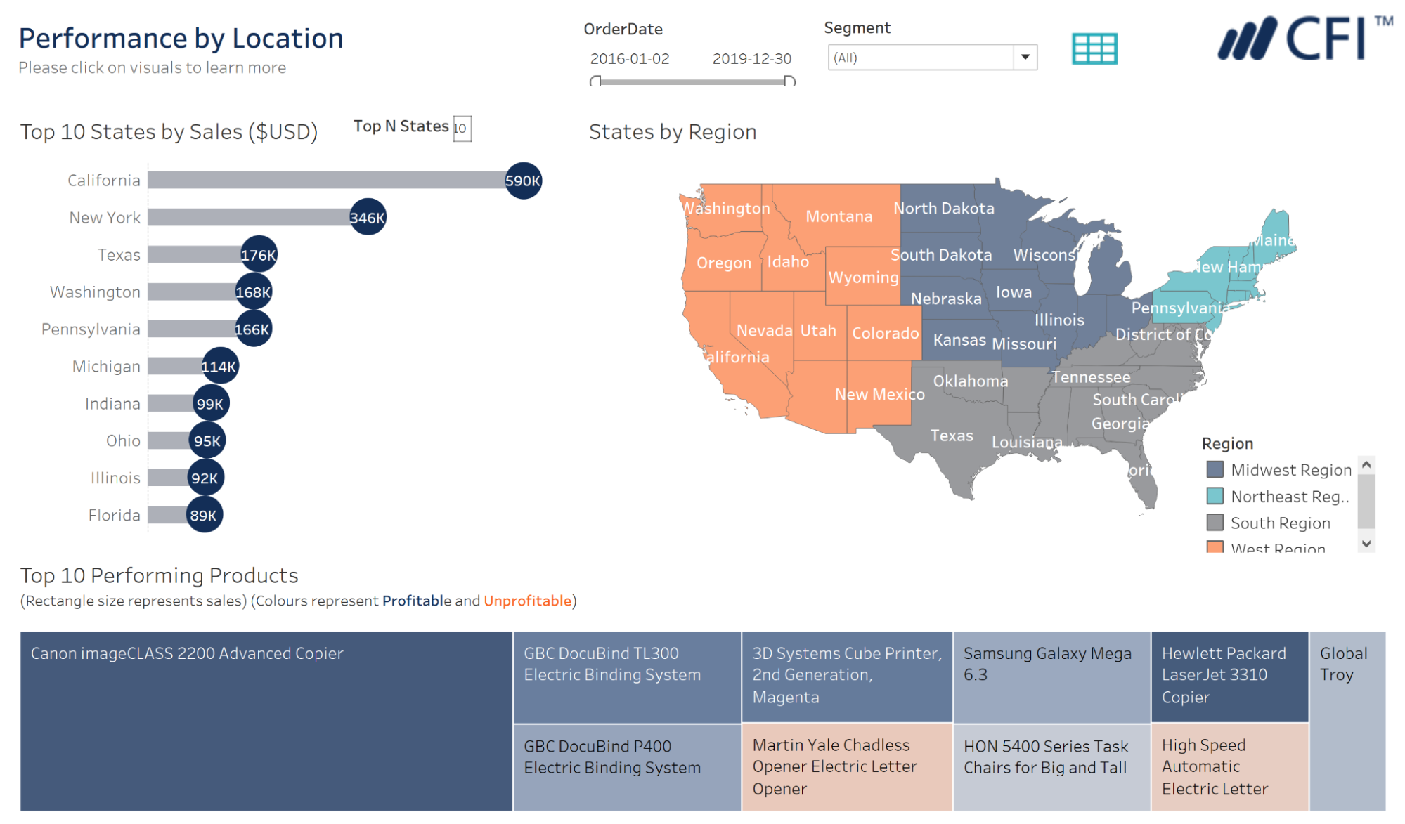
We are faced with more and more data every day in both our personal and professional lives. Large quantities of data can be overwhelming. It can take time and cost us effort to try and derive meaning and information from this vast quantity of data.
Data visualization can help us summarize large quantities of data from multiple sources — such as data warehouses, online sources, commercial systems, legacy Excel files, or anything in between. It allows us to compile all of this data and turn it into useful information. Different types of charts and visuals can help us find and communicate insights that may previously have been lost in the volume.
Working with data can be a complex and onerous task. Generating insights from data requires experience and skill. It can be a challenge to communicate these insights with others who do not understand the data and the limitations of our analysis.
Data visualization provides a way to communicate a clear message from our insights without us needing to explain (or, more importantly, our audience needing to understand) the complex technical methodology and concepts that went into finding them in the first place.
When communicating messages from our data, there are a few popular types of insights:
We have popular data visualization types that can help us communicate these four key types of messages.
A bar chart visualizes categorical data using rectangular bars. These bars can be plotted either horizontally or vertically. Bar charts are a great way to compare categorical data and are primarily used to show the count for each category. In the bar chart visual below, we can compare the mean adjusted closing prices of three different stocks and quickly see the magnitude of differences between them.

Scatter plots are charts that explore the relationship between two numeric variables. Scatter plots can allow us to see how one variable changes while another changes. This can lead us to draw conclusions about the correlation between two variables, or even if a causal relationship exists between the two. In the scatter plot below, we can explore the relationship between the percent change in stocks and the percent change in bonds over a two-year period, to see if there is a linear relationship between the two.

Line charts are most commonly used to display trends in a value over time. A common use case is in finance, to display the stock price over time. This is the case in the line chart below, where we follow the adjusted close price of a stock index over a two-year period. Notice how we can quickly identify when the price was the highest, lowest, the volatility of the stock, as well as the overall trend in price movement in the first half of the chart, compared to the second.

Box plots are a great way to show the distribution of our data and identify outliers that could cause us issues in our analysis. A box plot identifies the interquartile range and median of the data with the box and the relative maximum and minimum values with the whiskers. We can see the shape of the distribution of our data, as well as any outlier values that fall outside of the whiskers.

Anyone who is working with data and wants to communicate their insights should be using data visualization to help tell their story.
Data visualization is a must to fulfill the day-to-day tasks of a data or financial analyst role. With data visualization, these analysts can easily identify key insights from their data to showcase to the company, see trends in their data to extract possible next steps the company can take, and build dashboards to easily display important information, such as KPIs, to stakeholders.
Data visualization is also a key component of a data scientist’s day-to-day tasks. With data visualization, data scientists conduct exploratory data analysis (EDA), which helps them extract insights from the data that will need to be used when creating machine learning models. Additionally, when troubleshooting models and improving model performance, data visualization will allow data scientists to understand their data more when creating models that are more suitable to the data.
Technically, anyone, regardless of their formal role, should benefit from the use of data visualization. It is an intelligent way of displaying and analyzing data to make optimal decisions. When telling a story or in any decision-making process, data visualization is a great way to convey facts and data to the audience that can support your point.
Connect what you just learned to a clear career path with CFI’s role‑based courses and certification programs.
Dashboards & Data Visualization Course


