Get Certified for
Business Intelligence (BIDA®)
Develop analytical superpowers by learning how to use programming and data analytics tools such as VBA, Python, Tableau, Power BI, Power Query, and more.
Collections of charts, graphs, tables, and metrics that help us understand particular business scenarios
Dashboards are collections of charts, graphs, tables, and metrics that help us understand particular business scenarios. Importantly, dashboards may help us identify issues, highlight key messages, or establish root causes for problems. Ultimately the goal is to use the information presented to make quick and effective decisions to improve the performance of the business.
When you’re driving your car and look down at the dashboard, you get all the most important information in a single glance: your speed, fuel level, mileage, engine light, and more. Manufacturers include only the most important data that will help you drive the vehicle, and make fast decisions if you need to.
A dashboard is one of the main outputs of business intelligence, which is the practice of turning data into actionable insights. Data analysts collect, transform, and analyze business data, such as how many loans a bank issued per year or what category delivered the highest margin in Q4. They then put that data into charts, graphs, and maps to make it easy to understand for non-technical audiences.
Dashboards are the most effective tool for business leaders to quickly understand how their business is performing. Interactive charts and visuals that make key messages clear and are a far more effective tool for communication than PDFs of Excel tables from times gone by.
A dashboard visualizes data to help us understand what’s happening and why it’s happening so that business leaders can chart a better course going forward. That could mean staying in the same direction, a complete strategy reassessment, or just a minor adjustment. The key is that the dashboards represent an accurate, data-driven picture of the business.
Dashboards are often linked to live or automatically updating real-world data. This means that manual work in producing the report each month is eliminated, and business leaders have on demand analytics at their fingertips. Consequently, issues can be identified more quickly, and action can be taken.
A dashboard should include actionable insights, meaning that someone can take action based on what they see. Here are some example of actionable insights, and the actions that might be taken:
If insights are not actionable, they should at the very least be relevant and informative.
There is a temptation to say that all reports should be interactive. While users should be able to choose time periods, and perhaps filter some basic categories, the extent of interactivity depends on the audience.
If a dashboard provides a company wide update of performance, then it’s essential that everyone is talking about the same numbers. A single, clean, high-level view with few filters will ensure that everyone is working from the same data.
If the dashboard is more specific, or targeted to a particular audience who know the data well, they are likely to need more interactivity, allowing them to explore the data in more detail. These types of dashboards may include the ability to drill down into a single visualization or zoom in or out helps them find the takeaways that they need on any given day. When a user needs more context, they should be able to get it.
Every dashboard should exist for a specific purpose. In our car example, the dashboard exists to help a motorist drive the car effectively and safely. If you cannot define the purpose of a dashboard, it may not be necessary at all.
As described above, most dashboards exist to enable someone to take action. This action may be a change in approach, an adjustment to strategy, or may simply be confirmation that the current approach is correct.
Other dashboards may simply exist to inform users and keep them updated. Ultimately, this will also feed into long-term decision-making, but in a less direct manner. Informative dashboards may give users a weekly view of business performance, to help guide senior management discussions, or to flag key issues that need to be investigated.
The best dashboards go beyond raw data. They tell a story. Dashboard creators need to be intentional about the metrics that they choose to highlight. Only by understanding the business, its priorities, and its issues can we know which data points are most important to the dashboard’s audience. The goal is to identify issues or inefficiencies, point out trends, and discover patterns that might otherwise get lost.
If the dashboard identifies an issue, can we make it clear why that issue was caused? Or what can be done about it?
The best dashboards are always visual-first and summary-focused. Once the summary is consumed, the dashboard should guide users to the detail, through a link, filter or drill-down functionality.
It’s tempting to measure and include every metric you can think of in your dashboards. But this doesn’t help make decisions when each metric tells a slightly different story. Ensure that business leaders and BI teams have a consistent view of the most important metrics or key performance indicators (KPIs), and ensure that these feature the most prominently in dashboards.
Going back to our automobile example, we usually see the speedometer front and center because it’s the most important piece of information that a driver constantly needs to be aware of.
Creating effective dashboards is a collaborative and iterative process. Metrics and KPIs need to be both accurate and relevant to changing business priorities. A dashboard should be more than easy to understand; it should instantly answer the intended audience’s most pressing questions. If the most pressing business questions are changing, then so too should our dashboards.
By using tools like Tableau or Power BI, data analysts and dashboard creators can pick visuals that help them to convey overall themes, highlight trends, and give a big-picture view.
But equally important in the process is the importance of picking the right type of visual for each situation. For example, line charts are great for tracking metrics over time and a bar graph is ideal for comparing categories side-by-side. Pie charts are rarely good for anything, as humans are bad at comparing angles.
Ultimately the choice of visual comes down to how clearly you can communicate the insights, so you’ll need to work closely with your business stakeholders to see if they understand the key messages you’re trying to convey.
With many solutions for web-based dashboards, it’s never been easier to share reports and dashboards online. However, you should exercise caution in sharing any dashboard that may contain sensitive company information or customers’ personal data. Web-based dashboards are accessible from any device and any network, giving us the flexibility to view and use dashboards while traveling, working from home, or anywhere else. Dashboards should be tested on different devices to ensure everyone gets the same experience.
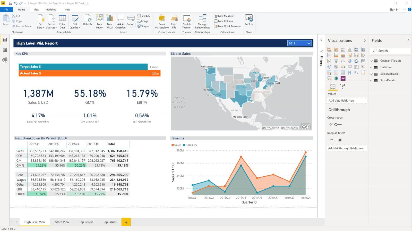
Microsoft’s Power BI and Tableau are the two leading tools for creating data driven, interactive dashboards. Both offer a suite of tools to manipulate and connect different data sources, before creating metrics, visuals, and ultimately interactive dashboards.
Often, the purpose of a financial dashboard ultimately focuses on the bottom line. That can mean giving the C-suite a bird’s eye view of the company’s overall financial performance, or it could be providing pertinent information to department heads so that they make tactical moves that drive revenue, reduce costs, or react to changing market conditions.
Dashboards are an essential tool for business leaders to make fast, effective, and data-driven decisions. Automatically updating reports give business leaders access to on-demand analytics that help them make better decisions, more often.
Connect what you just learned to a clear career path with CFI’s role‑based courses and certification programs.
Dashboards & Data Visualization Course


