Get Certified for
Business Intelligence (BIDA®)
Develop analytical superpowers by learning how to use programming and data analytics tools such as VBA, Python, Tableau, Power BI, Power Query, and more.
Learn how to create different chart types in Tableau
Tableau is a world leader in creating beautiful, professional visuals. But equally exciting is its customizability, which allows users to create a wide range of complex visuals in just a few steps.
To offer its impressive customization features, Tableau comes with several complex options for creating visuals that are not always the most intuitive. We’ve broken down the most common chart types into easy steps below. The brief snapshots below, along with our helpful cheat sheet, provide a valuable overview of chart types in Tableau.
While the type of data being presented often dictates the type of chart being used, knowing how to create each of these common chart types will give you greater flexibility in what you can create in Tableau and ultimately make you a better visualization specialist.
The brief snapshots below, along with our helpful cheat sheet, provide a quick reference guide to creating all the most common chart types in Tableau.
Download CFI’s free Tableau Visuals Cheat Sheet to advance your knowledge and perform better analysis.
Line graphs help display changes over a set period. Use them to view and predict various trends and patterns for your organization. Some common values and data points include sales, profits, customer numbers, subscribers, and rates. You can plot a single value or several in the same line chart.
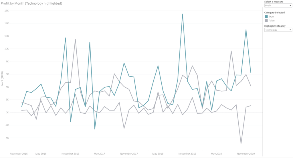
Here’s a simple example to create Sales by Order Date:
Bar charts are great because they’re simple. You simply compare data in different categories with vertical or horizontal bars. Bar charts create an easy-to-comprehend visual representation of key data. The size of the bar “columns” represents the data values.
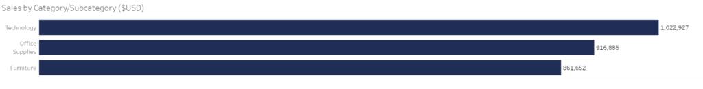
Here’s a simple example to build Sales by Category:
Tip: The option above creates horizontal bars. Switch the values between rows and columns to create vertical bars.
Ratios, proportions, and percentages are valuable data points. While not always the best option, pie charts are suitable for displaying this type of data when you only have a few values. Note that it’s difficult to compare angles with pie charts. We suggest using them with two to three categories at most in a single chart. You divide the pie chart into “slices” that represent each value as part of a whole.

Here’s a simple example to create Sales by Country:
Maps can be used for two purposes:
Tableau comes with several built-in mapping capabilities to let you design simple maps. You’ll need location data to use the tools.

Here’s an example to create a regional division map like the one above.
Note: To create a heat map that shows high and low performance, drag a measure to color instead of a categorization.
There are many other chart types available in Tableau, which we’ve summarized below. Be sure to download our cheat sheet for a quick and easy guide to create any of them.
Lollipop charts compare categorical data. They use circles and bars, mimicking the appearance of candy lollipops. The lines work like the columns in a bar chart, measuring scale. Add color to the circles to better demonstrate magnitude or category.

If you’re working with huge numbers, BANs (Big-Ass Numbers) charts are a good option. These key performance indicators (KPIs) highlight a range of data points at a glance. These are some of the advanced chart types in Tableau that you can use for dynamic impact.

Scatter charts are good at comparing data points across two variables. Additional color or size can be added to each point to help identify further patterns.

Tree maps are a great way to visualize the relative importance of categories within a whole. For this reason, they can be useful as interactive slicers but are less good at comparing values between categories.

Though tables aren’t technically charts, they remain popular. That’s likely because of users’ familiarity with Excel. We suggest that each time you create a visual, you start with a table before converting it to a chart. This will help you ensure that your numbers and calculations are feeding through accurately.

Heat maps help add visual cues to tables. They draw the user’s attention to values of particular importance.

These short Tableau chart descriptions barely scratch the surface of the options available in this popular tool. But our Business Intelligence & Data Analyst (BIDA)® certification program teaches you more about different types of charts in Tableau and their uses, as well as more advanced features. The Tableau Fundamentals Course is also ideal for anyone looking to learn how to create powerful dashboards using Tableau. Also, check out our business intelligence resources.


