Get Certified for Financial Modeling (FMVA)®
Gain in-demand industry knowledge and hands-on practice that will help you stand out from the competition and become a world-class financial analyst.
A guide to sensitivity analysis
Sensitivity Analysis is a tool used in financial modeling to analyze how the different values of a set of independent variables affect a specific dependent variable under certain specific conditions. In general, sensitivity analysis is used in a wide range of fields, ranging from biology and geography to economics and engineering.
It is especially useful in the study and analysis of a “Black Box Process” where the output is an opaque function of several inputs. An opaque function or process is one which, for some reason, can’t be studied and analyzed. For example, climate models in geography are usually very complex. As a result, the exact relationship between the inputs and outputs is not well understood.
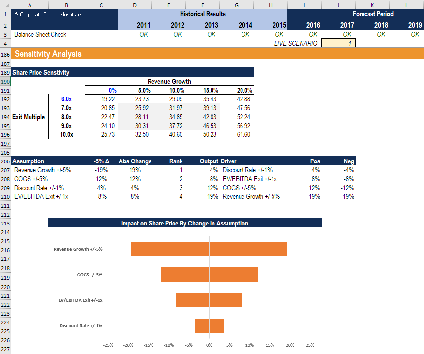
Image from CFI’s Scenario & Sensitivity Analysis in Excel Course
A Financial Sensitivity Analysis, also known as a What-If analysis or a What-If simulation exercise, is most commonly used by financial analysts to predict the outcome of a specific action when performed under certain conditions.
Financial Sensitivity Analysis is done within defined boundaries that are determined by the set of independent (input) variables.
For example, sensitivity analysis can be used to study the effect of a change in interest rates on bond prices if the interest rates increase by 1%. The “What-If” question would be: “What would happen to the price of a bond if interest rates went up by 1%?”. This question can be answered with sensitivity analysis.
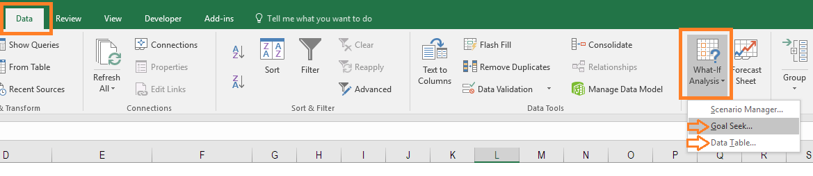
The analysis is performed in Excel, under the Data section of the ribbon and the “What-If Analysis” button, which contains both “Goal Seek” and “Data Table”. These functions are both taught step-by-step in our free Excel Crash Course.
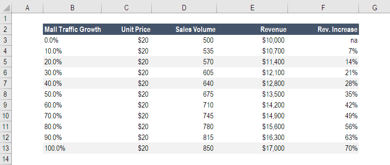
John is in charge of sales for HOLIDAY CO, a business that sells Christmas decorations at a shopping mall. John knows that the holiday season is approaching and that the mall will be crowded. He wants to find out whether an increase in customer traffic at the mall will raise the total sales revenue of HOLIDAY CO and, if so, then by how much.
The average price of a packet of Christmas decorations is $20. During the previous year’s holiday season, HOLIDAY CO sold 500 packs of Christmas decorations, resulting in total sales of $10,000.
After carrying out a Financial Sensitivity Analysis, John determines that a 10% increase in customer traffic at the mall results in a 7% increase in the number of sales.
Using this information, John can predict how much money company XYZ will generate if customer traffic increases by 20%, 40%, or 100%. Based on John’s Financial Sensitivity Analysis, such increases in traffic will result in an increase in revenue of 14%, 28%, and 70%, respectively.
Learn how to build a table like this in our Free Excel Crash Course!
Click the button below to download our free Sensitivity Analysis template!
It is important not to confuse Financial Sensitivity Analysis with Financial Scenario Analysis. Although similar to some degree, the two have some key differences.
Sensitivity Analysis is used to understand the effect of a set of independent variables on some dependent variable under certain specific conditions. For example, a financial analyst wants to find out the effect of a company’s net working capital on its profit margin. The analysis will involve all the variables that have an impact on the company’s profit margin, such as the cost of goods sold, workers’ wages, managers’ wages, etc. The analysis will isolate each of these fixed and variable costs and record all the possible outcomes.
Scenario Analysis, on the other hand, requires the financial analyst to examine a specific scenario in detail. Scenario Analysis is usually done to analyze situations involving major economic shocks, such as a global market shift or a major change in the nature of the business.
After specifying the details of the scenario, the analyst would then have to specify all of the relevant variables so that they align with the scenario. The result is a very comprehensive picture of the future (a discrete scenario). The analyst would know the full range of outcomes, including the extremes, and would understand what the various outcomes would be for a specific set of variables defined by a real-life scenario.
There are many important reasons to perform sensitivity analysis:
Layout, structure, and planning are all important for good sensitivity analysis in Excel. If a model is not well organized, then both the creator and the users of the model will be confused and the analysis will be prone to error.
The most important points to keep in mind for layout in Excel include:
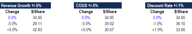
The direct method involves substituting different numbers into an assumption in a model.
For example, if the revenue growth assumption in a model is 10% year-over-year (YoY), then the revenue formula is = (last year revenue) x (1 + 10%). In the direct approach, we substitute different numbers to replace the growth rate – for example, 0%, 5%, 15%, and 20% – and see what the resulting revenue dollars are.
The indirect method (as shown below) inserts a percent change into formulas in the model, instead of directly changing the value of an assumption.
Using the same example as above, if the revenue growth assumption in a model is 10% year-over-year (YoY), then the revenue formula is = (last year revenue) x (1 + 10%). Instead of changing 10% to some other number, we can change the formula to be = (last year revenue) x (1 + (10% + X)), where X is a value contained down in the sensitivity analysis area of the model.
Learn how to do this step-by-step – launch our Sensitivity Analysis course now!
Sensitivity analysis can be challenging to comprehend even by the most informed and technically savvy finance professionals, so it’s important to be able to express the results in a manner that’s easy to comprehend and follow.
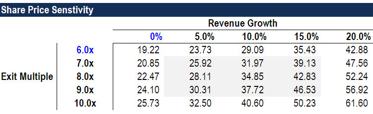
Data tables are a great way of showing the impact on a dependent variable by the changing of up to two independent variables. Below is an example of a data table that clearly shows the impact of changes in revenue growth and EV/EBITDA multiple on a company’s share price.
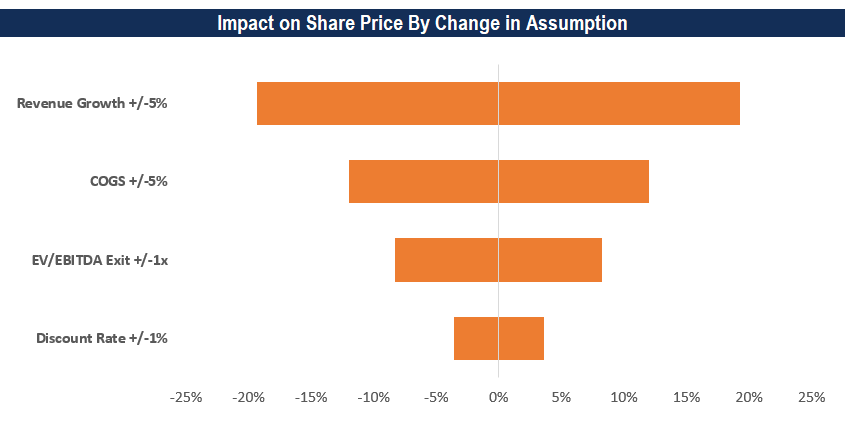
Tornado Charts can be a great way of showing the impact of changes to many variables at once. They are called Tornado Charts because they are sorted, from the most impactful to least impactful, in a way that shapes the chart like a tornado cone. To learn how to build these charts, launch our Sensitivity Analysis in Excel course now!
Watch this short video to quickly understand the main concepts covered in this guide, including the Direct and Indirect methods.
Connect what you just learned to a clear career path with CFI’s role‑based courses and certification programs.
Thank you for reading this guide to sensitivity analysis. To learn more about financial modeling, these free CFI resources will be helpful:


