Excel Pivot Table Guide
Step by step tutorial
What is a Pivot Table in Excel?
A pivot table allows you to organize, sort, manage and analyze large data sets in a dynamic way. Pivot tables are one of Excel’s most powerful data analysis tools, used extensively by financial analysts around the world. In a pivot table, Excel essentially runs a database behind the scenes, allowing you to easily manipulate large amounts of information.
How to Use a Pivot Table in Excel
Below is a step by step guide of how to insert a pivot table in Excel:
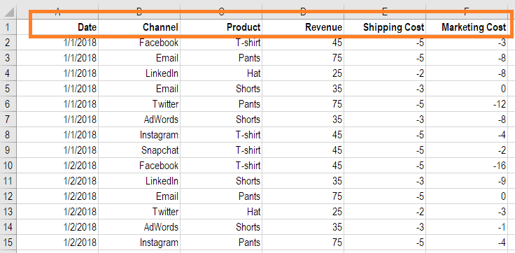
#1 Organize the data
The first step is to ensure you have well-organized data that can easily be turned into a dynamic table. This means ensuring that all data is in the proper rows and columns. If data is not properly organized, then the table will not work properly. Ensure that the categories (category names) are located in the top row of the dataset, as shown in the screenshot below.
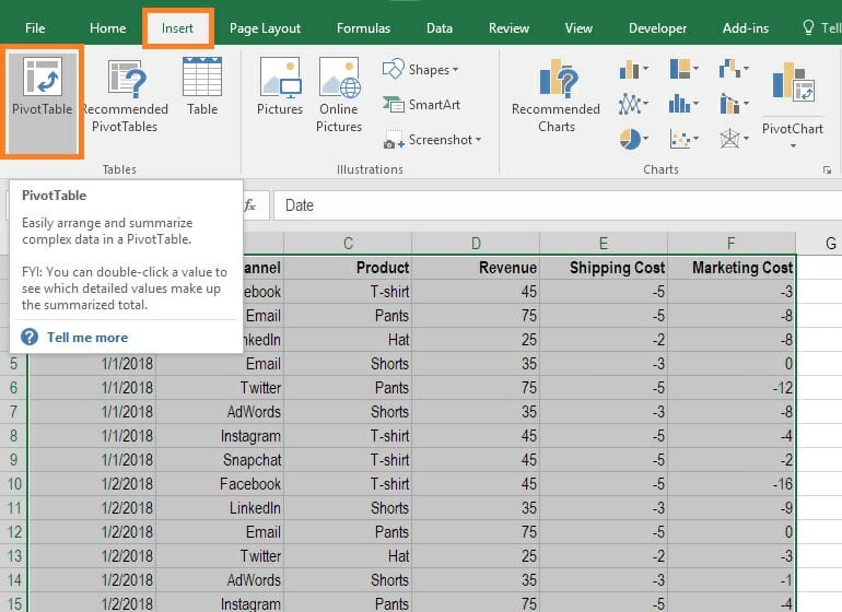
#2 Insert the pivot table
In step two, you select the data you want to include in the table and then, on the Insert Tab on the Excel ribbon, locate the tables Group and select Pivot Table, as shown in the screenshot below.
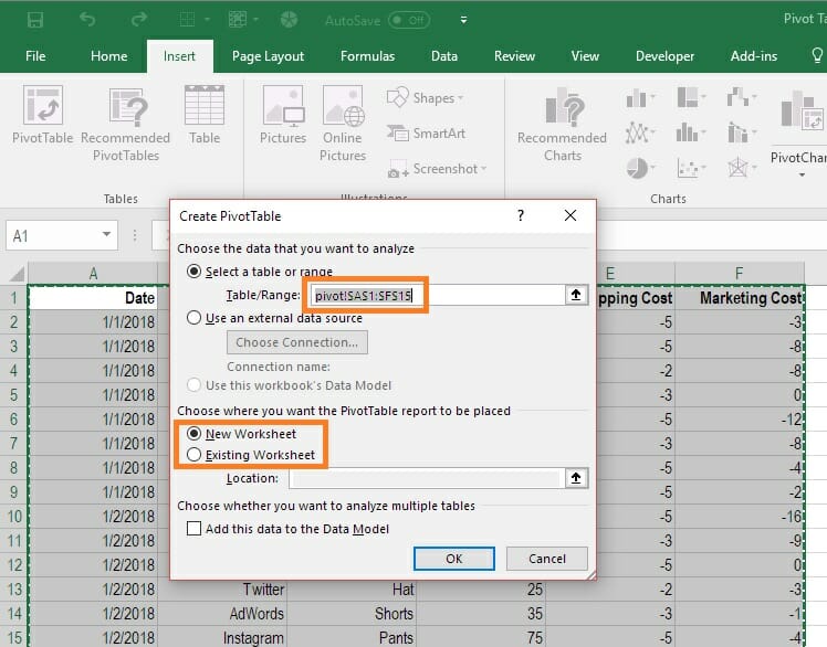
When the dialog box comes up, ensure the right data are selected and then decide if you want the table to be inserted as a new worksheet, or located somewhere on the current worksheet. This is entirely up to you and your personal preference.
#3 Setup the pivot table fields
Once you’ve completed step two, the “PivotTable Fields” box will appear. This is where you set the fields by dragging and dropping the options that are listed as available fields. You can also use the tick boxes next to the fields to select the items you want to see in the table.
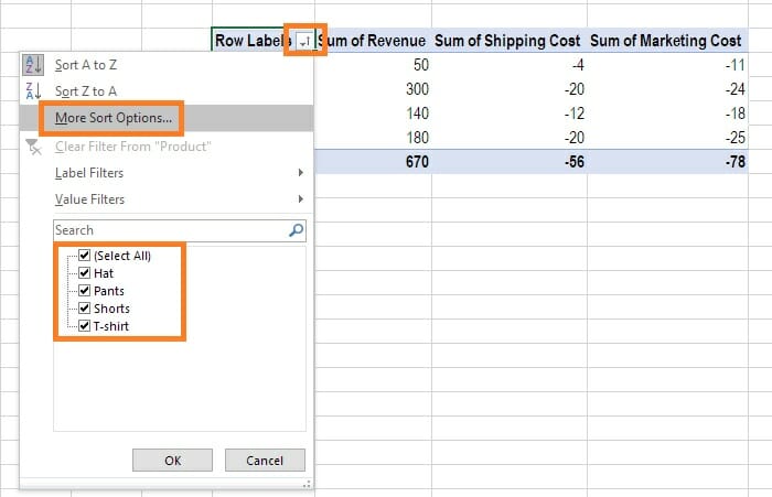
#4 Sort the table
Now that the basic pivot table is in place, you can sort the information by multiple criteria, such as name, value, count, or other things.
To sort the date, click on the autosort button (highlighted in the image below) and then click “more sort options” to pick from the various criteria you can sort by.
Another option is to right-click anywhere in the table and then select Sort, and then “more sort options”.
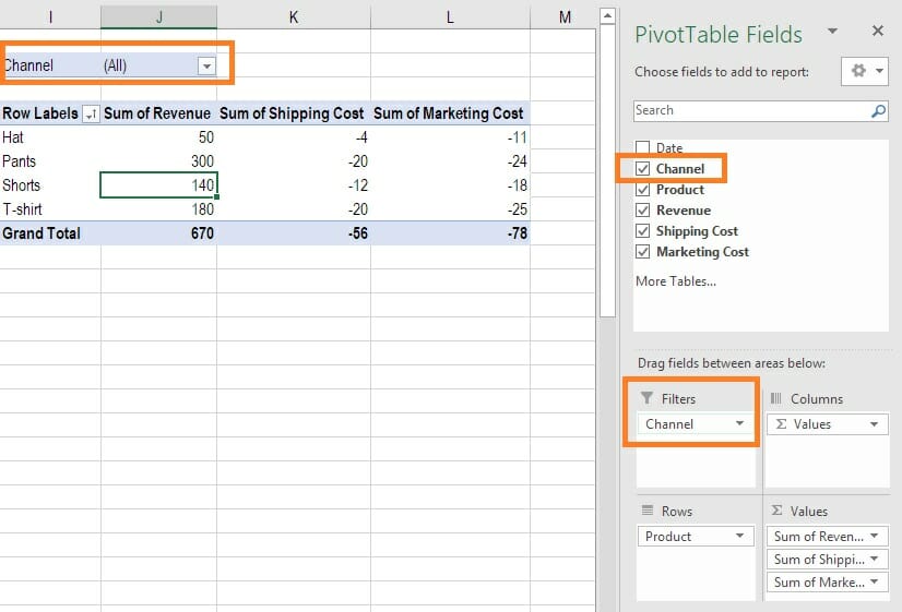
#5 Filter the data
Adding a filter is a great way of sorting the data very easily. In the above example, we showed how to sort, but now with the filter function, we can see the data for specific sub-sections with the click of a button.
In the image below you can see how, by dragging the “channel” category from the list of options down to the Filters section, all of a sudden an extra box appears at the top of the pivot table that says “channel”, indicating the filter has been added.
Next, we can click on the filter button and select the filters we want to apply (as shown below).
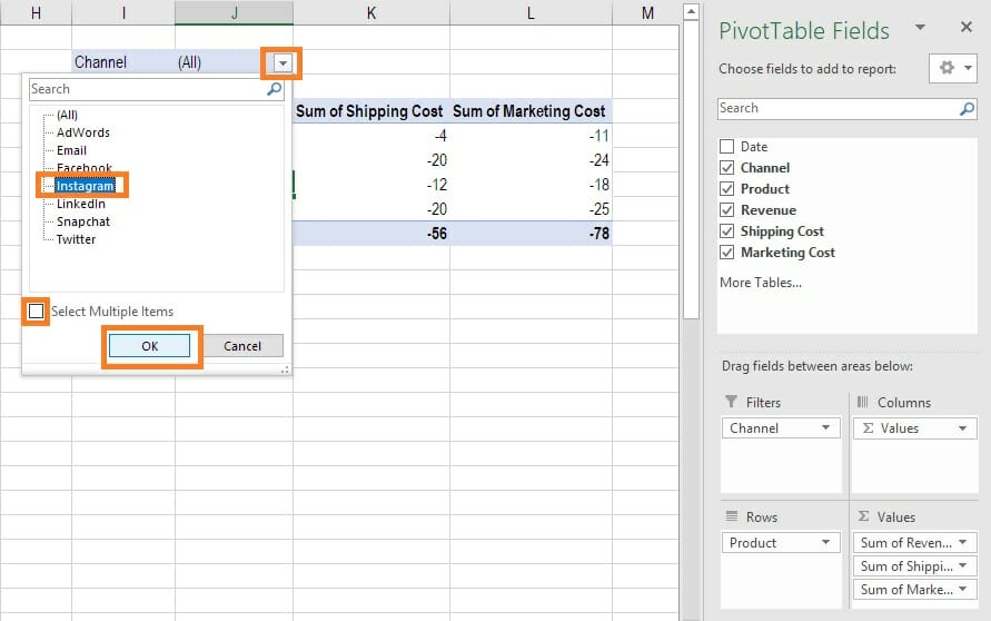
After this step is completed, we can see the revenue, shipping, and marketing spending for all products that were sold via the Instagram channel, for example.
More filters can be added to the pivot table as required.
#6 Edit the data values (calculations)
The default in Excel pivot tables is that all data is shown as the sum of whatever is being displayed in the table. For example, in this table, we see the sum of all revenues by category, the sum of all shipping expenses by category, and the sum of all marketing expenses by category.
To change from showing the sum of all revenues to the “count” of all revenue we can determine how many items were sold. This may be useful for reporting purposes. To do this, right-click on the data you wish the change the value of and select “Value field settings” which will open the box you see in the screenshot below.
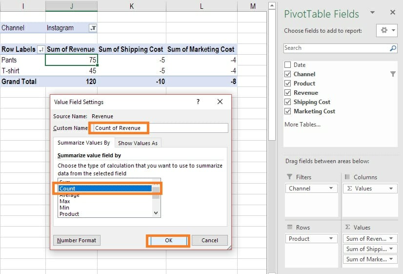
In accounting and financial analysis, this is a very important feature, as it’s often necessary to move back and forth between units/volume (the count function) and total cost or revenue (the sum function).
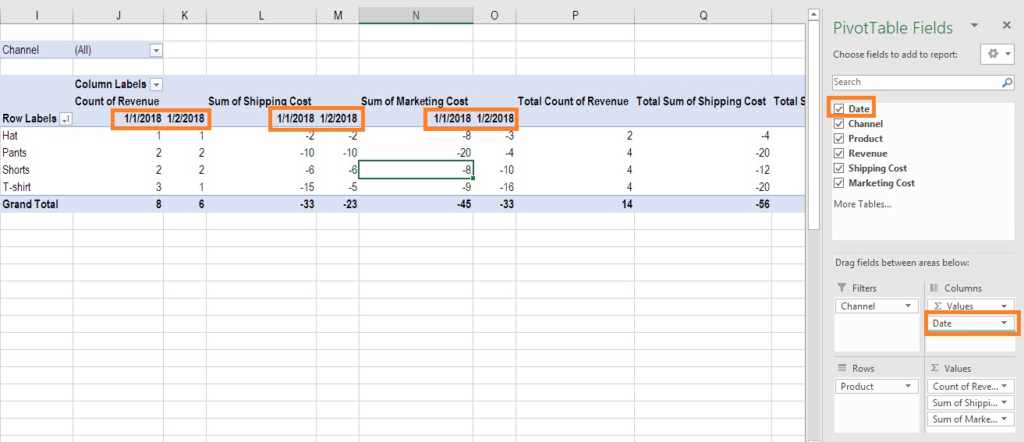
#7 Adding an extra dimension to the pivot table
At this point, we only have one category in the rows and one in the columns (the values). It may be necessary, however, to add an extra dimension. A brief warning, however, that this could significantly increase the size of your table.
In order to do this, click on the table so that the “fields” box pops up and drag an extra category, such as “dates”, into the columns box. This will subdivide each column heading into additional columns for each date contained in the data set.
In the example below, you can see how the extra dates dimension has been added to the columns to provide much more data in the pivot table.
Video Tutorial – The Ultimate Pivot Table Guide
The video below is a step-by-step guide on how to create a pivot table from scratch. Follow along and see how easy it is to create a pivot table in Excel. This is one of the most powerful analysis tools that you can use in the spreadsheet program.
Additional Features and Examples
To learn more about PivotTables in Excel, check out our Advanced Excel Course, which covers all the main functions a financial analyst needs to perform an analysis.
In addition to that course, we also highly recommend these free CFI resources:
Analyst Certification FMVA® Program
Below is a break down of subject weightings in the FMVA® financial analyst program. As you can see there is a heavy focus on financial modeling, finance, Excel, business valuation, budgeting/forecasting, PowerPoint presentations, accounting and business strategy.
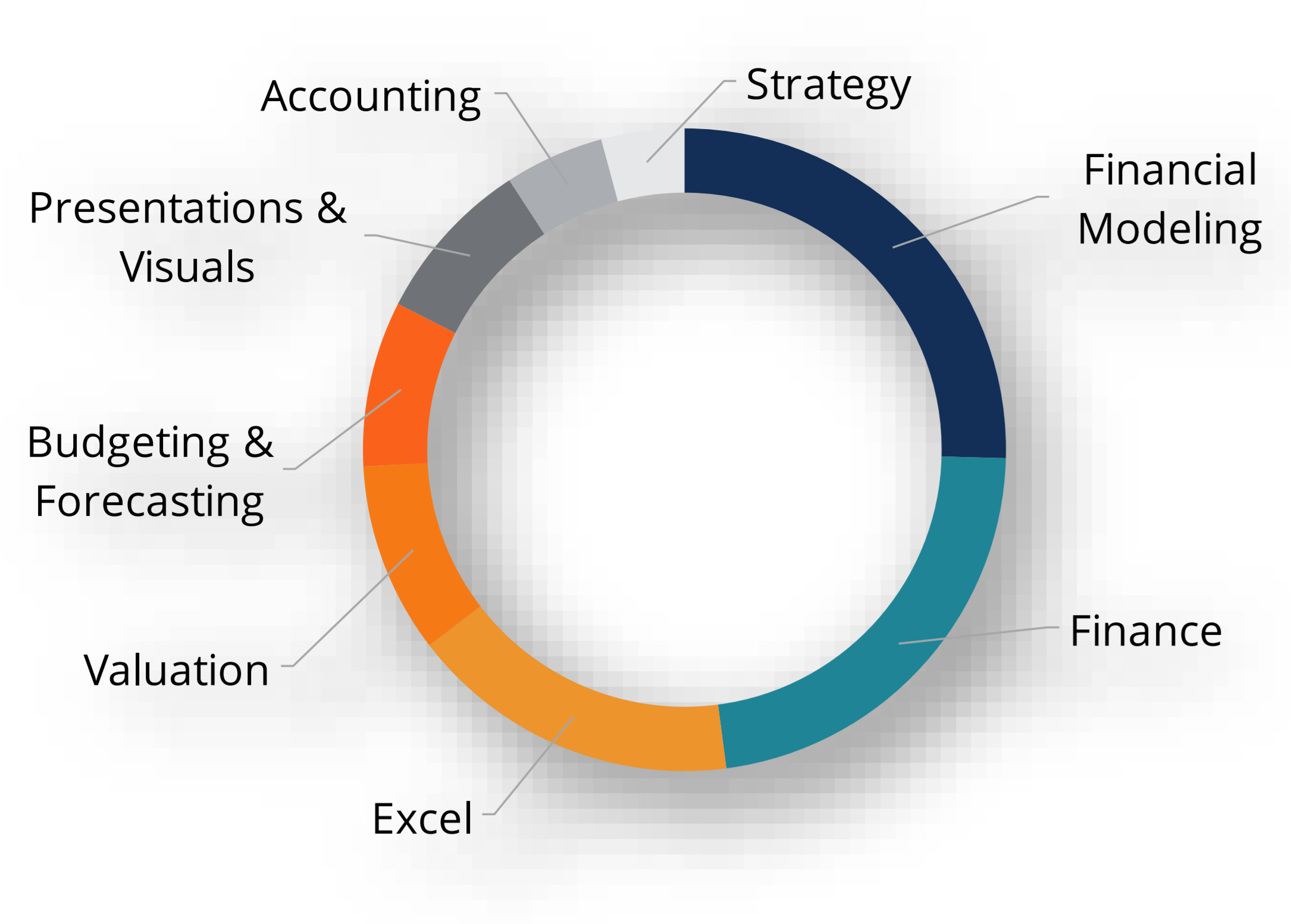
A well rounded financial analyst possesses all of the above skills!
Additional Questions & Answers
CFI is the global institution behind the financial modeling and valuation analyst FMVA® Designation. CFI is on a mission to enable anyone to be a great financial analyst and have a great career path. In order to help you advance your career, CFI has compiled many resources to assist you along the path.
In order to become a great financial analyst, here are some more questions and answers for you to discover:
- What is Financial Modeling?
- How Do You Build a DCF Model?
- What is Sensitivity Analysis?
- How Do You Value a Business?
Excel Tutorial
To master the art of Excel, check out CFI’s Excel Crash Course, which teaches you how to become an Excel power user. Learn the most important formulas, functions, and shortcuts to become confident in your financial analysis.

Launch CFI’s Excel Crash Course now to take your career to the next level and move up the ladder!


