What’s New at CFI | Dashboard Visualization & Analysis for FP&A
In this episode of FinPod, host Asim Khan is joined by Duncan McKeen, CFA, FMVA, to talk about the final components of the FP&A model Duncan’s been developing for our FP&A courses. Duncan shares how dashboards and data visualization techniques can transform traditional financial analysis into compelling stories.
Learn the importance of effectively presenting data using colorful visualizations and dynamic charts that capture trends, highlight insights, and aid decision-making. Discover how purposeful errors in Excel can help toggle graph features and gain valuable tips on making your models user-friendly and efficient. Tune in for lots of tips & tricks.
Transcript
Asim (00:15)
Hello and welcome to the What’s New at CFI podcast. My name is Asim Khan. I’m joined today by my colleague, Duncan McKeen. Duncan, welcome.
Duncan McKeen, CFA, FMVA (00:22)
Thanks so much, Asim
Asim (00:23)
Right, so over a number of podcasts, we’ve been discussing your FP&A model that’s come together now and it’s, I think the final component is done and that’s the dashboards and visualization piece, correct?
Duncan McKeen, CFA, FMVA (00:39)
Yeah, absolutely. Yeah. And it’s fun to get to that moment when you actually start putting together the piece that everyone’s gonna see.
Asim (00:45)
We’re not dealing with numbers so much anymore. It’s pictures and colorful bits and, well, the visualization. It’s the story that you’re going to tell. Or you’re displaying the story that the numbers tell.
Duncan McKeen, CFA, FMVA (00:58)
Exactly. Yeah. And it’s like, it’s really so important. I think you and I’ve talked about before how it’s, it’s striking how many financial models, you know, don’t include graphs, you know, and they can tell us, story so much better. They can get people’s attention. And also, you know, like you, you know, as well as I do that executive teams don’t really want to look through an ocean of numbers, you know, they, they don’t have the time. They just, they want to see a quick trend line or which direction something’s headed.
Asim (01:22)
They don’t have the time.
Duncan McKeen, CFA, FMVA (01:28)
And that can often tell the story so much more effectively than the numbers can. So it’s important to include the numbers as well, of course, but we’ve been putting a lot more of these dashboards on our models lately, and it’s been getting some great feedback.
Asim (01:41)
Oh, I’ll bet. Can you tell us what sorts of visualizations you’ve got on the dashboard? How many and what they depict, that sort of thing?
Duncan McKeen, CFA, FMVA (01:50)
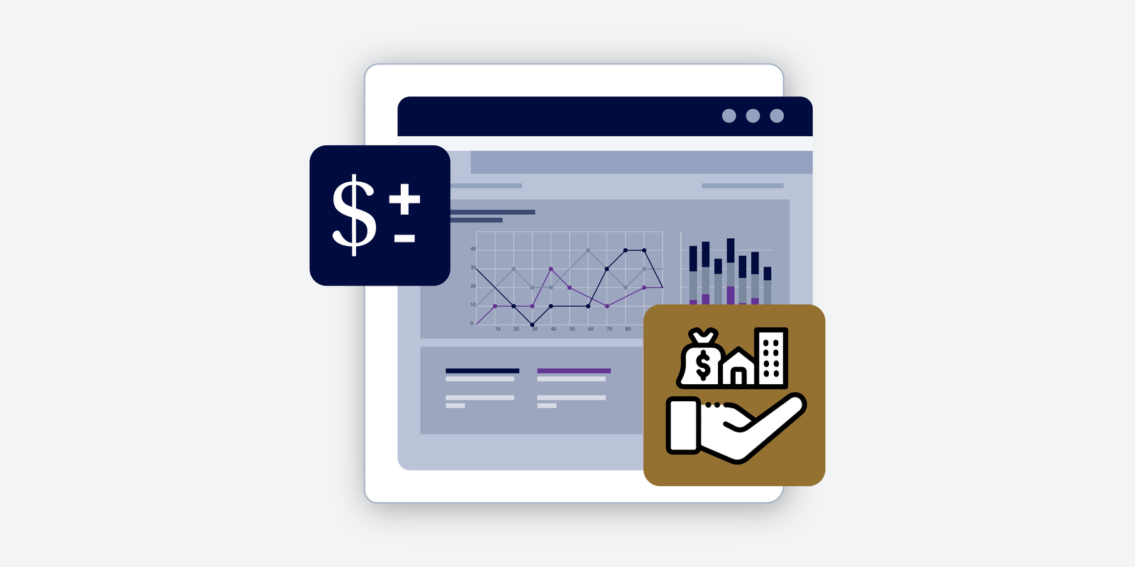
Yeah, so it’s sort of like a… So there’s four different dashboards on it. We’re basically showing the company’s revenue. We’ve got the second one is showing ending cash balance. And then we’re doing EBITDA margin and net income margin. But for each one of those four dashboards, we’re really showing three things. And we’re showing everything by month, and then aggregated by quarter and also by year. So you’re really, you’re multiplying…
you know, four times three to get to 12 different graphs that are there. And you can you can quickly flip through them because they’re organized onto four pages. So lots of information just compacted into those four pages that a person can see.
Asim (02:33)
Any particular sort of tips and tricks you want to share with us?
Duncan McKeen, CFA, FMVA (02:38)
Yeah, one of the interesting tricks that we go through in the course is a little trick using an error in Excel, actually. Normally, errors are just not something that you’d ever want in a model. And you often have alerts programmed into models to prevent you from making errors in the first place. But they can be used to your advantage when you’re graphing. There’s certain types of errors. I won’t go through the exact type because there may be some questions about it.
in the course, but there’s a certain type of error in Excel where if you cause that error, the particular line item will not show up on the graph at all, which actually can be quite helpful because sometimes you don’t want a certain line item to appear on the graph, and sometimes you do, and so you can actually switch lines on and off on using a line graph. As an example, you can switch the lines on and off by causing these errors on purpose, which is an interesting little trick.
And one that we cover in the course, it can be really helpful.
Asim (03:38)
So you can purposefully cause an error to toggle a graph feature on and off. Is that right? That’s right.
Duncan McKeen, CFA, FMVA (03:45)
Exactly. Yeah, it sounds really counterintuitive, like who would want to cause an error in the software on purpose? But yeah, that’s what you do in and it acts It helps you basically toggle or switch something on.
Asim (03:58)
Right, so not very long ago I spoke with our colleague, Sebastian Taylor, who runs the data visualization course and we spoke about the different types of pictorial representations you can have in visualization. So he really kind of favors bar charts over say pie charts. Do you have a view on that?
Duncan McKeen, CFA, FMVA (04:19)
Yeah, I would definitely share that view. Yeah. If you go through and read any book on sort of data visualization, the one thing that they’ll tell you consistently across those books or courses is that humans are not good at measuring angles. So if you present somebody a pie chart and there’s one section of the pie that’s maybe like 15 degrees and the other one’s about
25 degrees, like we can tell that one’s bigger than the other, but we can’t necessarily tell the exact angle, if you will. It’s really, really difficult. Whereas if you put things on a, like a stack line chart, stack bar chart, for example, you can normally tell the differences in something that’s linear better than you can something that’s, I guess, radial or, you know, like a pie chart.
Lots of times, I’ve heard people say, you know, like friends don’t let friends build pie charts. It’s just, they kind of look pretty and interesting and it’s not the worst crime in the world to throw one in. I guess just if you’re trying to mix it up a little bit, but you gotta keep in mind that people can’t really tell those things apart. He may have said the same thing as well about saturation and color codes. You know, like if you’re going to look like at a heat map, for example, where
Let’s say you’ve got a map of North America, let’s say, and you’re selling into different geographies and you want a darker color where you’re doing a lot of volume in that particular geography. Well, you can tell that geography is darker, but you can’t tell how much darker it is than the lighter ones. You just know that it’s darker. You don’t know the exact number, right? And that’s another place where we as humans are just not good at measuring that. So you gotta keep these things in mind when you’re putting together
some visualizations for sure.
Asim (06:10)
And so what are the components of them, or the outputs of the model, I should say, that you’re depicting in the data visualization?
Duncan McKeen, CFA, FMVA (06:16)
Yeah, so we’re depicting the four revenue, ending cash balance, EBITDA margin and net income margin. But the ending cash balance one is an interesting one because we’re not just showing the company’s cash level. What we’re doing is we’re also showing whether or not the company’s drawing on its revolver, which is really important to look at as well. And so the way that we do this is we basically show
We show it on a line graph. Imagine a line graph going across 12 months. Well, anytime the line is above zero, that’s cash. And anytime the line is below zero, that’s a draw on the revolver. So we like to show it that way. It just sort of paints a nice, easy picture. Like one look at the graph and you can quickly see if they’re dipping into the revolver or not. And we usually like to throw up the…
the limit on the revolver as well, just to see. Because sometimes in a forecast, as you know, you’ll breach through the limit on the revolver. And that’s just an indication that there’s a conversation that needs to be had with the lenders, or maybe you need to go back and check the inputs that are going into the model to see if they’re realistic. So yeah, that’s the way that we’ve shown it there.
Asim (07:24)
No, that’s excellent. So if you’re dipping below, if you blow through the revolver basically, you need more envelope from your lender. Line of credit is just not sufficient in a stress case scenario, right? No, excellent. And I suppose they’re all fully dynamic as the numbers change in the model, the charts automatically update and things like that.
Duncan McKeen, CFA, FMVA (07:35)
Yeah.
Yeah, everything is completely dynamic, totally wired. And that’s the way you always, always want a model to be. You never want to go make a change and then think to yourself, oh, gosh, you know, which footnotes might have changed because of that change in the number or, you know, which graphs do I need to update? You want everything to just flow instantly the moment you make any change. And, you know, people always dream about presentations that can do this, too. But you would know as well as I do that.
Um, a lot of the times, um, you know, the, the presentation is not connected to the model, like if you’re going across to PowerPoint, for example. And so, you know, many, a long night going through making sure that all the numbers are matching the numbers in the model, right? Mm hmm. Yeah, definitely.
Asim (08:28)
I remember those all too well. So is there more to come for the FP&A course? Or are we there?
Duncan McKeen, CFA, FMVA (08:38)
There’s definitely more to come. We’re working on a couple more right now. And one of the things that we’re working on is we’re going to look at how you would roll forward an FP&A model and sort of do analysis and look at variants as the actuals are sort of coming in on a month to month basis. You want to have a sort of prescribed procedure for how to do that.
Learning from the actuals as they’re coming in. So you’re hopefully getting better and better and better at forecasting as time goes on. So we’re gonna have one course on that. The other course that we’re gonna put together is gonna involve a couple of things. We’re gonna look at file protection and we’re also gonna look at print settings and really how to present some of the findings in the model. We’ve just talked about dashboards now, but sometimes you wanna…
actually go through and hone in the print settings so that you can either save it as a PDF and distribute it that way, or you can put it into print like old school style, like on paper, like the good old days, and have somebody flip through it just to see what’s coming out of the model as well. And so we go through that because it’s something that should be simple in the software, but it’s just not, and a lot of people struggle with it. And so we really wanna guide people on your best practices for doing that. And also,
how to lock down and protect the model once you built it, so that you can think about maybe different levels in your organization. Some of the more senior model builders would have full access, but somebody who’s just going through and updating the actuals as they come in may just have access to the inputs and may not have access to the formulas, for example. So we’re gonna go through those concepts as well.
Asim (10:20)
That’s terrific. It maintains the integrity of the model across users. Yeah.
Duncan McKeen, CFA, FMVA (10:23)
Yeah, so important. Yeah, after putting so many hours into building it, you don’t want somebody to go in and break it.
Asim (10:28)
Well, we look forward to seeing those additions to the FP&A course. Duncan, thank you so much for joining us today. It was great having you on and we’ll see you soon to discuss the roll forward and the file protection features. Thank you.
Duncan McKeen, CFA, FMVA (10:43)
Sounds great, Asim. Thank you.
