What’s New at CFI | Data Visualizations & Dashboards – The Basics
In this episode of FinPod, host Asim Khan sits down to discuss data visualization with Sebastian Taylor.
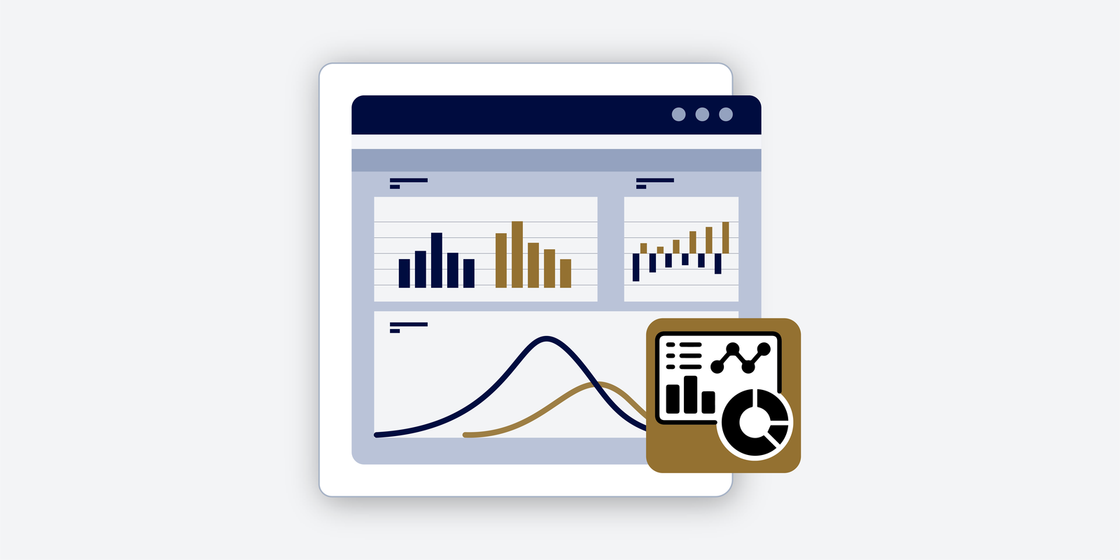
They cover best practices for creating effective visual representations of data, from choosing the right charts to crafting impactful stories. To communicate data effectively, learn the importance of understanding your audience and focusing on key messages.
Sebastian shares valuable tips on designing dashboards, using color effectively, and avoiding common mistakes in data visualization. Whether you’re a data analyst or simply interested in data storytelling, this episode offers a wealth of knowledge to help you improve your data visualization skills. Tune in for charts, graphs, and dashboards!
Transcript
Asim (00:13)
Hello and welcome to the What’s New at CFI podcast. My name is Asim Khan. I’m here with my colleague, Sebastian Taylor. Welcome, Seb.
Seb Taylor (00:21)
Thanks for having me.
Asim (00:22)
Thank you. I’ve been eager to talk about this data visualization course that you’ve put together. Could you give us a rundown of some of the highlights?
Seb Taylor (00:30)
Yeah, I mean, I guess for anyone that hasn’t done much in terms of data visualization before, that simple definition maybe is useful. So data visualization is really where we’re taking data and presenting it in charts and graphs to present messages visually. So I guess you might ask, well, why do we do that when we’ve always had tables of numbers? And generally it’s because…
Asim (00:38)
Please.
Seb Taylor (00:53)
Your brain is able to interpret visual information much more quickly than it can a table of numbers. So instead of having to scan through, read and interpret each one and compare numbers, now you have charts and graphs which tell stories that you can interpret very quickly. So this course really goes through the best practice of the sorts of things you might need to consider before you start visualizing your data. Mainly that comes down to, okay, who are we presenting this information to?
And therefore what is the relevant information that we need to be thinking about? What is the technical expertise? What is the key message in particular that we’re trying to communicate? And that really then helps us think about everything downstream from there in terms of the types of visuals we use, how to draw out the key messages and how to bring it all together into a dashboard.
Asim (01:46)
So if I could summarize in my own inexpert way, you’re talking about identifying the audience and then crafting the story that you’d like to tell using data visual. Would that be correct?
Seb Taylor (01:58)
Yeah, exactly. An example we go through in the course is imagine you’re a rollercoaster engineer and you’ve just designed a new rollercoaster and you’re going to give two different presentations to two very different audiences about this new design. So the first presentation you give is to a colleague who is also an engineer and he cares about the grade of steel that’s
on the roller coaster, the average G-force pulled around the corners, and other kind of strength metrics perhaps involved in the construction. Whereas when you go home and give your six-year-old the same presentation about the new project you’ve worked on at work, all he wants to know is how many loops does the roller coaster have and how loud is everyone going to scream when they go on it. So you’re presenting the same thing, but…
giving different pieces of information, knowing that your audience has different wants and needs.
Asim (02:56)
Oh, excellent. And, you know, I, and I think maybe a lot of people who attempt to do charts and things like that. Is there a sort of like a best practice on, you know, do you use bar charts or pie charts? What, what would you recommend? And how does one decide what to use?
Seb Taylor (03:15)
Yeah, well, it’s interesting that you picked out bars and pies, which for me sit at the two ends of the spectrum of, I tend to always use bars, if possible, and I tend to always avoid pies, if possible. And the reasons for those are, bar charts are probably, I mean, they’re pretty boring really, when you think about it, but they are the simplest and most effective way to communicate most messages, I would say, in terms of visuals.
High charts can be helpful in certain scenarios, which we’ll go through in the course. But they’re often misused, I think, is why they have such a bad reputation within data visualization and business intelligence.
Not least using 3D segments on pie charts. I think that’s the ultimate recipe for disaster. But yeah, in terms of which visual to choose, visuals generally serve a certain purpose. For example, bars and columns allow you to compare things across categories. Line charts and area charts allow you to look at trends over some kind of continuous axis, usually timed.
Pie charts and tree maps allowed you to see contributions towards a total amount. And so we’ll go through the different use cases in the course, the strengths and weaknesses of each and when might be an appropriate time to use them depending on the question you’re trying to answer.
Asim (04:36)
Excellent. And so once we have the audience and the story kind of laid out, where does one go from there? Any kind of, well, let me ask you this. What sort of mistakes are common in creating these sort of graphics?
Seb Taylor (04:54)
I would say probably the biggest mistake is trying to cram too much onto one screen. Often that happens from not really being clear about what is the question I’m trying to answer with this visual. If we really think hard, usually there is one or two questions that we’re really trying to get to the bottom of with a chart. So what is that question? How do we answer it most simply?
And all other information that doesn’t answer that question really isn’t relevant to that chart. Or at the very least, we should be making that supporting information less pronounced so that we’re drawing the reader’s attention to the key message.
Asim (05:33)
So you’d say focus the message of the chart first, have that in mind, and then build the appropriate chart.
Seb Taylor (05:41)
Yeah, exactly. And I would summarize that as less is more. Focus on the question.
Asim (05:47)
folks on the question, okay? And here’s another one that always kind of, well, one is faced with a lot of possibilities when thinking about colors. Do you have anything to say about that?
Seb Taylor (05:55)
Mm-hmm.
I think in general using a light grey colour for most things on your dashboard is helpful because then it allows you to draw out the key messages with your key colours, which you can either use with a colour that is appropriate to your branding or a colour that’s appropriate to the message being told. For example, green or blue are often used for good messages and red is often used for bad messages, at least to a Western audience.
Asim (06:27)
Now you’ve mentioned dashboard a couple of times and that’s the place where you kind of aggregate all of your charts, right? So to speak. And so are there best practices there? Like how much information can you have on a dashboard? Is less as more, is that still the operative thing?
Seb Taylor (06:44)
Yeah, I think the same principles still apply. Before you start building a dashboard, we suggest the same best practice of, well, why are you building this dashboard? What are you trying to answer? And what is the audience for this dashboard? We generally think of, I guess, the most high-level type of dashboard would be a summary or KPI dashboard that is viewed by senior management in a business. And there, really, you’re trying to ensure
a small number of individuals have the same view of the truth and are focusing on the most important metrics. And they’re not distracted by tables and charts of other metrics that are not those most important ones. Another thing we cover in the course is about, well, how much interactivity should you give people on a dashboard to be able to slice, dice and filter charts? And the answer at a…
for a high level dashboard to execs and senior managers is not much, because again, you want everyone to have the same consistent view of those high level metrics. And so the, generally the higher up in the organization, the audience, the less information I would say there’s going to be on the dashboard, and the more focused it’s going to be on key metrics. If you take that to the other end of the spectrum and start working with
an analyst who has a very in-depth knowledge of a particular area, then they’re going to want much more detail in their dashboard, much more ability to slice and dice, because they’re going to investigate lots of different questions on the fly.
Asim (08:23)
So I guess we’re down to audience again, right? And speaking to one of our colleagues, Duncan, about modeling, he reiterated CFI best practices, which is before you begin modeling, envision the dashboard, what do you want the outputs to be, and then kind of work backwards to model design from there. And I suppose in a way when you’re…
Seb Taylor (08:26)
Exactly. Yeah.
I’m sorry.
Asim (08:44)
doing data visualization, it’s the same sort of thing, right? You’d want to picture kind of what the output’s going to look like, who the audience is, and the story that you’re going to tell.
Seb Taylor (08:53)
Exactly. And often a lot of data viz analysts will even sketch up what they want the dashboard to look like, maybe even on paper. Potentially on paper. It’s just a nice quick way to kind of sketch through different ideas. And I guess the thing with a dashboard is because you’re introducing, say, four, maybe five even charts into a dashboard.
Asim (09:02)
You mean on paper? On paper. Wow, okay.
Seb Taylor (09:19)
There’s lots of different ways you could put that together. When we talk about a data story, it’s really about, well, what insights do I get from my first chart? What questions does that present me with?
Asim (09:31)
You mentioned the number four or five. Is that an optimal number of visuals to have on the dashboard?
Seb Taylor (09:38)
Yeah, it’s a good question. I would say there is no fixed right answer. I’ve seen far less than that and I’ve seen certainly far more than that in dashboards. I think it’s all going to come down to, again, your audience. How much detail do they need? The reason I certainly started with the number of four is by splitting your dashboard into quadrants and kind of having one piece of information in each quarter. That usually feels like…
a good amount of information to have on a dashboard without it getting too crowded. Certainly even three or two visuals is often enough as well. I think as soon as you start going beyond five, you really need to be wondering, okay, am I losing a focus here or is there really a value in me adding more visuals to this dashboard?
Asim (10:26)
Got it. And if I could one last question. So you’re an expert in this. When you open up somebody else’s dashboard, what tells you right away that this is a professionally done and well done dashboard?
Seb Taylor (10:35)
Hehehe
or maybe too many things to list, but I’ll give you a few. I would say formatting is probably the one you get at a glance. And whilst formatting is not the be all and end all of dashboarding, it is important. And so the consistency of your charts, the consistent use of colors between charts, alignment, formatting, white space, all of that stuff matters.
Asim (10:45)
Mm-hmm.
Seb Taylor (11:05)
Because if you’ve got a great looking dashboard, it is going to command authority when you start presenting it. It is gonna build trust with your audience. So I’d say that’s probably the one that stands out before you even start looking at the data. The second is, does it give me background or context? So for example, is there a date range on the chart? Is it clear to me what period I’m looking at? If I have a sales dashboard,
Is it sales for last month or is it sales for last year? And all those sorts of questions pop up and if you don’t have the answers to them, the charts are very difficult to interpret. So I would say that’s the second one is everything in the dashboard should be able to speak for itself without me as the audience needing to ask any supporting questions.
Asim (11:53)
That’s excellent. So thank you so much for your time. This was really illuminating, pun intended. Yeah, and I encourage all of our viewers to check out your data visualization course. It’s really terrific. Thanks a lot for your time and we’ll see you again, I’m sure.
Seb Taylor (12:10)
Thanks for having me.
