Get Specialized with our Financial Planning & Analysis (FP&A) Program
Support business leaders in their decision-making with best-in-class financial models to evaluate and forecast the financial performance of a company.
FP&A is about helping the business make better, faster decisions. Yet many professionals struggle with a frustrating reality. They conduct brilliant analysis, uncover critical insights, and present their findings only to hear “thanks for the update” before everyone moves on.
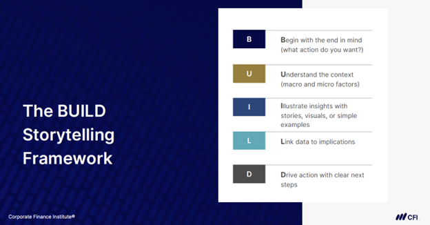
The BUILD framework changes this dynamic, giving you a structured approach to data storytelling that helps you communicate insights clearly, persuasively, and with purpose. This five-step method gives you a repeatable process for presenting financial data.
This guide walks through structuring presentations using the BUILD framework to ensure they resonate with your audience and influence business decisions.
Think about your last few presentations. Did you wonder if your message landed effectively? A storytelling framework eliminates that uncertainty by providing structure to your communication.
Storytelling frameworks are especially effective for FP&A professionals, financial analysts, and finance business partners who regularly translate complex financial models or dashboards into clear business guidance. It reinforces the idea that great analysis doesn’t just answer questions, it drives decisions and action.
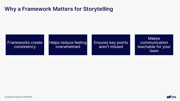
Here’s what a framework does for you:
Without a framework, you risk delivering information without impact. Using a framework like BUILD helps organize your analysis so others can easily understand and apply it.
The five-part framework works together to create compelling financial stories. Here’s what each step means and how you can apply it to your next presentation.
Starting with your desired outcome shapes everything that follows in your presentation. Before you open Excel or PowerPoint, clarify the key takeaways and next steps. In other words, define the conclusion first.
This means answering four fundamental questions:
| Who is your audience? | Different audiences have different priorities, knowledge levels, and preferences. | • CEO: Big-picture strategy • Department head: specific action items |
| What decision do you want made? | A clear decision or outcome gives your presentation focus. | • Approval for three new salespeople • Discontinuing an unprofitable product |
| What changes are you recommending? | Thinking beyond the decision shows thorough planning. | • Affected departments • Implementation timeline |
| How will success be measured? | Clear metrics help stakeholders evaluate outcomes. | • Revenue growth percentages • Cost reduction targets |
These four questions form the foundation of every effective financial presentation.
Your financial story needs context to resonate with your audience. Provide background on the business environment, financial goals, or strategic initiatives at play. This helps your audience quickly orient themselves before diving into the numbers.
Consider the following factors when framing your story:
Layer context into your presentation to help the audience see how your analysis fits into their daily challenges and decisions.
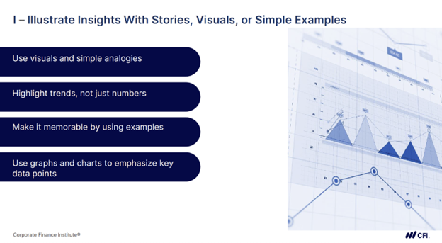
Numbers alone rarely inspire action. Your audience needs to see and remember your insights, which means going beyond tables of data.
Highlight key takeaways from your analysis. Use plain language, visuals, or comparisons to make patterns stand out.
Here’s how to make your insights stick:
Well-chosen visuals and examples help your audience grasp complex information quickly and retain it longer.
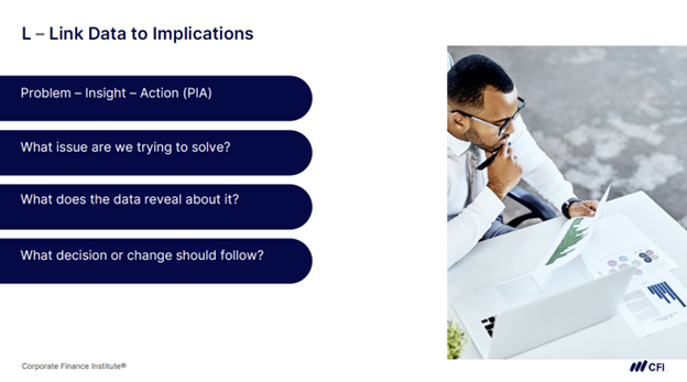
Your analysis means nothing if your audience doesn’t understand the business implications. This step shows how to connect your data to the bigger picture.
Here’s how to make those connections clear:
Linking your data to what it means for the business helps people understand what to do next.
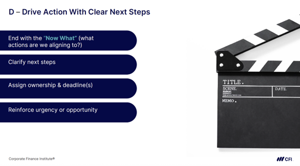
Your presentation needs to answer the “Now What?” question before your audience asks it. After all your analysis and recommendations, what should happen next? Without clear next steps, even the best insights fade into good intentions.
Here’s how to ensure action:
| “We should look at pricing” | “Sarah will review pricing with the sales team by Friday” |
| “Improve efficiency” | “Automate the monthly reporting process to save 20 hours per month” |
The BUILD framework gives you a repeatable process for financial storytelling. It ensures you deliver the two essential elements every data story needs: clear insights and specific recommendations.
Try applying this framework to your next presentation and work through each BUILD step:
Your analysis will increasingly inform and shape decisions, positioning you as a strategic partner who helps the business move forward.
Ready to become a master of data storytelling? The BUILD framework is just one component of effective financial data storytelling. Explore CFI’s Crafting the Narrative: Storytelling With Data course to develop the skills to communicate insights with clarity and impact.
The Art of Communication in FP&A: Presenting Data with Impact
Data Storytelling: Turning Raw Data into Impactful Narratives
Beyond Pretty Charts: Creating Actionable Financial Dashboards That Drive Decisions