Get Certified for Financial Modeling (FMVA)®
Gain in-demand industry knowledge and hands-on practice that will help you stand out from the competition and become a world-class financial analyst.
A line graph or chart that depicts global temperature data over time
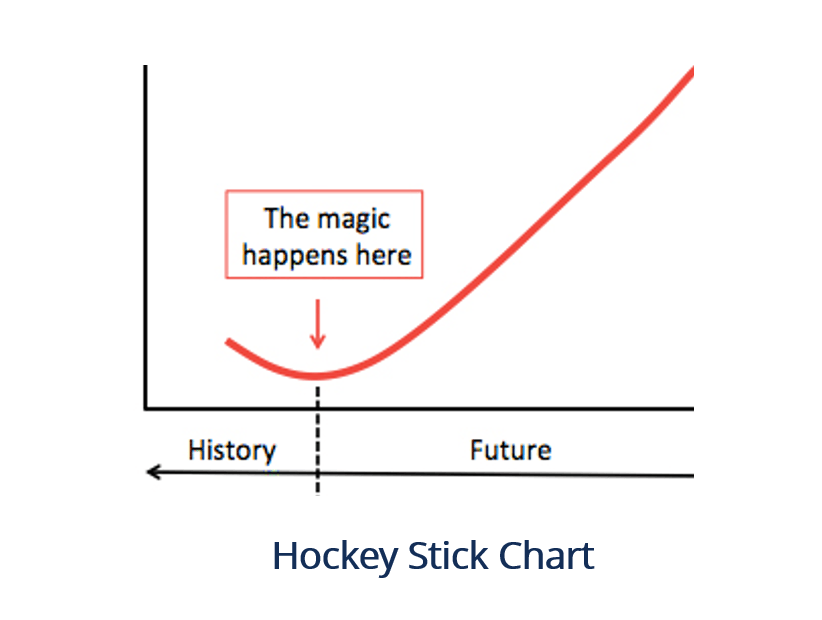
The hockey stick chart, as it relates to climate change, is considered to be one of the most debated charts in science. The chart is essentially a line graph or chart that depicts global temperature data over time. The shape of the line consists of a sharp upward curve occurring after a period of inactivity or dormancy. The shape of the chart is similar to a hockey stick, hence the name of the chart.
The chart can often be found in the United Nations Intergovernmental Panel on Climate Change (IPCC) climate reports and is a product of work and studies done by Michael Mann, Raymond Bradley, and Malcolm Hughes in 1998.
The hockey stick chart gained popularity in the late 1990s, following a study of the world’s past temperatures. The temperature data included a sample of temperatures 500 years before thermometers were used. The study was conducted by Michael Mann and two colleagues, Bradley and Hughes. The research findings showed that temperatures recorded since 1400 AD in the Northern Hemisphere had increased and became warmer. The chart portraying the findings took the shape of a hockey stick with a “blade” and a “shaft.”
The shaft is represented by the periods with minimal variation in temperature readings, and the blade is represented by the notable upward swing of the temperature readings. The report by Mann and his colleagues gained popularity in the climate science networks, and the chart was featured in the Third Assessment Report in 2001. The report was published by the UN’s Intergovernmental Panel on Climate Change (IPCC).
Despite its popularity and support, the hockey stick chart was not accepted by all, and a few debates surrounding climate change arose. In 2002, a paper was published, debating and critiquing the shape of the hockey stick chart. The argument by McIntyre, 2004, attributed the shape of the chart to the research techniques used and claimed that the shape was inevitable as a result of such techniques. The argument further rendered the hockey stick shape to be statistically insignificant.
Notwithstanding various claims that the hockey stick chart cannot be supported, numerous studies have been conducted after the hockey stick paper was published in 1998. The studies include obtaining data from boreholes, corals, ice cores, tree rings, etc. Findings from the proxy studies support the hockey stick theory that the 20th century has seen notable temperature increments over the last millennium and that the increase was notable from 1920.
The 20th century is, hence, considered to be the warmest century in the last millennium. A separate study by the National Center for Atmospheric Research (Wahl 2007) supported the initial hockey stick finding by Mann, Bradley, and Hughes. The study featured various statistical techniques that reconstructed temperatures and found that there has been a warming trend, primarily in the last half a millennium.
The hockey stick chart has since been commonly used in environmental or medical science studies. The chart has been applied to social studies, such as observing changes in poverty rates and levels, and in global warming studies where data points plotted in a chart followed a hockey stick shape. In finance, a hockey stick chart is used to show significant growth in revenues, EBITDA, and EBITDA margins.
The hockey stick effect is characterized by a rapid increase or decrease of data points subsequent to a dormant or “flat” period. It is represented by a line graph with a shape that resembles a hockey stick. The formation of the hockey stick chart shows that immediate action may be needed to explain a trend or find a solution for the abrupt variation in data points.
In order to help you become a world-class financial analyst and advance your career to your fullest potential, these additional resources will be very helpful: