Payoff Graphs vs Profit & Loss Diagrams
Learn about determining options payoffs
Payoff Graphs vs Profit & Loss Diagrams
Investors use payoff graphs vs profit & loss diagrams to determine returns from options trading. Option payoffs are simply the reward or return that one can expect from investing in or being involved in options trading. One can either earn a profit on the invested amount or, in the case of unfavorable conditions, incur a loss. An options payoff is represented either graphically through a payoff graph or diagrammatically through a profit & loss diagram.
Summary
- Options payoffs refer to the reward or return realized from investing in or being involved in options trading.
- Payoff graphs are the graphical representation of an options payoff. They are often also referred to as “risk graphs.”
- Profit & loss diagrams are the diagrammatic representation of an options payoff, i.e., the profit made or loss incurred on the investment made.
What are Payoff Graphs?
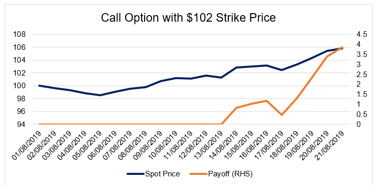
Payoff graphs are the graphical representation of an options payoff. They are often also referred to as “risk graphs.” The x-axis represents the call or put stock option’s spot price, whereas the y-axis represents the profit/loss that one reaps from the stock options. The payoff graph looks like the graph outline shown below:
What are Profit & Loss Diagrams?
Profit & loss diagrams are the diagrammatic representation of an options payoff, i.e., the profit gained or loss incurred on the investment made. The diagram below shows a profit and loss diagram for a “long call option.”
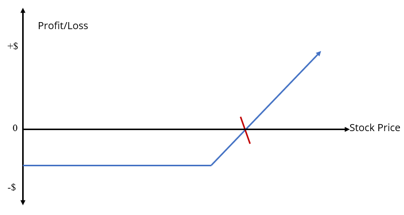
The vertical axis indicates the profit/loss earned or incurred. All amounts above zero level represent a profit earned, and all amounts below the zero level represent a loss incurred. The horizontal axis indicates the movement of the option stock price, which increases as the graph moves towards the right.
Usually, in an options pay-off profit and loss diagram, the blue line, like the one shown in the diagram above, is the profit and loss line. The point where the profit and loss line intersects the stock price line, indicated by the red line in the diagram above, is called the “break-even point.”
The break-even point in a profit and loss diagram is the point where an options strategy would neither make any profits nor incur any losses. Beyond this point, it’s either a profit gained or a loss incurred. There are four basic situations that are usually depicted through profit and loss diagrams. One of them, as shown above, is the long call option diagram. The other three situations are:
- Long put option diagram
- Short call option diagram
- Short put option diagram
The four situations are the basic forms of a profit and loss diagram associated with options trading. The most common example of such a situation is the “iron condor strategy.” The strategy is shown in the diagram below:
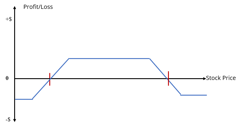
The iron condor strategy is a combination of selling a call stock option and a put stock option and buying a call stock option and a put stock option, all at the same time. Here, the options strategy is such that the profit is only earned up to a certain limit – as specified by the red check marks on the diagram above. However, if the option stock price increases or decreases significantly beyond the limits, the strategy will start to incur a loss.
Additional Resources on Payoff Graphs vs Profit & Loss Diagrams
CFI is the official provider of the Financial Modeling and Valuation Analyst (FMVA)™ certification program, designed to transform anyone into a world-class financial analyst.
In order to help you become a world-class financial analyst and advance your career to your fullest potential, these additional resources will be very helpful:


