Get Certified for
Business Intelligence (BIDA®)
Develop analytical superpowers by learning how to use programming and data analytics tools such as VBA, Python, Tableau, Power BI, Power Query, and more.
A visual interpretation of numerical data showing the number of data points falling within a specified range of values
A histogram[1] is used to summarize discrete or continuous data. In other words, it provides a visual interpretation of numerical data by showing the number of data points that fall within a specified range of values (called “bins”). It is similar to a vertical bar graph. However, a histogram, unlike a vertical bar graph, shows no gaps between the bars.
Creating a histogram provides a visual representation of data distribution. Histograms can display a large amount of data and the frequency of the data values. The median and distribution of the data can be determined by a histogram. In addition, it can show any outliers or gaps in the data.
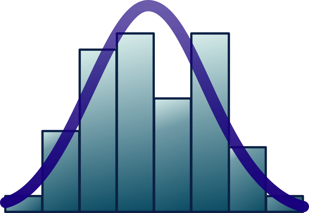
In a normal distribution, points on one side of the average are as likely to occur as on the other side of the average.

In a bimodal distribution, there are two peaks. In a bimodal distribution, the data should be separated and analyzed as separate normal distributions.

A right-skewed distribution is also called a positively skewed distribution. In a right-skewed distribution, a large number of data values occur on the left side with a fewer number of data values on the right side. A right-skewed distribution usually occurs when the data has a range boundary on the left-hand side of the histogram. For example, a boundary of 0.

A left-skewed distribution is also called a negatively skewed distribution. In a left-skewed distribution, a large number of data values occur on the right side with a fewer number of data values on the left side. A right-skewed distribution usually occurs when the data has a range boundary on the right-hand side of the histogram. For example, a boundary such as 100.

A random distribution lacks an apparent pattern and has several peaks. In a random distribution histogram, it can be the case that different data properties were combined. Therefore, the data should be separated and analyzed separately.

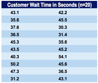
Jeff is the branch manager at a local bank. Recently, Jeff’s been receiving customer feedback saying that the wait times for a client to be served by a customer service representative are too long. Jeff decides to observe and write down the time spent by each customer on waiting. Here are his findings from observing and writing down the wait times spent by 20 customers:
The corresponding histogram with 5-second bins (5-second intervals) would look as follows:
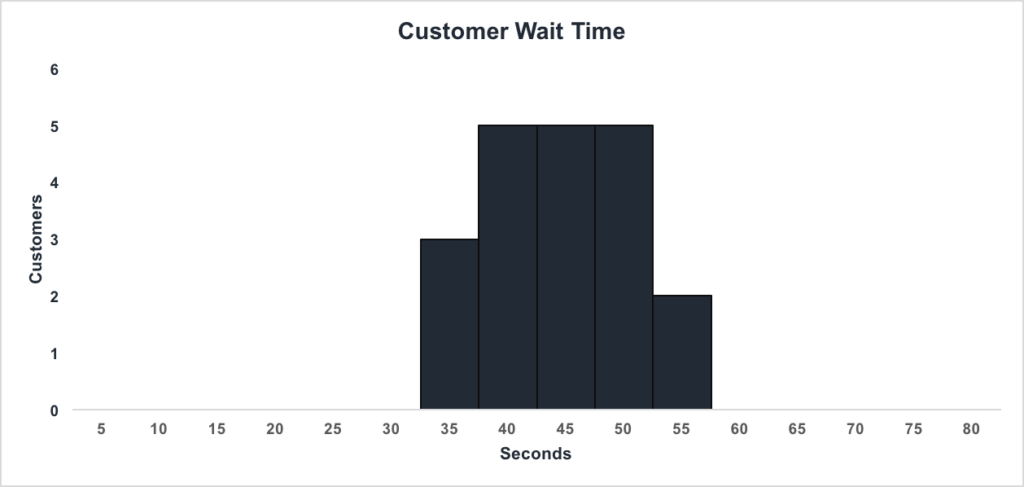
We can see that:
Jeff can conclude that the majority of customers wait between 35.1 and 50 seconds.
Let us create our own histogram. Download the corresponding Excel template file for this example.
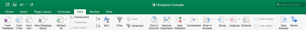
Step 1: Open the Data Analysis box. This can be found under the Data tab as Data Analysis:
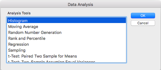
Step 2: Select Histogram:
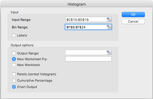
Step 3: Enter the relevant input range and bin range. In this example, the ranges should be:
Make sure that “Chart Output” is checked and click “OK”.
Download the Template Example to make one on your own!
Connect what you just learned to a clear career path with CFI’s role‑based courses and certification programs.
Thank you for reading CFI’s guide on Histogram. To keep learning and advancing your career, the following resources will be helpful:


