Get Certified for
Capital Markets (CMSA®)
From equities and fixed income to derivatives, the CMSA certification bridges the gap from where you are now to where you want to be — a world-class capital markets analyst.
A comprehensive guide to stock charts
If you’re going to actively trade stocks as a stock market investor, then you need to know how to read stock charts. Even traders who primarily use fundamental analysis to select stocks to invest in still often use technical analysis of stock price movement to determine specific buy, or entry, and sell, or exit, points.
Stock charts are freely available on websites such as Google Finance and Yahoo Finance, and stock brokerages always make stock charts available for their clients. In short, you shouldn’t have any trouble finding stock charts to examine.
Stock charts can vary in their construction from bar charts to candlestick charts to line charts to point and figure charts. Nearly all stock charts give you the option to switch between the various types of charts, as well as the ability to overlay various technical indicators on a chart. You can also vary the time frame shown by a chart. While daily charts are probably the most commonly used, intraday, weekly, monthly, year-to-date (YTD), 5-year, 10-year, and a complete historical lifetime of a stock are also available.
There are relative advantages and disadvantages to using different chart construction styles and to using different time frames for analysis. What style and time frame will work best for you as an individual analyst or investor is something that you can only discover through actually doing stock chart analysis. You can glean valuable indications of probable stock price movement from any stock chart. You should choose the chart style that makes it easiest for you to read and analyze the chart, and trade profitably.
Below is a year-to-date daily chart of Apple Inc. (AAPL), courtesy of stockcharts.com. This chart is a candlestick chart, with white candles showing up days for the stock and red candles showing down days. In addition, this chart has several technical indicators added: a 50-period moving average and a 200-period moving average, appearing as blue and red lines on the chart; the relative strength indicator (RSI) which appears in a separate window above the main chart window; the moving average convergence divergence indicator (MACD) which appears in a separate window below the chart.
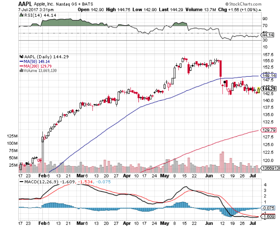
Along the bottom of the main chart window, the daily trading volume is shown. Note the large spike in volume that occurred on February 1st, when the stock gapped higher and began a strong uptrend which lasted until early June. Also, note the high amount of selling volume (indicated by red volume bars which indicate days with a greater amount of selling volume than buying volume) that occurs when the stock moves sharply downward around June 12th.
Volume appears on nearly every stock chart that you’ll find. That’s because trading volume is considered a critical technical indicator by nearly every stock investor. On the chart above, in addition to showing the total level of trading volume for each day, days with greater buying volume are indicated with blue bars and days with greater selling volume are indicated with red bars.
The reason that volume is considered to be a very important technical indicator is a simple one. The vast majority of stock market buying and selling is done by large institutional traders, such as investment banks, and by fund managers, such as mutual fund or exchange-traded fund (ETF) managers. When those investors make major purchases or sales of a stock, it creates high trading volume, and it is that kind of major buying and selling by large investors that typically move a stock higher or lower.
Therefore, individual or other institutional traders watch volume figures for indications of major buying or selling activity by large institutions. This information can be used either to forecast a future price trend for the stock or to identify key price support and resistance levels.
In fact, many individual investors determine their buying and selling decisions almost solely based on following the identified actions of major institutional traders. They buy stocks when volume and price movement indicate that major institutions are buying, and sell or avoid buying stocks when there are indications of major institutional selling.
Such a strategy works best when applied to major stocks that are generally heavily traded. It will likely be less effective when applied to stocks of small companies that are not yet on the radar screens of large institutional investors and that have relatively small trading volumes even on days when the stock is more heavily traded than usual.
There are four basic volume patterns that traders typically watch as indicators.
High volume trading on Up Days – This is a bullish indication that a stock’s price will continue to rise
Low volume trading on Down Days – This is also a bullish indication since it indicates that on days when the stock’s price falls back a bit, not many investors are involved in the trading. Therefore, such down days occurring in an overall bull market are commonly interpreted as temporary retracements or corrections rather than as indicators of future significant price movement.
High Volume Trading on Down Days – This is considered a bearish indicator for a stock, as it shows that major institutional traders are aggressively selling the stock.
Low Volume Trading on Up Days – This is another bearish indicator, although not as strong as high volume trading on down days. The low volume tends to peg the trading action on such days as less significant and usually evidence of just a short-term counter-trend retracement upward in an overall, long-term bearish trend.
In analyzing stock charts for stock market investing, investors use a variety of technical indicators to help them more precisely probable price movement, to identify trends, and to anticipate market reversals from bullish trends to bearish trends and vice-versa.
One of the most commonly used technical indicators is a moving average. The moving averages that are most frequently applied to daily stock charts are the 20-day, 50-day, and 200-day moving average. Generally speaking, as long as a shorter period moving average is above a longer period moving average, a stock is considered to be in an overall uptrend. Conversely, if shorter term moving averages are below longer term moving averages, then that indicates an overall downtrend.
The 200-day moving average is considered by most analysts as a critical indicator on a stock chart. Traders who are bullish on a stock want to see the stock’s price remain above the 200-day moving average. Bearish traders who are selling short a stock want to see the stock price stay below the 200-day moving average. If a stock’s price crosses from below the 200-day moving average to above it, this is usually interpreted as a bullish market reversal. A downside cross of price from above the 200-day moving average is interpreted as a bearish indication for the stock.
The interplay between the 50-day and 200-day moving averages is also considered as a strong indicator for future price movement. When the 50-day moving average crosses from below to above the 200-day moving average, this event is referred to by technical analysts as a “golden cross”. A golden cross is basically an indication that the stock is “gold”, set for substantially higher prices.
On the flip side, if the 50-day moving average crosses from above to below the 200-day moving average, this is referred to by analysts as a “death cross”. You can probably figure out on your own that a “death cross” isn’t considered to bode well for a stock’s future price movement.
There is virtually an endless list of technical indicators for traders to choose from in analyzing a chart. Experiment with various indicators to discover the ones that work best for your particular style of trading, and as applied to the specific stocks that you trade. You’ll likely find that some indicators work very well for you in forecasting price movement for some stocks but not for others.
Technical analysts often use indicators of different types in conjunction with each other. Technical indicators are classified into two basic types: trend indicators, such as moving averages, and momentum indicators, such as the MACD or the average directional index (ADX). Trend indicators are used to identify the overall direction of a stock’s price, up or down, while momentum indicators gauge the strength of price movement.
When reviewing a stock chart, in addition to determining the stock’s overall trend, up or down, it’s also helpful to look to identify aspects of a trend such as the following:
Stock charts can be particularly helpful in identifying support and resistance levels for stocks. Support levels are price levels where you usually seeing fresh buying coming in to support a stock’s price and turn it back to the upside. Conversely, resistance levels represent prices at which a stock has shown a tendency to fail in attempting to move higher, turning back to the downside.
Identifying support and resistance levels can be especially helpful in trading a stock that tends to trade within an established trading range over a long period of time. Some stock traders, having identified such a stock, will look to buy the stock at support levels and sell it at resistance levels over and over again, making more and more money as the stock traverses the same ground multiple times.
For stocks that have well-identified support and resistance levels, price breakouts beyond either of those levels can be important indicators of future price movement. For example, if a stock has previously failed to break above $50 a share, but then finally does so, this may be a sign that the stock will move from there to a substantially higher price level.
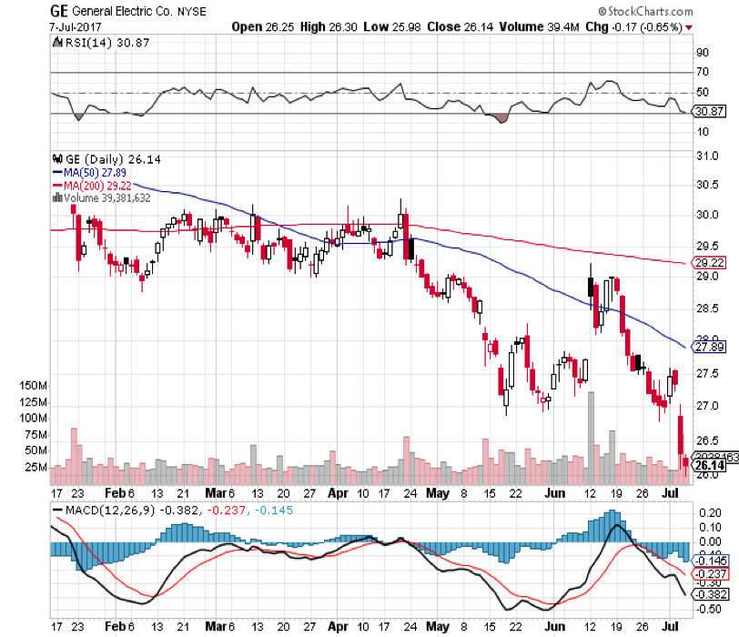
The chart of General Electric (GE) below shows that the stock traded in a tight range between $29 and $30 a share for several months, but once the stock price broke below the $29 support level, it continued to fall substantially lower.
Stock chart analysis is not infallible, not even in the hands of the most expert technical analyst. If it were, every stock investor would be a multi-millionaire. However, learning to read a stock chart will definitely help turn the odds of being a successful stock market investor in your favor.
Stock chart analysis is a skill, and like any other skill, one only becomes an expert at it through practice. The good news is that virtually anyone willing to work diligently at analyzing stock charts can become, if not an outright expert, at least pretty good at it – good enough to improve their overall profitability in stock market trading. Therefore, it’s in your best interest as an investor to begin or continue your education in stock chart analysis.
Thank you for reading CFI’s guide on How to Read Stock Charts. To keep learning and advancing your career, the following resources will be helpful:


