Point and Figure (P&F) Chart
A chart made up of columns of X's and O's that are used to represent filtered price movements
What is a Point and Figure (P&F) Chart?
A Point and Figure (P&F) chart is made up of multiple columns of X’s that represent increases in a security’s price and O’s that represent decreases in price. A column of X’s is always followed by a column of O’s, and vice-versa. The chart is composed of multiple boxes, with each box equal to a certain price level. The box is filled with an X if price increases to that level. The box is filled with an O if price decreases to that level.
P&F charts are regarded as “timeless” because, unlike traditional charts, time is not a factor. On traditional charts, a security’s price is plotted for specified time intervals, even if the price remains unchanged. With P&F charts, new information is plotted on the chart only if there is price action, a price change. If the price is static, even for a long period of time, then the chart is left unaltered. These charts are a useful tool in technical analysis, particularly helpful for identifying resistance and support levels.
A popular P&F charting method is the three-box reversal. This is a filtering process that requires a minimum of three boxes be filled (with either three X’s or three O’s) before reversing the present column on the chart and starting a new one in the opposite direction.
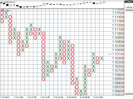
Merely talking about P&F charts can be confusing. But they are relatively easy to understand by looking at them. The image below shows a simple example of a P&F chart. The overall downtrend is clear from the fact that the O columns are, overall, much longer than the X columns.
Benefits of P&F Charts
While a P&F chart is one-dimensional in that it is focused only on price changes, not time, it can offer several benefits to traders and analysts. The benefits include:
- Filtering out insignificant price action – market noise
- Easy visualization of support and resistance levels
- A timeless tool for price movement analysis
- Helps a trader focus on the significant price movements
Creating a P&F Chart
Prices on a P&F chart are characterized by rising columns of X’s and falling columns of O’s. Every X and O sits in a box. The box represents a predetermined price range. The larger the box size, the fewer X’s and O’s that will be charted.
Every point and figure chart has a predetermined, specified reversal amount. This dictates how much a security’s price needs to move in the opposite direction to warrant charting a new column in that direction. When the reversal amount is reached, a new column begins next to the previous one. The new column moves in the opposite direction and is represented by the opposite character. If a column of O’s reverses, a new X column is started, and vice versa.
The amount that a column must reach in order to reverse – its reversal distance – is the product of the reversal amount and the box size. For example, if the box size is 2 and the reversal amount is 4, an 8-point price move is required for a reversal/new column. As long as the price of a security does not move more than the established reversal distance, the existing column continues.
There are several different ways to establish box scaling or size. The most commonly-used method involves a predefined table of price ranges to dictate what the box’s size should be. The table below shows a typical table of price ranges and box sizes.
| Price Range | Box Size |
|---|---|
| Under 0.25 | 0.0625 |
| 0.25 to 1.00 | 0.125 |
| 1.00 to 5.00 | 0.25 |
| 5.00 to 20.00 | 0.5 |
| 20.00 to 100 | 1 |
| 100 to 200 | 2 |
| 200 to 500 | 4 |
| 500 to 1,000 | 5 |
| 1,000 to 25,000 | 50 |
| 25,000 and up | 500 |
Bar and Candlestick Charts
There are alternatives to P&F charts, most notably, bar charts and candlestick charts.
A bar chart is plotted using an x-axis and y-axis and rectangular bars to represent the prices/values of the security being charted. A bar chart, unlike a P&F chart, is two-dimensional. The height and width of each bar are established by the factors set within each category: what the x- and y-axes are used to represent. In most cases, either the x- or y-axis represents time, a factor that P&F charts do not consider.
Candlestick charts reflect price action with clearer visuals and in more detail than bar charts. Each candlestick on a chart represents one specified time period (e.g., one hour or one day). Candlesticks clearly show four vital pieces of information for traders: the opening price, the high for the period, the low, and the closing price. The candlesticks form patterns that traders use as technical indicators. Again, time is an integral part of this type of chart, unlike P&F charts.
While sometimes considered an archaic form of charting price movements, point and figure charts can be incredibly useful. If nothing else, P&F charts provide a different point of view for analysis, which can be compared to indications gleaned from candlestick or bar charts.
Additional Resources
We hope you’ve enjoyed the CFI guide to point and figure charts. CFI is a global provider of Financial Modeling training and career advancement for finance professionals. To learn more and expand your career, explore the additional relevant resources below: