Get Certified for
Business Intelligence (BIDA®)
Develop analytical superpowers by learning how to use programming and data analytics tools such as VBA, Python, Tableau, Power BI, Power Query, and more.
Tools that are used in data visualization and technical analysis
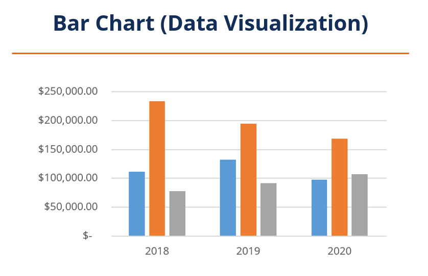
Bar charts, as a tool, can be used in two ways that are entirely different from each other. The first bar chart is used in data visualization that shows categorical data in the form of bars with varying heights or lengths based on the value it represents.
Alternatively, bar charts can be used in the technical analysis of an asset or security over time. Bar charts used in technical analysis are very different compared to the regular bar charts used in data visualization.
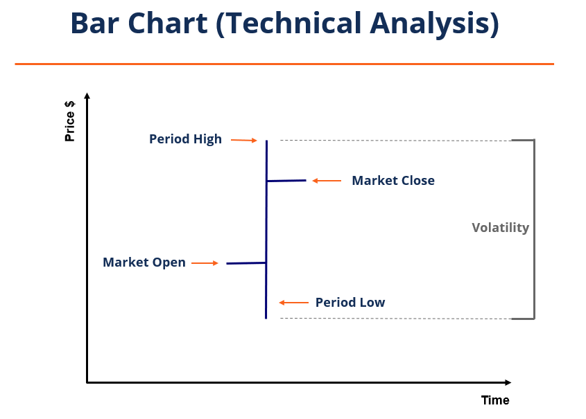
Bar charts in technical analysis are also referred to as open, high, low, and closing (OHLC). They are helpful in spotting trends, monitoring stock prices, and helping trading analysts make decisions.
Bar charts can be created by pen and paper, or a variety of programs can be used to help turn data into bar charts. Common software for business data visualization includes Excel, Tableau, Microsoft Power BI, and Google Charts. They can create a wide variety of bar charts.
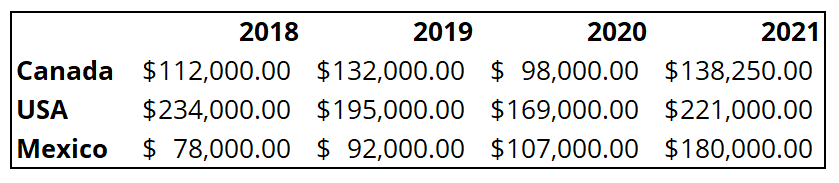
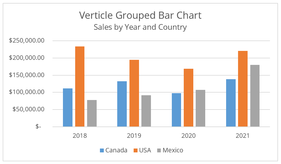
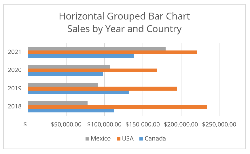
Various bar charts can be used to better represent the data you are trying to visualize. Some examples of bar charts are shown below.

Analysts use bar charts in technical analysis to help monitor price trends, volatility, security movement indicators, and more. These are used similarly to other charts in technical analysis, like the Japanese candlestick, to help trading analysts stay educated on their current or potential future investments.
The bar chart visually shows the opening, high, low, and closing prices of a security over a given period. The image below shows how to read a bar chart. The vertical line indicates the high and low prices of the period. The horizontal line to the left shows the market opening price, and the horizontal line to the right shows the market closing price.
It also shows the volatility of the security or asset over a given period which is the change between the period high and the period low. The volatility can be calculated by taking the period high and subtracting the period low.
If the period high and the period low are close together, the security would be considered relatively nonvolatile. Conversely, if the price difference between the period high and low is large, the security would be regarded as volatile.
If the market’s opening price is below the closing price for the period, the bar chart will sometimes be colored green or black, representing security gain. Alternatively, if the market open is above the market close, the bar chart will sometimes be colored red to represent a loss on the security.
When comparing tens or hundreds of bar charts from period to period, analysts often find it helpful to use color-coding in order to understand the graph they are looking at more quickly.
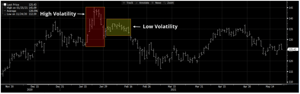
Below is an example of a bar chart of Apple, Inc. from November 21, 2020 to May 21, 2021, retrieved from Bloomberg. Highlighted in red, we can see a period of high volatility, with each period showing long bars. Slightly to the right, highlighted in yellow, we can see a period of relatively lower volatility.
Analysts will use bar charts like the one below to help them quickly spot trends in securities or assets. A bar chart alone does not provide nearly enough data or insight to warrant buying security; however, it can be a good indicator of whether or not more research should be conducted or simply pass over the investment opportunity.
Plenty of other valuable information can be taken from a bar chart. For example, if the market close is close to the period high, it could represent a more bullish outlook.
Conversely, if the market close is much lower than the period high, it means there were more sellers near the end of the period and could represent a more bearish outlook.
Bar charts used for data visualization are very different from when they are used for technical analysis. Bar charts in such situations are used to display categorical data with rectangular bars, either vertically or horizontally, whose lengths represent their values.
One axis of the bar chart will label the categories being compared. The other axis will show the values associated with each category. Often, bar charts will be scaled to help the data fit into the chart. However, it can misrepresent the data visually, so it is very important to read the bar chart and its axes carefully.
Connect what you just learned to a clear career path with CFI’s role‑based courses and certification programs.
To keep learning and developing your knowledge of financial analysis, we highly recommend the additional resources below:


