Get Certified for
Capital Markets (CMSA®)
From equities and fixed income to derivatives, the CMSA certification bridges the gap from where you are now to where you want to be — a world-class capital markets analyst.
Ichimoku Cloud, Bollinger Bands, and Heiken Ashi
Advanced technical analysis usually involves using either multiple technical indicators or a rather sophisticated (i.e., complex) indicator. “Sophisticated” does not necessarily mean “better” – it just means more difficult to calculate than, say, an arithmetic average.
Technical analysis is a means of interpreting the price action over time of a security. Various technical indicators – such as moving averages – are added to a price chart in an attempt to discern probable future price movement.
Technical indicators are not magical things, so don’t make the mistake of thinking that any of them is the Holy Grail that will unlock the key to guaranteed riches. The indicators simply provide a means for analysis of price movement – a means that may or may not provide a reliable predictive indicator of future price movements. Some work better than others, and all work better at some times than they do at other times. (Unfortunately, they don’t tell you if “now” is one of the good times to use them or not).
Following is an explanation of three advanced technical analysis indicators – the Ichimoku Cloud, Bollinger Bands, and the Heiken Ashi.
The Ichimoku Cloud – which contains a collection of technical indicators – can appear a bit challenging or overly complex at first glance. However, once you understand all the parts, it’s actually pretty simple to use. While not as popular in the West, it’s long been the technical indicator of choice on many Asian trading desks.
The Ichimoku Cloud boasts one of the most unusual histories for a trading indicator. It wasn’t developed by a software engineer or even a mathematician, but by a Japanese newspaper reporter. Users of the Ichimoku Cloud refer to it as a “one glance” indicator because, when displayed on a chart, it presents such a striking visual representation of the market.
Well, let’s dissect the Ichimoku Cloud line-by-line. It consists of five lines, two of which are utilized together to form the “cloud.”
The red line (as shown in the chart below) is the Tenkan Sen. The tenkan sen represents the average of the highest high and lowest low that have occurred over the last nine periods. For example, if you’re applying the Ichimoku to an hourly chart, then the tenkan line shows the high/low average over the last nine hours.
The cloud is more responsive to price action than a simple nine-period moving average because of its construction: It is not, as a simple moving average is, the average of the high and low of EACH time period, but the average of the highest high and lowest low recorded over the whole nine-period time frame. So, for example, if price begins to flatten out with the market trading sideways, the tenkan sen line will begin to indicate the fact sooner than a plain moving average line will.
Because the tenkan sen reflects price action over the shortest, most recent time frame, it is the component of the Ichimoku Cloud that gives the first indication of a change in the market – either a trend/direction change or an increase or decrease in momentum. (A steeper angle of slope in the line indicates more strength or momentum in the market’s movement, while a shallower angle indicates a weaker price move or lessening momentum).
The light blue line is the Kijun Sen. The Kijun Sen indicator line is slower to indicate a change in the market compared to the tenkan sen. The kijun sen represents the average of the highest high and lowest low over the last 26 time periods. The kijun line is interpreted as showing nearby support or resistance and, for that reason, is often used to identify where to place an initial stop-loss order when entering a trade. It may also be used to adjust a trailing-stop order as the market moves. As with the tenkan sen, the slope of the kijun sen is an indicator of price momentum.
The kijun sen line often represents an area of equilibrium between buying and selling pressure, a natural support/resistance level similar to major moving averages or daily pivot levels. Therefore, the kijun sen price level is often eyed as potentially a good level at which to initiate a buy or sell position following a temporary retracement (up or down) in price.
The Ichimoku Cloud (the areas on the chart shaded with either red or dark blue dashed vertical lines) is formed between the two lines known as Senkou Span A (calculated as the average of the values of tenkan and kijun, plotted 26 time periods ahead) and Senkou Span B (calculated as the average of the highest high and lowest low over the last 52 time periods, and also plotted 26 periods ahead). By pushing forward the calculations of the two lines that form the top and bottom edges of the Ichimoku cloud, the cloud extends to the right on a chart, past the latest recorded price, and is intended as an indicator of future price levels.
The senkou span A and B lines, as well as the cloud itself, delineate areas of longer-term support/resistance. The cloud is one advantage of the Ichimoku system. Rather than trying to pinpoint support or resistance at one specific price point (and it’s rarely the case that support or resistance can be so precisely pinpointed), the Ichimoku cloud shows traders an area of support or resistance.
The longer a trend in one direction continues, the “deeper” or thicker the cloud becomes. A deeper cloud is indicative of the fact that price would have to move substantially in the opposite direction in order to overcome the support or resistance that is protecting the current trend. A deeper cloud is also considered a sign of greater volatility in the market.
The dark blue line is the Chinkou Span. The chinkou span is a very unique indicator. It represents the closing price of the current candle – plotted 26 time periods back from the current period. (That’s why the end of the chinkou span line is much further back than the lines representing current price action.)

As noted on chart example, the correct way to interpret the chinkou span line is to look at it not in relation to all the current price action shown on the far right-hand side of a chart, but in relation to the other Ichimoku cloud indicators that match up with the end of the chinkou span line. Draw a vertical line, extending to the top and bottom of the chart, from the end of the chinkou span line, and then look at the other elements of the Ichimoku cloud system where they intersect that vertical line. Is the Ichimoku cloud above the end of the chinkou span line? It, along with the price and the tenkan and kijun lines all being above the chinkou line, indicates a downtrend. (Conversely, if the chinkou span is above price, the tenkan and kijun, and the cloud, that indicates an uptrend is in place.)
The strength, or momentum, of the trend is indicated by how far away from the corresponding price action the chinkou span is; the very strong downtrend that is shown on the right-hand side of the example chart is reflected by the fact that the chinkou span line is currently well away from the price levels and tenkan and kijun lines above it. It is an illustration of the “one glance” feature of the Ichimoku system – just a quick glance at the chart reveals the chinkou span line sitting off by itself, clearly separated from the price action indicators above it. The fact that it is located out in the wide-open spaces, all by itself, indicates a strong trend.
The chinkou span line may also serve as an indicator of support/resistance areas. It’s worth noting that the high or low points of the chinkou span frequently match up with Fibonacci retracement levels. Look at the peaks of the chinkou line that occur during the period from August 16 to August 21. Then, note that when the market tops out on August 27, it does so at a price level that almost perfectly matches up with the highest level the chinkou span line reached back on August 21.
The Ichimoku Cloud provides traders with a wealth of potential technical indications. The Ichimoku can be applied to any time frame that a trader prefers, from one minute to weekly or monthly charts. Following is a summary of most (I’m sure I’ll leave at least one or two out, there are so many) of the possible trading signals that one can glean from the Ichimoku.
Conversely, a downside crossover of kijun by tenkan is a sell signal.
To see an example, look back at the chart again, focusing on the time period from August 16 to August 27. The chinkou span line first peaks several days before the market itself does, indicating by its highest point almost the exact level the market will top out at. Then, by the time the market does peak on the 27th, the chinkou span has already given a strong sell signal, turning to the downside and crossing from above to below the tenkan sen, the kijun sen, and the cloud.
For all its features, one area where the Ichimoku system is weak is that of profit targets. Other than being stopped out of a trade, the Ichimoku does not offer much guidance in the area of picking profit targets, good potential trade exit points. The fact is that the Ichimoku is more concerned with minimizing risk than it is with maximizing profits. However, if you’re looking for a potential “take profits” level, don’t forget that the chinkou span line may reveal the peak or bottom of a trend some time in advance of the market actually reaching that price level.
The Ichimoku Cloud, with its multiple indicators, helps traders identify good trade entry points and support/resistance levels. It also provides clear indications of trend strength or market momentum. It offers, in short, an extremely comprehensive trading system.
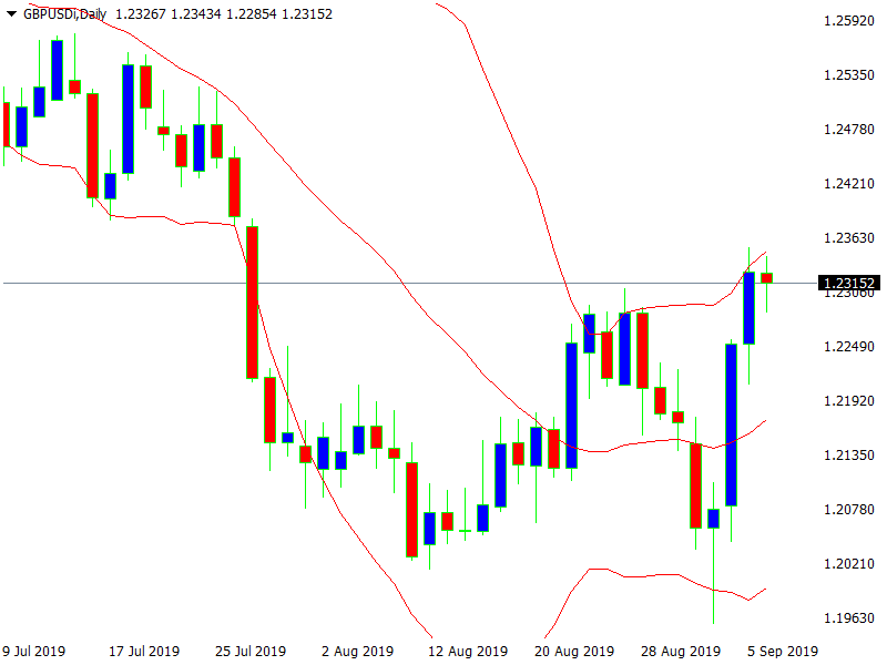
Bollinger Bands, developed by and named for noted technical analyst John Bollinger, employ a concept frequently used in the technical analysis of securities – standard deviation. Standard deviation is, essentially, a measure of how far the price of a security diverges from its mean average. In short, it is a measure of volatility. Bollinger bands provide a sort of range trendline where the range expands or contracts in conjunction with increased or decreased volatility. They do this by measuring how far closing prices are away from a 20-period moving average.
Bollinger found that by plotting the bands at two standard deviations, both above and below the moving average, roughly 90% of all closing prices should fall within the range of the bands. (Three standard deviations should contain approximately 99% of closing prices, but two standard deviations is the standard setting for Bollinger bands.) So, Bollinger bands are constructed by an upper band line that is two standard deviations above the 20-period simple moving average, a midline that is the 20-period average, and a lower band line that is two standard deviations below the midline.
A key element of Bollinger bands is that they are not focused on the absolute price of a security – such as $50 or $55 – but on where the price is relative to the Bollinger bands. In other words, is the price closer or further away from the outside bands. It is because of the expansion and contraction of the bands with volatility. The absolute price of a security might go higher, but at the same time be lower (further away) relative to the upper Bollinger band because the bands have expanded in line with increased volatility.
The fact is illustrated in the chart below – the first sign of impending trend change is the long red (down) candlestick, roughly in the middle of the chart. Although the absolute price is a new low, the price is higher relative to the lower Bollinger band, as it is contained with the band – compared to the previous low that went below (outside) the band.
So, what does all this mean for traders? When a security is trending solidly upward, the closing prices of each period tend to remain between the midline and the upper band – often “hugging” right along the edge of the upper band. When a solid downtrend is in place, prices tend to range between the midline and the lower band, often hugging right along the lower band line.
Therefore, one trading strategy derived from Bollinger bands is to buy (during an uptrend) or sell (during a downtrend) when prices retrace back to around the midline. Clues to an impending trend change are as follows:
An uptrend changing to a downtrend:
A downtrend changing to an uptrend:
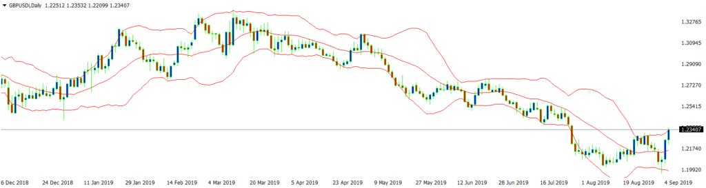
In determining uptrends and downtrends, it’s critical to note the overall slope of the Bollinger bands channel. As Bollinger bands provide a sort of trendline themselves, in an uptrend, the band channel is noticeably slanted upward, while in a downtrend it is slanting downward. When prices are ranging and trendless, the Bollinger bands channel will move mostly horizontally, and prices will often range back and forth all the way from the upper band line to the lower band line, as illustrated in the middle section of the chart below. Note the change in price action when a solid downtrend occurs, at which point price is more contained between the midline and the lower band.
In such ranging market conditions, swing traders can profit substantially by buying near the lower band and selling near the upper band. However, such a strategy can prove very costly when the market begins a new, sustained trend in one direction or the other. Such a swing trading strategy can be improved by using Bollinger bands in conjunction with a momentum indicator such as the RSI, which is designed to indicate overbought or oversold conditions.
Using both indicators, a trader only sells short at the upper band if the momentum indicator shows significantly overbought conditions – and only buys at the lower band with a momentum indicator of oversold conditions.
Finally, Bollinger bands are sometimes used as a “breakout” trading strategy. When price trades virtually “flat” for several periods, the bands will narrow considerably. Then, when the price inevitably breaks through either the upper band or lower band, the trader buys or sells accordingly, taking this as an indication of the start of a new trend. An initial stop-loss can be placed just outside the opposite band, e.g., just below the lower band when buying a breakthrough of the upper band.
Heiken Ashi is a unique kind of technical indicator, as it actually changes the basics of a candlestick chart. The fact distinguishes it from nearly every other technical indicator that is an addition laid on top of a traditional candlestick or bar chart. In contrast, Heiken Ashi actually changes the appearance – shape and form – of the candlesticks that make up the chart.
It does this by using a different formula from the open-high-low-close that is used to construct a normal candlestick. Instead, Heiken Ashi constructs each candlestick using the following calculations for each element of a candlestick:
By using averages (Heiken Ashi translates as “average bar”), the Heiken Ashi redrawing of candlesticks aims to smooth out price action and more clearly indicate trends. The result is that during an uptrend, Heiken Ashi candles will appear as a more unbroken succession of up candles – and in a downtrend, as more consistently down candles.
It is in contrast with a regular candlestick chart that might show alternating back and forth, up and down, candlesticks. The potential advantage for traders is being able to ride a trend longer rather than being “faked out” by one or two candles that would appear pointing in the opposite direction on a regular candlestick chart.
The Heiken Ashi also changes the overall appearance of the candlesticks as follows:
1. During a sustained trend, candlesticks typically assume longer bodies and shorter wicks or shadows on either end.
2. Thus, short body candlesticks with long wicks or shadows are frequently signals of a trend change.
Below are two charts of the same price action in the forex pair, GBP/AUD. The first is a regular candlestick chart, and the second is the same price action as tracked with the Heiken Ashi indicator applied. Note particularly on the left-hand side of the chart how, during the uptrend and following downtrend, the Heiken Ashi representation shows more continuous up, and then down, candles, while the original candlestick chart shows more of a mix of up and down candlesticks. You can also see the difference in the length of candlestick bodies and shadows.


Trend changes can often be spotted using the Heiken Ashi when a candlestick of the opposite color appears with a long shadow in the opposite direction of the previously existing trend. It can be seen in the uptrend and downtrend, which appear on the left-hand side of the chart. Just before the sustained uptrend begins, there is a short body blue (up) candle with a long upper shadow. When the trend changes to a downtrend, the first red (down) candle shows a long lower shadow.
Regardless of the simplicity or complexity of technical indicators that an investor uses, the goals of using such a tool remain the same:
Technical analysts are guided by their belief that the total buying and selling actions of all market participants accurately represent a fair market value of a security based on all the relevant information available to various market participants.
It’s worth noting that while technical analysis is based on the idea that current and past price actions are the most reliable indicators of probable future price movement, the legally required disclaimer on nearly every financial information or advice publication reads, “Past performance is no guarantee of future performance.”
The simple truth is that nearly all technical indicators are useful, but no technical indicators are flawless. That is why trading strategies advise placing stop-loss orders to limit one’s risk when taking a position – long or short – in a financial market. A good technical analyst is continually re-evaluating the market’s current price action in an effort to determine whether or not a given technical indicator’s signals are valid or not.
CFI offers the Capital Markets & Securities Analyst (CMSA®) certification program for those looking to take their careers to the next level. To keep learning and developing your knowledge base, please explore the additional relevant resources below:


