Get Specialized with our Financial Planning & Analysis (FP&A) Program
Support business leaders in their decision-making with best-in-class financial models to evaluate and forecast the financial performance of a company.
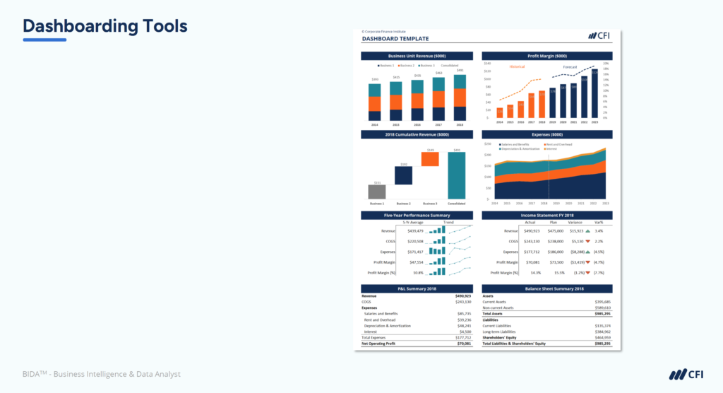
After weeks of work, you unveil your meticulously designed financial dashboard to the executive team. Your dashboard features strong visualization, an on-brand color scheme, and precise data. But the room falls silent as they take it in — then the CFO asks a simple question: “So what does this mean we should do?”
Creating attractive charts and graphs is relatively easy. But connecting those visuals to actionable insights requires a different approach. Effective financial dashboards must focus on clear priorities, highlight what matters most, and anticipate follow-up questions that leaders are likely to ask.
This guide will show you how to transform your financial dashboards from passive displays into decision-driving tools that influence what happens next.

Leaders frequently encounter financial dashboards that prompt one critical question: “So what?” This happens when visualizations present data without a clear path to action. This observation captures the core issue. Leaders need information that drives decisions, not just more data points.
The distinction between information and actionable insight is crucial. Information simply presents facts, while actionable insights connect those facts to specific business decisions that need to be made.
Consider two approaches:
The second approach transforms passive information into decision-driving insights. Ultimately, financial dashboards exist to improve business outcomes. Every chart and table should connect directly to business decisions that impact performance.
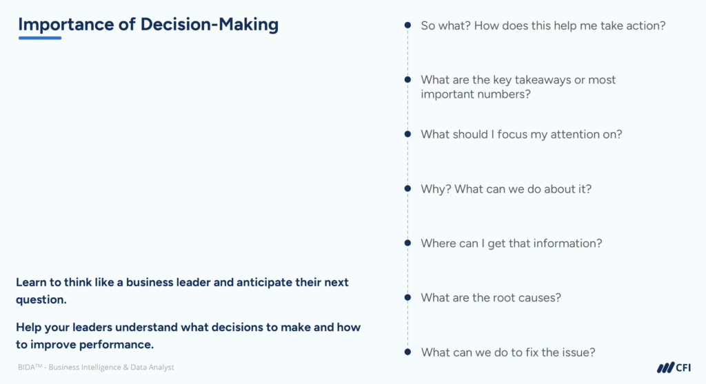
Business leaders consistently ask three essential questions when reviewing financial dashboards. By designing your data visualizations to address these questions, you’ll transform your dashboards from data displays into decision-driving tools.
Executive time is extremely limited. Often, business leaders don’t have time for the details of a financial model or digest dashboards with loads of metrics. This time constraint shapes how executives interact with your dashboards.
Your financial dashboards should prioritize the most critical information, create clear visual hierarchies, and make the most important insights immediately apparent. Think about what the CEO would mention in a board meeting and make those points stand out.
Even with key metrics highlighted, executives need help determining which issues deserve immediate attention and which can wait. Without clear prioritization signals, leaders waste precious time figuring out where to direct their efforts.
Effective dashboards use visual alerts strategically, provide meaningful comparisons against benchmarks, and emphasize issues based on their financial impact or strategic importance.
Identifying a problem without understanding its causes or potential solutions creates frustration rather than action. Suppose your dashboard shows a downward trend in revenue. You will naturally get questions from leaders asking why it’s happening and what can be done about it.
It’s helpful to include contextual annotations, root cause indicators, and suggested next steps in your dashboards. For example, add explanatory notes that highlight causes of significant changes or show related metrics that explain why performance might be shifting.
To create financial dashboards that drive decisions, apply these four key design principles from data visualization best practices:
Before we even start to create a visual, we need to be crystal clear about why we’re creating it and what it is going to be used for. This means identifying specific questions your dashboard must answer.
For financial dashboards, establish whether you’re creating:
Limit yourself to one to two clear focus questions that guide every design decision from metric selection to layout.
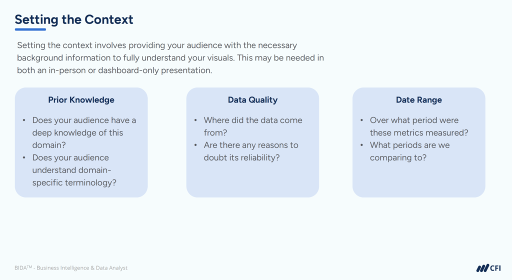
Setting the context in data visualization involves providing your audience with the necessary background information and explanations. This context helps viewers fully appreciate and understand the relevance and importance of your visuals.
Key contextual elements to include:
Without proper context, even beautifully designed financial dashboards lead to misinterpretations and poor decisions.
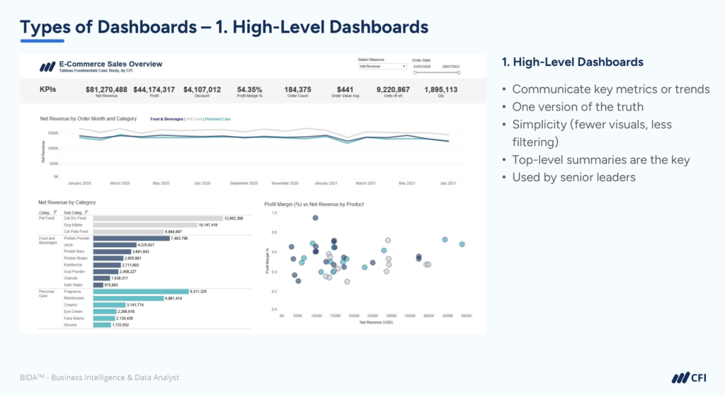
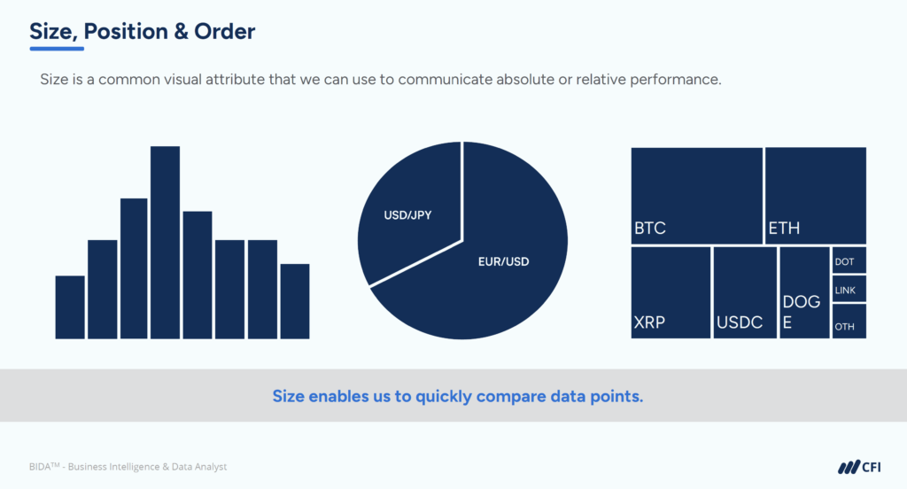
Size is the most obvious visual attribute that we can use to communicate absolute or relative performance. Position is equally important — higher data points immediately signal higher values.
Implement visual hierarchy through:
A dashboard with proper visual hierarchy guides viewers naturally to the most important information first.
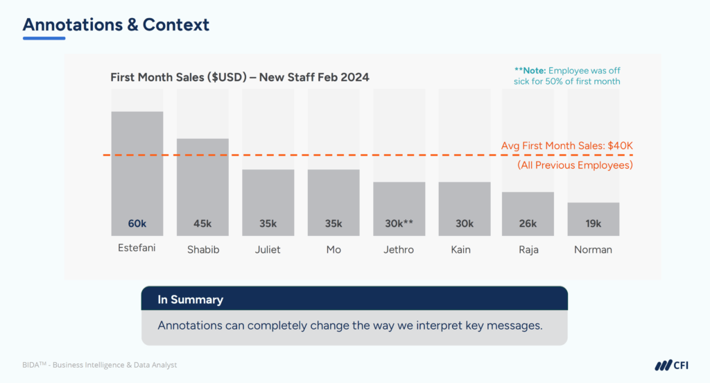
Annotations are a great way to get a little more specific with context or detail. We usually use annotations to highlight a specific point of interest on the chart or to add some relevant information that helps the user make sense of the data.
Effective annotations:
For example, a revenue chart showing a sudden drop might include an annotation noting “Website down for maintenance” to immediately explain the anomaly.
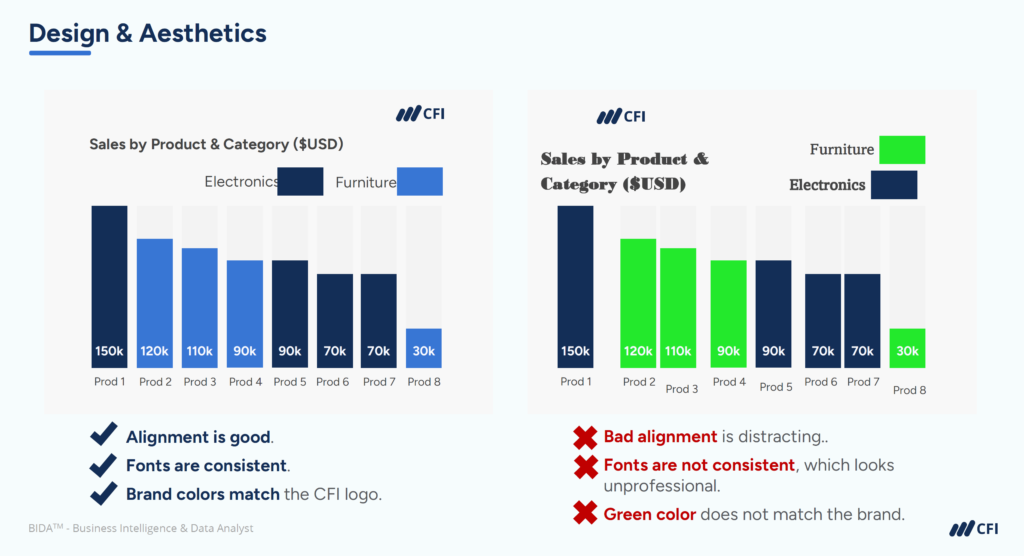
Before: A monthly expense dashboard featuring eight departments in a data-heavy table with multiple charts of equal visual weight provides comprehensive data but no clear focus or priorities.
After: Redesigned around the question “Which expense categories need attention?”, the dashboard:
By applying these four design principles from data visualization best practices, you transform financial dashboards from passive information displays into focused decision-support tools.
Creating well-designed financial dashboards is only half the battle. To truly impact your organization, these dashboards must connect directly to business decisions and processes.
Leaders have a business to run and decisions to make. Effective financial dashboards anticipate these decisions and provide the exact information needed to make them.
Where possible, ensure that your dashboard answers these questions and helps them understand what they need to do to make actionable decisions and to improve the performance of the business.
To achieve this connection between insights and action:
For dashboards to deliver value, they must be actively used throughout the organization. Successful adoption requires:
The most impactful financial dashboards become reference points in key meetings, driving discussions around performance and priorities rather than simply reporting numbers.
By applying the best practices for financial dashboards covered in this guide, you can significantly enhance how your dashboards are received and valued by business leaders.
Make building dashboarding skills a priority in your professional development. Mastering financial dashboards will help you make a bigger impact on your organization’s success and your career.
Ready to create effective, visually driven financial dashboards? CFI’s Data Visualization and Dashboards — The Basics course provides comprehensive guidance on developing compelling data visualizations. Enroll today and start creating financial dashboards that drive real business action!
Mastering Data Storytelling: Turning Raw Data into Impactful Narratives


