Get Certified for
Business Intelligence (BIDA®)
Develop analytical superpowers by learning how to use programming and data analytics tools such as VBA, Python, Tableau, Power BI, Power Query, and more.
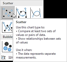
A chart type normally used to observe and visually display the relationship between variables
A scatter plot is a chart type that is normally used to observe and visually display the relationship between variables. The values of the variables are represented by dots. The positioning of the dots on the vertical and horizontal axis will inform the value of the respective data point; hence, scatter plots make use of Cartesian coordinates to display the values of the variables in a data set. Scatter plots are also known as scattergrams, scatter graphs, or scatter charts.
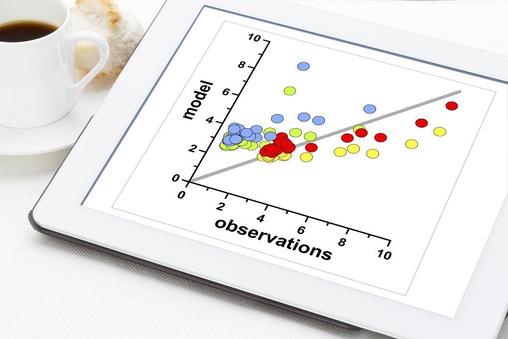
The most common use of the scatter plot is to display the relationship between two variables and observe the nature of the relationship. The relationships observed can either be positive or negative, non-linear or linear, and/or, strong or weak.
The data points or dots, which appear on a scatter plot, represent the individual values of each of those data points and also allow pattern identification when looking at the data holistically.
Another common use of scatter plots is that they enable the identification of correlational relationships. Scatter plots tend to have independent variables on the horizontal axis and dependent variables on the vertical axis. It allows the observer to know or get an idea of what the possible vertical value may be, provided there is information on the horizontal value.
Data pattern identification is also possible with scatter plots. Data points can be grouped together based on how close their values are, and this also makes it easy to identify any outlier points when there are data gaps.
Seeing as scatter plots aid in the identification of correlations between variables, the nature of the correlations can also be estimated based on a specific confidence level.
Also, through the use of a “Line of Best Fit” or a trendline, scatter plots to help identify trends. Following the best-fit framework, an equation can be derived in conjunction with the relationship that exists between the variables. Linear regression is part of the best-fit framework and is used for linear correlations.
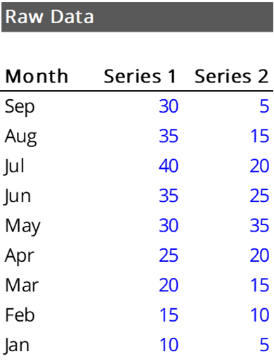
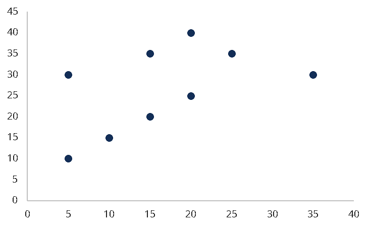
The scatter plot diagram for the data above is seen below:
To create a scatter plot diagram similar to the one above, the following steps can be taken in Excel:
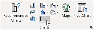
The chart will be generated, and the heading and visual presentation can be adjusted according to preference.
Two common issues have been identified with the use of scatter plots – overplotting and the interpretation of causation as correlation.
Overplotting occurs when there are too many data points to plot, which results in the overlapping of different data points. It can make relationship identification between variables challenging.
Concerning correlation, it is important to remember that correlation does not mean that the changes observed in one variable are responsible for the changes observed in another variable. Correlation should not be interpreted as causation. Causation implies that an event occurring will have an impact on an outcome.
Connect what you just learned to a clear career path with CFI’s role‑based courses and certification programs.
In order to help you become a world-class financial analyst and advance your career to your fullest potential, these additional resources will be very helpful:


