Get Certified for
Capital Markets (CMSA®)
From equities and fixed income to derivatives, the CMSA certification bridges the gap from where you are now to where you want to be — a world-class capital markets analyst.
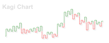
A type of chart that shows the asset price movements without a time axis
The Kagi chart is a type of chart that shows the price movements of an asset. Different from a candlestick chart or other conventional types of charts, a Kagi chart does not contain a time axis, which allows it to show price changes more clearly and effectively. Kagi charts are used as a tool to support technical analysis. It was originally developed in Japan since the inception of the Japanese stock market.
A Kagi chart shows the movements of an asset’s price through a series of vertical lines linked with short horizontal lines. A notable feature of Kagi charts is that they do not contain a variable of time. The diagram below is a simple example of a Kagi chart to help you to understand how it is constructed.

The vertical lines (marked by numbers) display the unidirectional movements of price, as the short horizontal lines (marked by alphabets) signal reversals of price movements. The vertical line (1) shows the asset price dropping from $60 to $24. The price drop may happen all of a sudden or gradually for a consecutive period since the chart lacks a time axis. Line (1) is followed by a horizontal line (a), which means a reversal in the price drop, and the price starts to rise.
Line (a) would not appear until the price’s increased by a pre-determined reversal amount, depending on the type of security and the trader’s preference. Typically, it is set as 4% of the current price. Other reversal value setting methods include the average true range (ATR) method and the fixed-point method. The vertical line (2) following Line (a) presents an increase in price from $24 to $42 after the reversal. Line (b) signals the end of the upward trend, and the price dropped to $17, as shown by the vertical line (3).
Another feature of the Kagi chart is the change in the thickness of the lines. Every time the price moves above the previous high or below the previous low, the thickness of the lines switches. For example, according to Line (2), the price increased to $42, which is below the previous high at $60, and thus the line remains thin.
The vertical line (3) switches from thin to thick after the price broke the previous low at $24. After the price increased above the previous high at $42, Line (4) switches back to thin. In some Kagi charts, the lines switch between colors, which functions the same as the switch of thickness.
The switch of thickness or color can be used by traders as transaction signals. When the Kagi line moves above the previous high, a buy signal is created, and a sell signal appears when the Kagi line drops below the previous low. Therefore, the switch at Line (3) gives a sell signal, as the switch at Line (4) gives a buy signal.
Although both depict the price movements of an asset, Kagi charts and candlestick charts are different in many aspects. Here are some of the major differences.
The large amount of time-based information that a candlestick chart contains can overburden traders who rely on technical analysis. It can be difficult for them to identify the significant price movements from noisy fluctuations.
Hence, the major advantage of a Kagi chart is that it allows traders to focus on the major price trends and changes by dropping unnecessary fluctuations. Through the neat vertical and horizontal lines and clear switch in color or thickness, traders can easily identify the meaningful asset trends and profitable trading signals.
CFI offers the Capital Markets & Securities Analyst (CMSA)™ certification program for those looking to take their careers to the next level. To keep learning and advancing your career, the following resources will be helpful:


