Get Certified for
Capital Markets (CMSA®)
From equities and fixed income to derivatives, the CMSA certification bridges the gap from where you are now to where you want to be — a world-class capital markets analyst.
Predicting the probable future price movement of a security based on market data
Technical analysis is a tool, or method, used to predict the probable future price movement of a security – such as a stock or currency pair – based on market data.
The theory behind the validity of technical analysis is the notion that the collective actions – buying and selling – of all the participants in the market accurately reflect all relevant information pertaining to a traded security, and therefore, continually assign a fair market value to the security.
Technical traders believe that current or past price action in the market is the most reliable indicator of future price action.
Technical analysis is not only used by technical traders. Many fundamental traders use fundamental analysis to determine whether to buy into a market, but having made that decision, then use technical analysis to pinpoint good, low-risk buy entry price levels.
Technical traders analyze price charts to attempt to predict price movement. The two primary variables for technical analysis are the time frames considered and the particular technical indicators that a trader chooses to utilize.
The technical analysis time frames shown on charts range from one-minute to monthly, or even yearly, time spans. Popular time frames that technical analysts most frequently examine include:
The time frame a trader selects to study is typically determined by that individual trader’s personal trading style. Intra-day traders, traders who open and close trading positions within a single trading day, favor analyzing price movement on shorter time frame charts, such as the 5-minute or 15-minute charts. Long-term traders who hold market positions overnight and for long periods of time are more inclined to analyze markets using hourly, 4-hour, daily, or even weekly charts.
Price movement that occurs within a 15-minute time span may be very significant for an intra-day trader who is looking for an opportunity to realize a profit from price fluctuations occurring during one trading day. However, that same price movement viewed on a daily or weekly chart may not be particularly significant or indicative for long-term trading purposes.
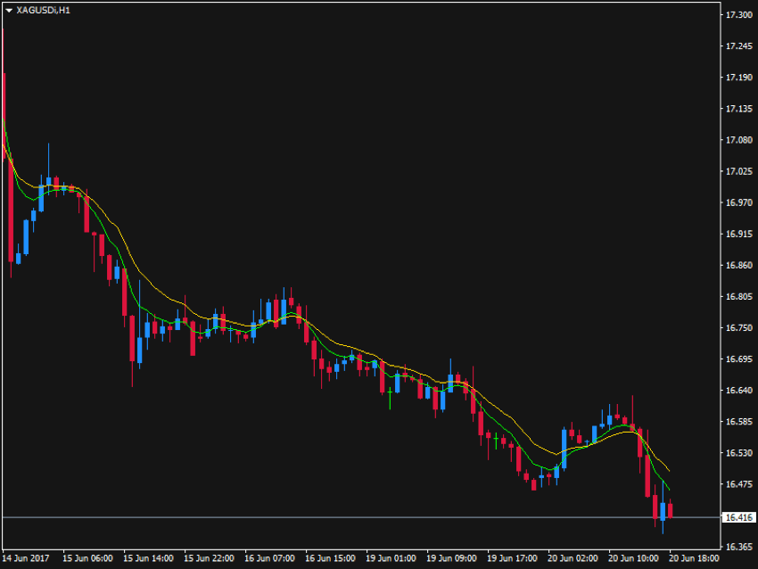
It’s simple to illustrate this by viewing the same price action on different time frame charts. The following daily chart for silver shows price trading within the same range, from roughly $16 to $18.50, that it’s been in for the past several months. A long-term silver investor might be inclined to look to buy silver based on the fact that the price is fairly near the low of that range.
However, the same price action viewed on an hourly chart (below) shows a steady downtrend that has accelerated somewhat just within the past several hours. A silver investor interested only in making an intra-day trade would likely shy away from buying the precious metal based on the hourly chart price action.
Candlestick charting is the most commonly used method of showing price movement on a chart. A candlestick is formed from the price action during a single time period for any time frame. Each candlestick on an hourly chart shows the price action for one hour, while each candlestick on a 4-hour chart shows the price action during each 4-hour time period.
Candlesticks are “drawn” / formed as follows: The highest point of a candlestick shows the highest price a security traded at during that time period, and the lowest point of the candlestick indicates the lowest price during that time. The “body” of a candlestick (the respective red or blue “blocks”, or thicker parts, of each candlestick as shown in the charts above) indicates the opening and closing prices for the time period. If a blue candlestick body is formed, this indicates that the closing price (top of the candlestick body) was higher than the opening price (bottom of the candlestick body); conversely, if a red candlestick body is formed, then the opening price was higher than the closing price.
Candlestick colors are arbitrary choices. Some traders use white and black candlestick bodies (this is the default color format, and therefore the one most commonly used); other traders may choose to use green and red, or blue and yellow. Whatever colors are chosen, they provide an easy way to determine at a glance whether price closed higher or lower at the end of a given time period. Technical analysis using a candlestick charts is often easier than using a standard bar chart, as the analyst receives more visual cues and patterns.
Candlestick patterns, which are formed by either a single candlestick or by a succession of two or three candlesticks, are some of the most widely used technical indicators for identifying potential market reversals or trend change.
Doji candlesticks, for example, indicate indecision in a market that may be a signal for an impending trend change or market reversal. The singular characteristic of a doji candlestick is that the opening and closing prices are the same, so that the candlestick body is a flat line. The longer the upper and/or lower “shadows”, or “tails”, on a doji candlestick – the part of the candlestick that indicates the low-to-high range for the time period – the stronger the indication of market indecision and potential reversal.
There are several variations of doji candlesticks, each with its own distinctive name, as shown in the illustration below.
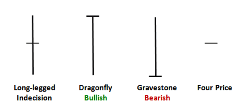
The typical doji is the long-legged doji, where price extends about equally in each direction, opening and closing in the middle of the price range for the time period. The appearance of the candlestick gives a clear visual indication of indecision in the market. When a doji like this appears after an extended uptrend or downtrend in a market, it is commonly interpreted as signaling a possible market reversal, a trend change to the opposite direction.
The dragonfly doji, when appearing after a prolonged downtrend, signals a possible upcoming reversal to the upside. Examination of the price action indicated by the dragonfly doji explains its logical interpretation. The dragonfly shows sellers pushing price substantially lower (the long lower tail), but at the end of the period, price recovers to close at its highest point. The candlestick essentially indicates a rejection of the extended push to the downside.
The gravestone doji’s name clearly hints that it represents bad news for buyers. The opposite of the dragonfly formation, the gravestone doji indicates a strong rejection of an attempt to push market prices higher, and thereby suggests a potential downside reversal may follow.
The rare, four price doji, where the market opens, closes, and in-between conducts all buying and selling at the exact same price throughout the time period, is the epitome of indecision, a market that shows no inclination to go anywhere in particular.
There are dozens of different candlestick formations, along with several pattern variations. Probably the most complete resource for identifying and utilizing candlestick patterns is Thomas Bulkowski’s pattern site, which thoroughly explains each candlestick pattern and even provides statistics on how often each pattern has historically given a reliable trading signal. It’s certainly helpful to know what a candlestick pattern indicates – but it’s even more helpful to know if that indication has proven to be accurate 80% of the time.
In addition to studying candlestick formations, technical traders can draw from a virtually endless supply of technical indicators to assist them in making trading decisions.
Moving averages are probably the single most widely used technical indicator. Many trading strategies utilize one or more moving averages. A simple moving average trading strategy might be something like, “Buy as long as price remains above the 50-period exponential moving average (EMA); Sell as long as price remains below the 50 EMA”.
Moving average crossovers are another frequently employed technical indicator. A crossover trading strategy might be to buy when the 10-period moving average crosses above the 50-period moving average.
The higher a moving average number is, the more significant price movement in relation to it is considered. For example, price crossing above or below a 100- or 200-period moving average is usually considered much more significant than price moving above or below a 5-period moving average.
Daily pivot point indicators, which usually also identify several support and resistance levels in addition to the pivot point, are used by many traders to identify price levels for entering or closing out trades. Pivot point levels often mark significant support or resistance levels or the levels where trading is contained within a range. If trading soars (or plummets) through the daily pivot and all the associated support or resistance levels, this is interpreted by many traders as “breakout” trading that will shift market prices substantially higher or lower, in the direction of the breakout.
Daily pivot points and their corresponding support and resistance levels are calculated using the previous trading day’s high, low, opening and closing prices. I’d show you the calculation, but there’s really no need, as pivot point levels are widely published each trading day and there are pivot point indicators you can just load on a chart that do the calculations for you and reveal pivot levels. Most pivot point indicators show the daily pivot point along with three support levels below the pivot point and three price resistance levels above it.
Fibonacci levels are another popular technical analysis tool. Fibonacci was a 12th-century mathematician who developed a series of ratios that is very popular with technical traders. Fibonacci ratios, or levels, are commonly used to pinpoint trading opportunities and both trade entry and profit targets that arise during sustained trends.
The primary Fibonacci ratios are 0.24, 0.38, 0.62, and 0.76. These are often expressed as percentages – 23%, 38%, etc. Note that Fibonacci ratios complement other Fibonacci ratios: 24% is the opposite, or remainder, of 76%, and 38% is the opposite, or remainder, of 62%.
As with pivot point levels, there are numerous freely available technical indicators that will automatically calculate and load Fibonacci levels onto a chart.
Fibonacci retracements are the most often used Fibonacci indicator. After a security has been in a sustained uptrend or downtrend for some time, there is frequently a corrective retracement in the opposite direction before price resumes the overall long-term trend. Fibonacci retracements are used to identify good, low-risk trade entry points during such a retracement.
For example, assume that the price of stock “A” has climbed steadily from $10 to $40. Then the stock price begins to fall back a bit. Many investors will look for a good entry level to buy shares during such a price retracement.
Fibonacci numbers suggest that likely price retracements will extend a distance equal to 24%, 38%, 62%, or 76% of the uptrend move from $10 to $40. Investors watch these levels for indications that the market is finding support from where price will begin rising again. For example, if you were hoping for a chance to buy the stock after approximately a 38% retracement in price, you might enter an order to buy around the $31 price level. (The move from $10 to $40 = $30; 38% of $30 is $9; $40 – $9 = $31)
Continuing with the above example – So now you’ve bought the stock at $31 and you’re trying to determine a profit target to sell at. For that, you can look to Fibonacci extensions, which indicate how much higher price may extend when the overall uptrend resumes. The Fibonacci extension levels are pegged at prices that represent 126%, 138%, 162%, and 176% of the original uptrend move, calculated from the low of the retracement.
So, if a 38% retracement of the original move from $10 to $40 turns out to be the retracement low, then from that price ($31), you find the first Fibonacci extension level and potential “take profit” target by adding 126% of the original $30 move upward. The calculation goes as follows:
Fibonacci extension level of 126% = $31 + ($30 x 1.26) = $68 – giving you a target price of $68.
Once again, you never actually have to do any of these calculations. You just plug a Fibonacci indicator into your charting software and it displays all the various Fibonacci levels.
Pivot and Fibonacci levels are worth tracking even if you don’t personally use them as indicators in your own trading strategy. Because so many traders do base buying and selling moves on pivot and Fibonacci levels, if nothing else there is likely to be significant trading activity around those price points, activity that may help you better determine probable future price moves.
Moving averages and most other technical indicators are primarily focused on determining likely market direction, up or down.
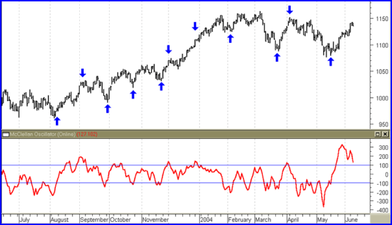
There is another class of technical indicators, however, whose main purpose is not so much to determine market direction as to determine market strength. These indicators include such popular tools as the Stochastic Oscillator, the Relative Strength Index (RSI), the Moving Average Convergence-Divergence (MACD) indicator, and the Average Directional Movement Index (ADX).
By measuring the strength of price movement, momentum indicators help investors determine whether current price movement more likely represents relatively insignificant, range-bound trading or an actual, significant trend. Because momentum indicators measure trend strength, they can serve as early warning signals that a trend is coming to an end. For example, if a security has been trading in a strong, sustained uptrend for several months, but then one or more momentum indicators signals the trend steadily losing strength, it may be time to think about taking profits.
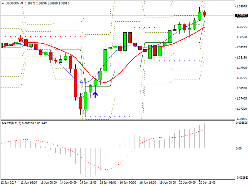
The 4-hour chart of USD/SGD below illustrates the value of a momentum indicator. The MACD indicator appears in a separate window below the main chart window. The sharp upturn in the MACD beginning around June 14th indicates that the corresponding upsurge in price is a strong, trending move rather than just a temporary correction. When price begins to retrace downward somewhat on the 16th, the MACD shows weaker price action, indicating that the downward movement in price does not have much strength behind it. Soon after that, a strong uptrend resumes. In this instance, the MACD would have helped provide reassurance to a buyer of the market that (A) the turn to the upside was a significant price move and (B) that the uptrend was likely to resume after the price dipped slightly on the 16th.
Because momentum indicators generally only signal strong or weak price movement, but not trend direction, they are often combined with other technical analysis indicators as part of an overall trading strategy.
Keep in mind the fact that no technical indicator is perfect. None of them gives signals that are 100% accurate all the time.
The smartest traders are always watching for warning signs that signals from their chosen indicators may be misleading. Technical analysis, done well, can certainly improve your profitability as a trader. However, what may do more to improve your fortunes in trading is spending more time and effort thinking about how best to handle things if the market turns against you, rather than just fantasizing about how you’re going to spend your millions.
Connect what you just learned to a clear career path with CFI’s role‑based courses and certification programs.
Thank you for reading CFI’s guide on Technical Analysis – A Beginner’s Guide. To keep learning and developing your knowledge of financial analysis, we highly recommend the additional CFI resources below:


