Get Certified for
Business Intelligence (BIDA®)
Develop analytical superpowers by learning how to use programming and data analytics tools such as VBA, Python, Tableau, Power BI, Power Query, and more.
A visual representation of a distribution
A frequency polygon is a visual representation of a distribution. The visualization tool is used to understand the shape of a distribution. Essentially, the frequency polygon indicates the number of occurrences for each distinct class in the dataset. In addition, the graph may be used to show the cumulative frequency distribution.
The frequency polygon is a curve that is drawn on the x-axis and the y-axis. The x-axis represents the values in the dataset, while the y-axis shows the number of occurrences of each distinct category.
The frequency polygon can serve as an alternative to a histogram. Both visual representations perfectly reflect the shape of a distribution. However, unlike the histogram, the frequency polygon can be easily utilized to compare multiple distributions on the same graph. In some cases, a histogram and a frequency polygon can be used simultaneously to get a more accurate picture of the distribution shape.
Excel can be a convenient and simple tool for creating the frequency polygon of a distribution. The frequency polygon can be created using the following steps:
Midpoint = (Lower limit + Upper limit) / 2
The identified midpoints must be arranged in a separate column.
You are a financial analyst in a retail business. You are preparing a report regarding the current financial conditions of the company. One part of the report describes the management of the company’s accounts payable. You obtain the data that defines how many days are required to settle each invoice.
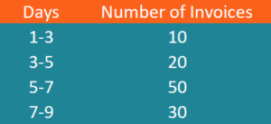
You need to create a frequency polygon that will reflect the distribution of the accounts payable. Using the data from the table above, let’s create the frequency polygon:
1. The classes within the dataset are listed in the first column of the table above.
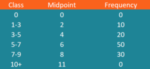
2. The midpoints for each class can be calculated in the following way:
Midpoint (1-3) = (1 + 3) / 2 = 2
Midpoint (3-5) = (3 + 5) / 2 = 4
Midpoint (5-7) = (5 + 7) / 2 = 6
Midpoint (7-9) = (7 + 9) / 2 = 8
3. The frequencies for each class are listed in the second column on the table above.
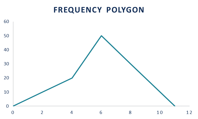
4. To ensure that our graph is closed shape, you must determine the first and last class with zero frequencies. The first class is zero days with zero frequency. The last class is 10-12 days (it must show a similar spread as the other classes) and zero frequency.
5. The input table for the creation of the frequency polygon is summarized below:
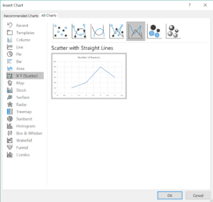
6. Select the columns Midpoint and Frequency. Then, select Insert -> Charts -> Insert Scatter -> Scatter with Straight Lines. The frequency polygon should look like the graph at the top of this article.
CFI is the official provider of the global Business Intelligence & Data Analyst (BIDA)® certification program, designed to help anyone become a world-class financial analyst. To keep learning and advancing your career, the additional CFI resources below will be useful:


