Creating a Gantt Chart in Excel
A project scheduling chart
What is a Gantt Chart?
The Gantt Chart is a type of a bar chart used to depict the schedule of a project. The chart was developed at the beginning of the 20th century by Henry Gantt, an engineer and management consultant.
The Gantt Chart is a powerful project management tool that illustrates the start and finish dates of project elements, as well as the sequence and dependencies between project elements. The chart provides project managers with the opportunity to manage and monitor resources and tasks in a project, as well as the opportunity to check whether the project remains on the track.

Elements of a Gantt Chart
To use a Gantt chart effectively, you must know the key elements of this type of charts.
- Tasks and sub-tasks are listed on the left side.
- Dates are located at the top.
- Bars represent the length of each task and sub-task
- Milestones are the tasks crucial to a project’s success. Milestones are represented as diamonds on the chart.
Gantt Chart Template in Excel
There are many different software applications that can be used to create a Gantt Chart. Many of them are specific project management tools such as Microsoft Project. Microsoft Excel can also be used to develop a Gantt Chart but it is not the best software to do it. There is no specific template in Excel for creating the chart; thus, it is necessary to create the template for the chart from scratch.
In this article, we will discuss two methods to create a Gantt Chart in Excel.
Download the free template
Gantt Chart Template
Download the free Excel template now to advance your finance knowledge!
How to create a simple Gantt chart in Excel
The first method to create a Gantt chart in Excel is to use existing chart templates and adjust them for the chart.
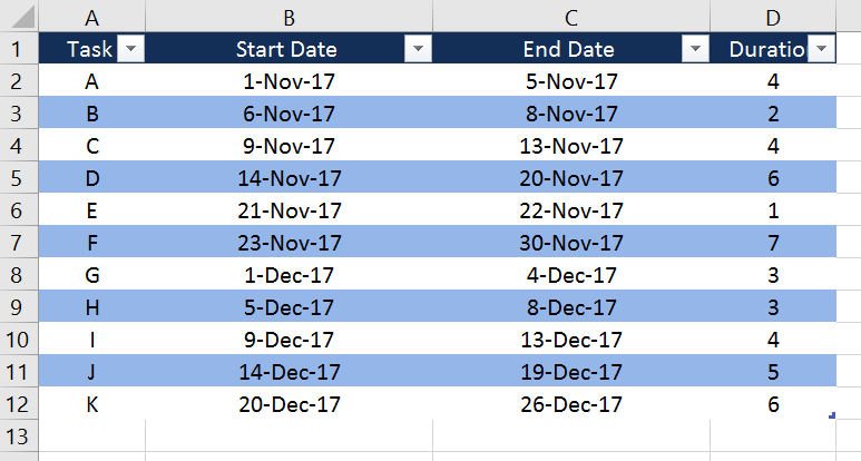
1. Create a table with project’s data
The table should contain the main information about the project such as a list of tasks to complete a project, start and end dates for each task, and the duration of each task.
2. Create a simple bar chart using the data from the table
Select the Start Date range in the table, click Insert -> Column or Bar Chart -> Stacked Bar.
3. Add Duration series to the chart
After creating a simple bar chart with the Start Date series, add Duration data to the chart by:
a. Right-click on the chart area.
b. Choose Select Data.
c. In the pop-up menu, on the left side under Legend Entries (Series), click
d. Select the cell with column’s title for Series Name and select the range of Duration values for Series values. Do not include the title cell into the range for Series values.
4. Add Tasks names to the chart
a. Right-click on the chart area.
b. Choose Select Data.
c. In the pop-up menu, on the right side under Horizontal (Category) Axis Labels, click Edit for the Start Date series.
d. Select the tasks names range from the table.
5. Transform the bar chart into a Gantt chart
a. Right-click on any blue bar in the chart, choose Format Data Series -> Fill & Line -> No Fill. The blue bars will become transparent on the chart.
b. Right-click on any task’s name on the chart and choose Format Axis. Then, select Categories in reverse order. It will arrange the tasks names in the right order on the chart.
c. Right-click on the first value of Start Date in the table and choose Format cells -> General. You will see the number such as Then, right-click on any date on the chart and choose Format axis and under Axis Options -> Bounds -> Minimum enter the number you saw before. It will remove the white space on the left side of the chart.
d. Right-click on any of the bars on the chart and choose Format Data Series. Minimize the percentage of Gap Width to remove the excess space between the bars in the chart.
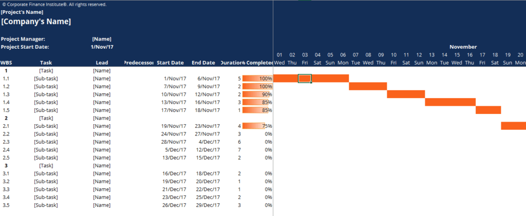
In the end, your chart should look like this:

Interactive Gantt chart in Excel
The previous method provides only a simple version of a Gantt chart. The main drawback of that method is that the user cannot simply modify the data in the chart if there are any changes in the project. However, there is another approach to create a Gantt chart in Excel to address this problem.
1. Create a table with the inputs for a Gantt chart
List the names of each task, start and end date, duration of each task, and percentage of the work completed. In addition, you can input the tasks ID and names of people responsible for performing each task.
2. Create the dates on the top of the table
a. Choose the start date of the project and enter it in one of the cell. Right-click on that cell and choose Format cells -> Custom and under Type enter Your date will appear only as the day number.
b. To enter the next day, in the next cell to the right enter the following formula =I6+1. Instead of I6, enter the cell that contains the original date of your project. Copy and paste the formula to have range of dates you need.
c. You can also insert the day of the week below to make tracking the dates easier. To do so, in the cell below, enter the following formula =TEXT (WEEKDAY(I6,1), ”ddd”).
Now your template for the interactive Gantt chart is ready.
3. Apply conditional formatting to create bars
a. Click Home -> Conditional Formatting -> New Rule -> Use a formula to determine which cells to format.
b. Type the following formula =AND ($E9<=I$6, $F9>=I$6). Cells E9 and F9 should correspond to the start and end dates of the first task in your table, while I6 is the first date you entered in the table.
c. Click Format -> Fill, choose the color of the fill and press OK.
d. Then go to Conditional Formatting -> Manage Rules -> This worksheet. In the Applies to section, enter the area of the worksheet where the bars of a Gantt Chart should be located.
Additional Resources
Analyst Certification FMVA® Program
Below is a break down of subject weightings in the FMVA® financial analyst program. As you can see there is a heavy focus on financial modeling, finance, Excel, business valuation, budgeting/forecasting, PowerPoint presentations, accounting and business strategy.
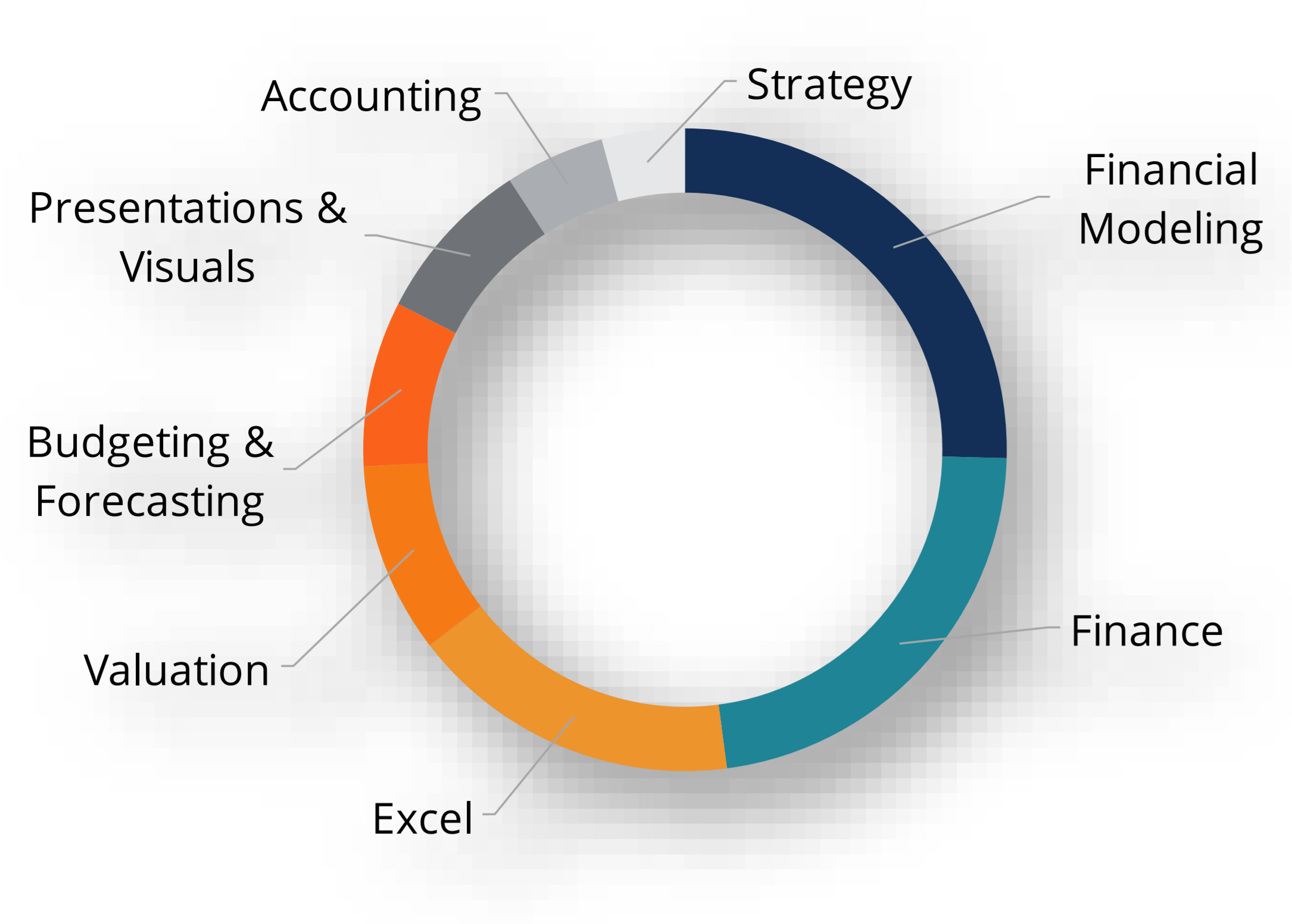
A well rounded financial analyst possesses all of the above skills!
Additional Questions & Answers
CFI is the global institution behind the financial modeling and valuation analyst FMVA® Designation. CFI is on a mission to enable anyone to be a great financial analyst and have a great career path. In order to help you advance your career, CFI has compiled many resources to assist you along the path.
In order to become a great financial analyst, here are some more questions and answers for you to discover:
- What is Financial Modeling?
- How Do You Build a DCF Model?
- What is Sensitivity Analysis?
- How Do You Value a Business?
Excel Tutorial
To master the art of Excel, check out CFI’s Excel Crash Course, which teaches you how to become an Excel power user. Learn the most important formulas, functions, and shortcuts to become confident in your financial analysis.

Launch CFI’s Excel Crash Course now to take your career to the next level and move up the ladder!


